 Last week saw the launch of the Democratic Dashboard, a new site aimed at engaging and informing voters about the local areas before the election. In this post, Carl Cullinane introduces the Dashboard, and discusses how it helps us to understand the changing nature of party politics in the run up to the forthcoming election.
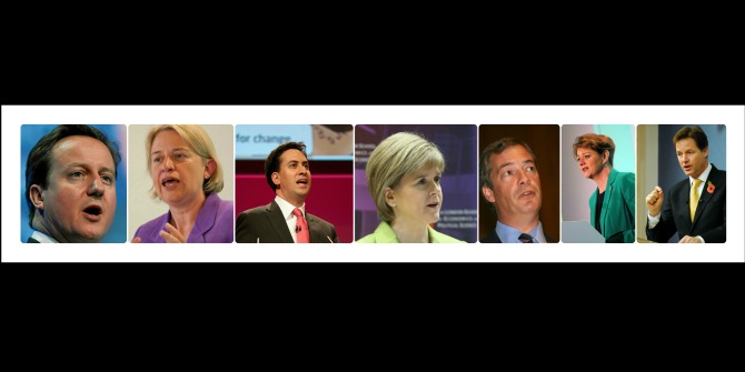
The Dashboard launches at a particularly crucial juncture for British electoral politics. During the term of this parliament, a disillusioned and frequently disengaged electorate has found invigoration mainly outside the traditional Big Three political parties, and the structure of party politics is on the brink of radical change. Britain is moving ever closer to multi-party politics, and the Dashboard’s data demonstrates how this has happened since 2010, at a seat-by-seat level, with the SNP, the Greens and UKIP all making significant progress in certain geographical areas.
The map above visualises how the country would look if the European Elections in 2014 were translated into Westminster seats (more info here). It aptly demonstrates the openness to change, but it also shows how voters behave very differently in different electoral contexts. UKIP’s strong performance, topping the poll in several regions, means that it would have secured vast swathes of the country, eating into traditional Conservative heartlands. UKIP would in fact have won 246 seats under this model, decimating the Conservatives, and leaving them on just 112 seats, compared to the 303 they currently hold.
While the Labour party held their own, and improved on their European showing in 2009, they would nonetheless sit in second place on 238 seats. On the other hand, without the benefit of their MPs’ incumbency advantages, the Liberal Democrats would have been obliterated and left with just two seats. It’s probably fair to say this division of seats would cause an even greater impasse than we are likely to see in a month’s time. Whether the case for Proportional Representation for Westminster is furthered or held back by General Election 2015 very much remains to be seen.
For the moment, the nature of First Past the Post elections puts an emphasis on local factors, and with the increasing complexity of local battlegrounds, if voters want to maximise the value of their vote, awareness of their local context is more relevant than ever. However, as younger generations become increasingly geographically mobile, people are less tied to their local areas and have less in-built knowledge of their area compared to long-standing residents. Furthermore, they often face confusing and contradictory messages through the door on which candidates are and aren’t “competitive”. This is where the Dashboard comes in, providing an independent resource of information about what’s been happening in constituencies since 2010 and offering context to the choices faced by the electorate on the 7th of May.
The Dashboard also seeks to illuminate national issues, through the local. There are drastic differences in the demographic and social makeup of constituencies across the UK, shaping, and shaped by their relationship with the political process. 395 constituencies have had all male, all white MPs since 1992, and 268 haven’t seen a female MP, a non-white MP, nor a change in party over the last twenty five years. In some seats, a large majority of the electorate lives in areas of deprivation, others contain practically none. Health, a major issue in this election, also varies drastically between constituencies.
As highlighted by the Voter Power Index, and the Index of Local Disproportionality the voting system is also a highly unequal one. Voters in permanently safe seats (388 seats have not changed party hands since 1992) have a fraction of the potential influence of voters in marginal constituencies. To take an example, on Merseyside alone, a vote in Wirral South is worth effectively 185 votes in Liverpool Walton. The pattern of money spent in order to secure people’s votes bears this inequality out.
In highlighting these issues through data, along with making that data available, we hope that the Dashboard will be a useful tool for those wanting to know more about their locality, along with journalists, researchers and citizen social scientists alike.
Note: This article gives the views of the author, and not the position of the General election blog, nor of the London School of Economics. Please read our comments policy before posting.
Carl Cullinane is a researcher in the Democratic Audit, LSE Public Policy Group. He tweets at @CullinaneCarl and the Democratic Dashboard can be followed on twitter at @DemocraticDash.