 Between 1976 and 2018, income inequality rose almost every year: the richest 0.1% now take 67 times the mean income. But this may have already begun to change as Brexit encourages the best-off to move elsewhere or reduce the value of their assets. Danny Dorling (University of Oxford) looks at how Leave-voting areas outside London will be worst hit by the coming falls in house prices.
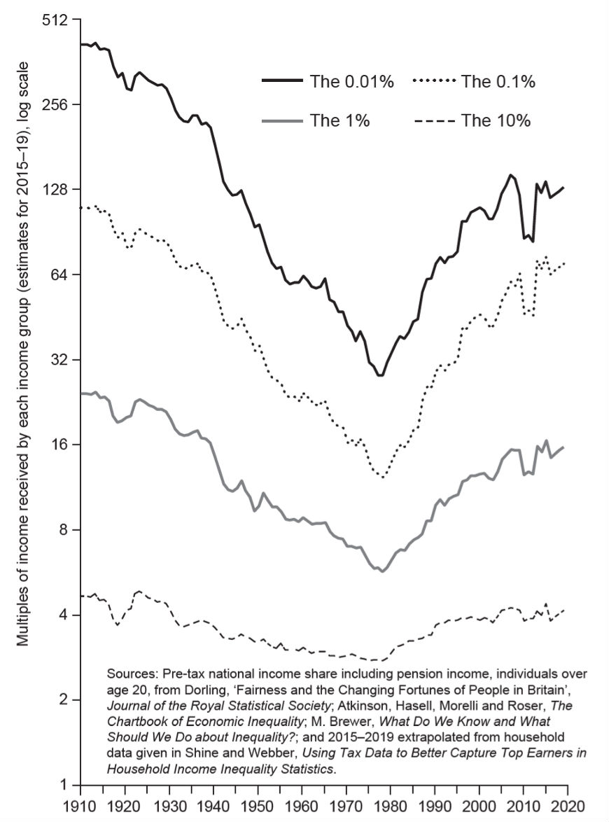
In 2014 in the UK, the best-off 1% took 15 times of average incomes, a share almost identical to what they took before the second world war. In between those two dates they always took less – almost four times less (after tax) in 1976, the year when Britain was the most equal it has even been.
Since 2014 the take of the top 1% had dipped slightly – but then began to rise again, to become as high in 2018 as it was in 2014. We are currently teetering on the edge of either the beginnings of a long downward curve towards the slow realisation of greater equality (as the gap between rich and poor begins to fall), or we are about to see inequality rise again to even greater heights. The curve has never flatlined. It either goes up, or it goes down.
Politics is what matters most. Not the everyday politics of most general elections, which has made no difference at all to the long-term trend. Between 1914 and 1976, income inequalities in the UK almost always fell – regardless of which party won power. Between 1976 and 2018 they almost always rose, again regardless of which party won power. By 2018 the ‘bottom 90%’, the vast majority of the population of Britain, were living on 67% of average mean income. That was because the top 10%, and especially the top 1%, were taking so much more than in the decades before.
By 2018 the best-off 0.1% took 67 times, a share so high that they had last achieved such excesses only in 1936 – other than in the one year, 2013, when their take was 7.2% or 72 times average earnings – and that year, the best-off 0.01% took 130 times average earnings.
By 2019, university research had found that almost a third of UK adults with children under the age of 16 were food insecure. The risk was greatest among the unemployed, those with long-term conditions or disabilities, and those on the lowest household incomes. This compares to one in five of all adults being so insecure today, three per cent of whom often go without food and starve. Between 2004 and 2016 food insecurity among the least well-off almost doubled.
Figure 1: Annual house price change by region in the UK, year to Q3 2019
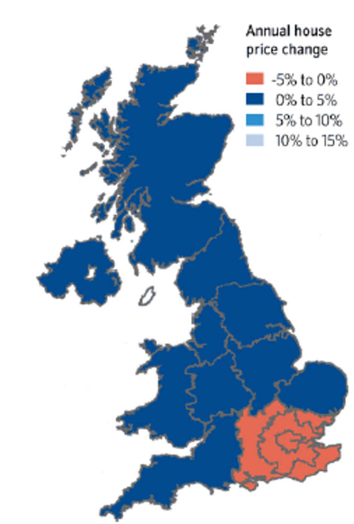
Source: Nationwide building society, 30 September 2019 press release
We see wealth inequality still rising as more and more people go hungry in Britain, as homelessness rises and overall life expectancy begins to fall. Wealth inequality tends to lag behind the trend of income inequality, although that may not be the case when inequalities begin to fall today – if they fall. If UK house prices in the south-east continue to slump as they were in September 2019 (Figure 1), wealth inequalities will fall even as income inequalities still, for a short time at least, appear to teeter on a plateau.
In February 2019, the Daily Telegraph reported that income inequality in the UK was still growing, ten years after the great economic crash, because ‘the richest grew their earnings but the poorest were faced with falling benefits’. The newspaper went on to explain to its more well-heeled readers that median average household income after tax was now stagnant and still standing at just £28,400 according to the latest data (the financial year ending in 2018). That is just £77.80 a day to live on – to cover the rent, food, clothing, bus fares, gas and electricity bills, an internet access charge, a mobile phone, children’s clothes, maybe a book or a birthday present occasionally. Fifty percent of the population had to manage on £77.80 a day, or less.
Figure 2: Income inequality 1910–2019, UK
In the latest financial year, the poorest fifth of households – those families surviving (or not) on £36.50 on average a day – have seen their incomes fall. In contrast, the richest fifth of households more recently saw their incomes rise as their earnings rose and as they reap the rewards of very low rates of taxation. ONS reported that this was the second year in a row that income inequality as measured by household surveys had risen.
In March 2019 the Office for Budget Responsibility explained that there were 31,000 people in the UK with incomes of a million pounds a year or more (£3,000, £5,000 or even £10,000 a day to live on). The OBR explained that this group accounted for 8 per cent of all PAYE (Pay As You Earn) income tax and national insurance receipts of all those that the government had received in the financial year 2017–18. The average tax paid by each member of this 0.1 per cent of the population was £730,000 that year – which demonstrates that most of them were earning much more than a million pounds a year.
The most recent figures from the European Banking Authority reveal that the pay of bankers in the UK had begun to rise again so that now a record 3,567 were receiving more than €1m a year, with the average yearly salary of UK bankers in this group being £1,700,000 (£4,660 a day). This was nine times as many high-paid bankers than could be found in the next most ‘banker-heavy’ country in the EU (Germany). A decade after the 2008 crash, three-quarters of all Europe’s highest paid bankers were still working and living in London, but the writing was on the wall.
At the very same time as these figures were revealed, it was announced that 7,000 finance jobs could be lost from London in the very near future due to the Brexit mess. The bankers were simply taking the money while they could, and once they did, many ran for it. In 2019 they knew the good times (for them at least) were likely to very soon end.
We will probably see the fall in inequality begin at the top of the income and wealth scale, not at the bottom, and not until after life for the poorest in the UK has first worsened to be even harder than it was at the peak. This happened before in the 1920s and 1930s and it may be what is just starting to happen now. It happens partly because rising wealth inequalities can never continue indefinitely.
In the year to October 2016, sales of individual properties within London ‘worth’ more than £10m fell by 86%; and outside of London, they fell from ten properties in 2015 to none being sold for such huge prices in 2016. In May 2017 it became clear that housing prices across London for all properties had begun to fall slightly. In 2018 the London housing market fell faster. In 2019 it is no longer polite to mention house prices at dinner parties in south-east England (see Figure 1). All postwar housing slumps have begun in London and spread outwards. In September 2019 the Nationwide Building Society reported that the average house in England had fallen in value, despite only the south-east and London having fallen. Prices there were so very high that falls in them can alter the national average that much – because wealth has become so unequally distributed across the UK..
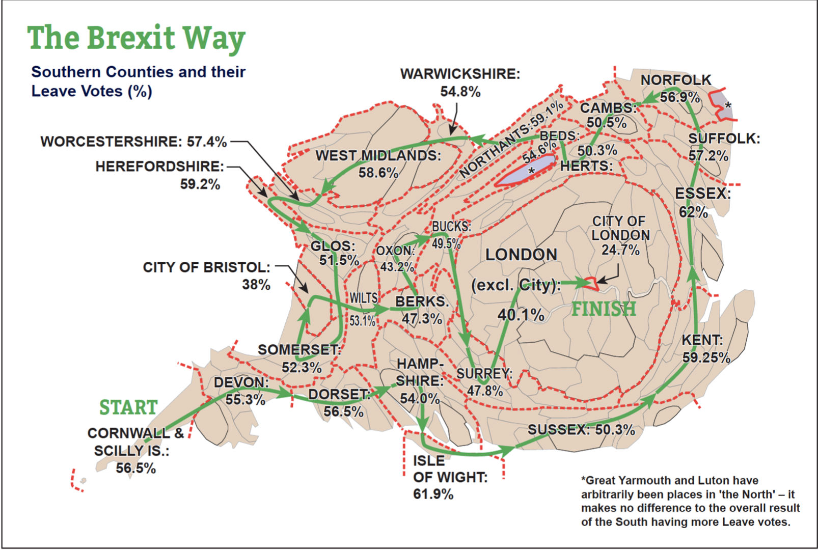
The overall fall in UK wealth inequality could have already begun. If you measure your wealth in dollars and you live in the UK and own property there, you are already much worse off than you were in June 2016. But no one will have any sympathy for you in the most unequal state of all EU28 states. The map below shows a walking route through those countries where wealth may fall the most in absolute terms as the UK housing market currently adjusts to the Brexit mess. It is where the greatest number of people voted Leave.
The Brexit Way
This second map (Figure 3) shows a route past the homes of the majority of UK Leave voters and a minority of the UK electorate. For every county shown there is a unique area of the UK outside of the South of England – as shown on this map, where fewer people voted Leave despite there being a greater electorate able to vote in each area. Because most people in the south of England live in the south-east region of England, the majority of the map by area is of the south-east. Thus across the majority of this map, as is the case for the majority of people living in the south of England, house prices have already fallen, in some cases substantially. If the house prices falls reported to have rippled out by autumn 2019 continue to do so, then very soon all across the south of England all housing will be falling in value. That itself is not a bad outcome, unless the falls are very fast and show little sign of stopping. Then we are in uncharted economic waters.
Figure 3: The Brexit Way
The third edition of Danny Dorling’s Inequality and the 1% was published by Verso in September 2019. It contains all the references for the statistics given above and a more nuanced argument about how rising inequality and its consequences may well have caused the vote for Leave to become so strong, most noticeably of all in the South of England.
The income inequality graph shown in Figure 2 is derived from the following sources: Atkinson, Anthony B., The Distribution of Top Incomes in the United Kingdom 1908-2000; in A. B. Atkinson, and T. Piketty, T. (editors) Top Incomes over the Twentieth Century. A Contrast Between Continental European and English-Speaking Countries (Oxford: Oxford University Press, 2007), Chapter 4. Series updated by the same author, and then updated by A. B. Atkinson, J. Hasell, S. Morelli and M. Roser (2017) The Chartbook of Economic Inequality, M. Brewer (2019) What Do We Know and What Should We Do About Inequality? London: Sage; and 2015–2019 extrapolated from household data given in M. Shine & D. Webber (2019) Using tax data to better capture top earners in household income inequality statistics, London: ONS, February 26. (Note that it so complicated to construct and update now because the current UK government is not encouraging HMRC to release taxation data in a timely or useful fashion. See: Corlett, A., Unequal results: Improving and reconciling the UK’s household income statistics, London: Resolution Foundation, December 2017.)
This post represents the views of the author and not those of the Brexit blog, nor LSE.
Danny Dorling is the Halford Mackinder Professor of Geography at the University of Oxford.


Are you really going to include the South West in the ‘South’? Southern counties. I don’t understand how they share a social, economic or political history?
Okay, just because I will know more than you about Cornwall, and, oh, I will. Further, I will know more about Devon, probably, as well. The Working Class in Cornwall voted to leave the EU because they were lied to, like many people in the UK, but because they have been brainwashed to believe that leaving the EU will help with fishing.
“Danny Dorling (University of Oxford) looks at how Leave-voting areas outside London will be worst hit by the coming falls in house prices.”
Or should that read “How Leave Voting areas outside London will benefit most from an increase in affordability following a slow down in immigration from the EU”? Elsewhere the ONS reported that “earnings growth was highest in 2018 in the lowest-paid occupations” and the “proportion of low-paid employee jobs by hourly earnings falls to 17.8%, the lowest since the series began”
“At the very same time as these figures were revealed, it was announced that 7,000 finance jobs could be lost from London in the very near future due to the Brexit mess.”
So let’s put this in perspective. The CEO of the London Stock Exchange had predicted 200,000 jobs would leave London but two years after the referendum Reuters found that only 2,000 jobs had gone abroad and furthermore they found that in the 2 years up to April 2018 foreign exchange trading volumes in London had increased by 23% compared to only an 11% increase in New York.
Fascinating piece, but (1) is it possible to repost Fig 1 so the blue colour difference is marked and (b) is there any chance of a bit more explanation of how the Brexit Way works — just what joins the houses passed by the route — and how exactly does it come to start n Cornwall ???– but thanks for the post and the damning detail.
Income inequality widened with the UK joining the EU. Please present the facts to show or dispute this cause and effect. Please do not say it’s just a coincidence. Thanks.
Falling house prices and a lower population are exactly what the UK needs. The country is hugely overcrowded. Social and physical infrastructure is overloaded. I voted brexit hoping for a house price crash and a lower population. And I say all this as an owner of three properties. ” No one voted to be poorer” they say. Well I did. I voted to be poorer so the next generation could afford to buy somewhere to live without having to break their backs paying gazillions to a bank on a 40 year mortgage for a two bedroom flat.