Data and its visualizers have always exploited the latest trends in media and communication in its quest to make seemingly dull numbers engaging, affective and interesting. In this post Kalina Borkiewicz, Eric Jensen, Stuart Levy, Jill .P. Naiman, and Jeff Carpenter discuss the emerging concept of cinematic scientific visualization. Locating it between traditional scientific visualization and illustration, they explore how the aesthetics of cinema can be used to highlight different aspects of scientific research and how this in turn can create more compelling visualizations.
With rapid advances in science, data processing, and computer graphics technologies, the line between representations of “real science” and “Hollywood science” is blurring. The film “Interstellar” made the news for contributing to scientific understanding of astrophysics, but the blurring goes both ways: science is making visual effects more believable, while visual effects are making science more widely accessible. A cinematic presentation of scientific data, or ‘cinematic scientific visualization’, can capture public attention and interest in complex science topics in this current age of rapidly growing media consumption. By placing emphasis on aesthetic design, storytelling, and cinematography, these visualizations reach millions of viewers worldwide through entertainment and informal learning experiences ranging from museums and documentary films to YouTube and Reddit. This form of scientific visualization is driven by distinctive goals, processes, and outcomes, making it a new and important frontier in science communication.
A grey area between “data visualization” and “scientific illustration”.
A scientific illustration is an artist’s impression of what a scientific phenomenon might look like, used often in the case of lacking data. The precise details of how dinosaurs looked are one example. The 1993 film “Jurassic Park” used some scientific information but took major creative liberties in filling knowledge gaps. It has made a lasting public impression, although it was not very accurate, for example, we now know that dinosaurs had feathers and may have been quite colourful.
In contrast, a scientific data visualization is based on research data and is often created by scientists rather than by filmmakers or artists. The dataset may be collected from the real world via satellite, telescope, microscope, or some other instrument; or it may be simulated based on the laws of physics.
Cinematic scientific visualizations are situated between these two categories, comprising both a visualization of scientific data and a Hollywood-style artistic impression. Cinematic scientific visualization is defined by its (1) use of scientific data, (2) aim of achieving intelligibility for a public audience and (3) visual appeal.

Visualization and illustration are both types of science communication, but with distinct intended audiences: scientific experts (e.g., via research publications) and/or non-experts (e.g., via documentary films). Cinematic visualization is most often aimed at the general public, although it is also used for high-visibility or high-stakes scientific communication with crossover appeal (e.g., when publishing an image for the cover of Nature). Recently improved computer graphics tools and machine learning are making cinematic visualization accessible to a wider range of scientists, although this remains rare in practice.
A common aim of cinematic scientific visualization is informal science education, or “edu-tainment”. The overarching goal is often to make audiences excited about a science topic, rather than teaching specific, discrete facts. To this end, these visualizations are sometimes designed to create visual analogies to spark curiosity or feelings of wonder. For example, chlorophyll molecules that plants use for photosynthesis are usually visualized in green because of their link with green plants, despite being too small to be seen as any colour in an optical microscope. To create a visualization of the process of photosynthesis, designers must also determine how to show the moment when a photon (a unit of light) hits a receptor. Physicists think of photons as quantum phenomena, which act sometimes like particles and sometimes like moving waves, but neither fully describes how photons behave. Photons are how we see, they don’t “look” like anything. This means that showing photosynthesis “accurately” or “photorealistically” is outright impossible.

Photon visualization tests
Therefore, cinematic scientific visualization designers must balance accuracy and intelligibility. Decisions about where to make omissions, simplifications, abstractions, or where to add artistic elements must be made jointly between visualizers, scientists, and communication and media experts. Occasionally, there is capacity to use an evidence-based communication approach, with audience research in a project to systematically test different design options. Only when an image is sufficiently understandable and accurate can the focus shift to the final piece of the puzzle, namely, aesthetics.
 Hierarchy of cinematic scientific visualization needs: Appealing, accurate, understandable.

The visual difference between a scientific visualization and a cinematic one is not a matter of venue (e.g., computer screen vs. large dome IMAX screen). To present scientific data using the language of film, several cinematic techniques must be applied to the virtual scene. A selection of such techniques is provided in the table below.
 is associated with cinema, 30FPS with television, 60FPS+ with virtual reality")
Cinematic scientific visualization uses filmmaking techniques to present complex scientific datasets in a visually compelling way, while prioritizing audience understanding. It currently occupies a sliver of space along the spectrum between “traditional data visualization” and “scientific illustration”. However, its broad appeal and ever-expanding technical feasibility will see it continue to grow as a field and gain ground in the overlapping domains of education and entertainment. Using tools that automate parts of the visualization process, introducing cinematic dimensions to data visualizations is increasingly within the grasp of ordinary researchers with a modest level of supplemental training. Researchers may start to see the value of investing a week or two in developing such skills to dramatically upgrade the visual appeal and impact of their data visualizations.
The content generated on this blog is for information purposes only. This Article gives the views and opinions of the authors and does not reflect the views and opinions of the Impact of Social Science blog (the blog), nor of the London School of Economics and Political Science. Please review our comments policy if you have any concerns on posting a comment below.
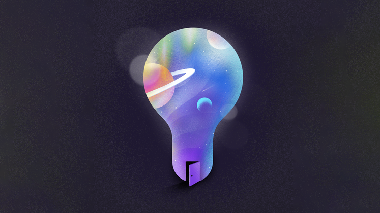
Image Credit: In text images reproduced with permission of the authors, featured image, Jake Hills via Unsplash.


A full-length journal article on this topic is now available, published in Frontiers in Communication:
‘A New Frontier in Science Communication? What We Know About How Public Audiences Respond to Cinematic Scientific Visualization’. Check out this open access article here: https://www.frontiersin.org/articles/10.3389/fcomm.2022.840631/full