Background
In 1969, the economist Thomas Schelling was seeking to understand some of the game theoretic considerations underlying the kind of racial segregation observed in large American cities at that time. Using only a chequerboard and some zinc and copper coins, he ran a simple experiment, known as the Schelling Segregation Model (chequerboard – SSM). With the coins originally randomly distributed on the board, he supposed that each coin might be satisfied in its present location so long as at least half of the coins in adjacent squares were of its own type (zinc or copper). Then he took each coin in turn, and moved those unsatisfied coins to the nearest position in which they would be satisfied, leaving satisfied coins where they were. This process of taking each coin in turn was repeated until no further moves were possible. What he observed might initially be considered rather surprising: while each individual would be happy in quite a mixed environment, the global structure which emerges is one in which large segregated regions appear, i.e. large clusters of individuals all of one type. For Schelling this provided evidence of a recurrent theme in his research: that the actions of individuals behaving according to their own locally-defined interests can lead to global results which are undesired by all.
Since then, Schelling’s model has received a good deal of attention, in part because of deep connections to other models studied in statistical mechanics and in neural networks. While the model is very simple to describe, however, it turns out to be very tricky to analyse precisely in a mathematical setting. One thing that can be done in order to make analysis easier is to introduce ‘noise’ into the dynamics of the process. Recently, however, Andy Lewis-Pye (LSE) and his colleagues George Barmpalias (Wellington) and Richard Elwes (Leeds) have been able to rigorously analyse the original (noiseless) model… and some of the results are quite surprising. To describe some of these results though, we need to define the model a little more precisely.
Defining the model
There are lots of slight variants of the model that one might consider. Let’s concentrate initially on a particularly simple 1-dimensional version of the model, then it will be easy to extend to the 2-dimensional case.
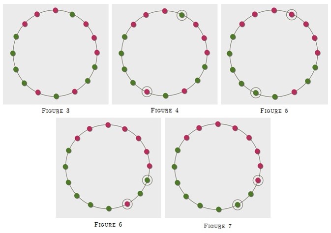
One begins with a large number n of nodes (individuals) arranged in a circle. Each node is initially assigned a type, and has probability 0.5 of being of type α and probability 0.5 of being of type β (the types of distinct individuals being independently distributed). We fix a parameter w, which specifies the ‘neighbourhood’ of each node in the following way: at each point in time the neighbourhood of the node u, is the set containing u and the w-many closest neighbours on both sides – so the neighbourhood consists of 2w + 1 many nodes in total. The second parameter τ is a real in the interval [0, 1], and specifies the proportion of a node’s neighbourhood which must be of their type before they are happy. So, at any given moment in time, we define u to be happy if at least τ (2w + 1) of the nodes in its neighbourhood are of the same type as u. One then considers a discrete time process in which, at each stage, one pair of unhappy individuals of opposite types are selected uniformly at random and are given the opportunity to swap locations. We work according to the assumption that the swap will take place as long as each member of the pair has at least as many neighbours of the same type at their new location as at their former one (note that for τ ≥ 0.5 this will automatically be the case). The process ends when (and if) one reaches a stage at which there are no longer unhappy individuals of both types. As an example, let’s suppose that n = 16 (although normally we’d be interested in much larger numbers of course), w = 2 and τ = 0.6. Then the initial configuration might look as depicted in Figure 3. At the first stage, we might then select the two nodes indicated in Figure 4, which then swap, causing a configuration as depicted in Figure 5. At the second stage, we might then select the two nodes indicated in Figure 6, which then swap, causing a (final) configuration as depicted in Figure 7.
Now for the two dimensional model, we consider instead the nodes to be arranged in a grid formation. The neighbourhood of a node u could be defined in a number of ways. A particularly natural choice is that the neighbourhood of u should now be the set of all nodes whose horizontal and vertical distances from u, are both at most w.
The behaviour of the model
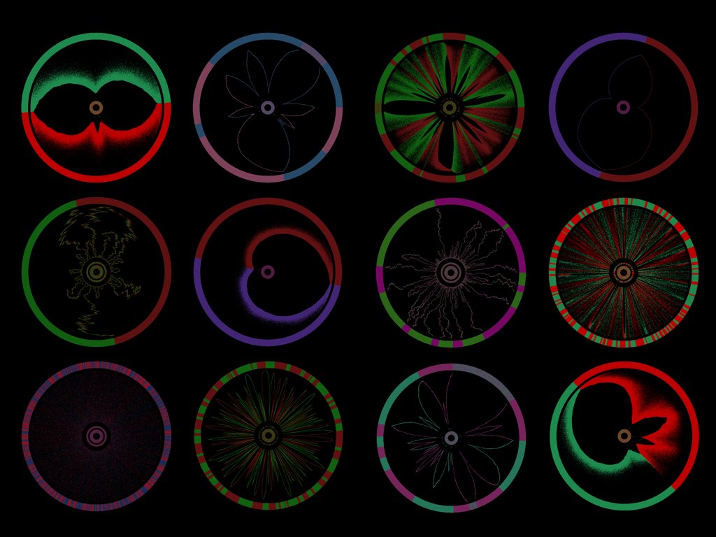
What Andy and his colleagues have been able to rigorously establish is that the model displays some rather counterintuitive behaviour. In particular, there are a variety of situations in which increased levels of intolerance (i.e. increased values of τ ) actually give rise to decreased levels of segregation. This can be seen clearly in Figure 8, but first we’ll need to describe the way in which this diagram depicts the process. Here we show the outcome of simulations of the process where the number of nodes n = 100000, w = 60, and for varying values of τ . Individuals of type α are coloured light grey and individuals of type β are coloured black. The inner ring displays the initial mixed configuration (in fact the configuration is sufficiently mixed that changes of type are not really visible, so that the inner ring appears dark grey). The outer ring displays the final configuration. Just immediately exterior to the innermost ring are the second and third inner rings, which display individuals which are unhappy in the initial configuration and individuals belonging to certain ‘stable’ intervals in the initial configuration respectively.

The process by which the final configuration is reached is indicated in the space between the inner rings and the outer ring in the following way: when an individual changes type this is indicated with a mark, at a distance from the inner rings which is proportional to the time at which the change of type takes place.
The top left diagram depicts the process for low levels of the intolerance parameter τ , and what one sees here is not very surprising – as one might expect, low levels of segregation result. There is a certain threshold, however, and as soon as one pushes τ past this threshold (top right) very large levels of segregation can be seen in the final configuration. Here one ends up with long intervals of nodes all of one type. Then, as one continues to increase the level of intolerance, one will see decreased levels of segregation. This continues all the way up to τ = 0.5, as depicted in the bottom left diagram. Then, as one pushes τ past 0.5 (bottom right), one sees another sudden change in the behaviour of the model…now complete segregation becomes inevitable!
If you are interested in pursuing the information here, the papers (published in FOCS 2014 and the Journal of Statistical Physics) can be found at Andy’s website.
Andy’s colleague, Richard Elwes, has also written a couple of blogs on the topic: www.richardelwes.co.uk/2013/06/14/schelling-segregation-part-1/ www.richardelwes.co.uk/2013/06/18/schelling-segregation-part-2/
There is also a very nice article written by Brian Hayes in American Scientist.
Dr Andy Lewis-Pye is a Royal Society University Research Fellow in the Department of Mathematics at the London School of Economics.