 Since May’s General Election, one question has dominated discussion of opinion polling in Britain – how did the polls get it so wrong? New analysis by Matt Singh from Number Cruncher Politics finds that the polls were wrong because the flows of voters between parties, following the Lib Dem collapse and the UKIP surge, were substantially different from what voting intention polling had measured.
By analysing electoral data and the results of the recently published cross-sectional wave of the British Election Study, it is now possible to explain why the apparent photo finish predicted by the polls was, in reality, a Conservative outright majority, an outcome to which many forecasters has ascribed a negligible probability.
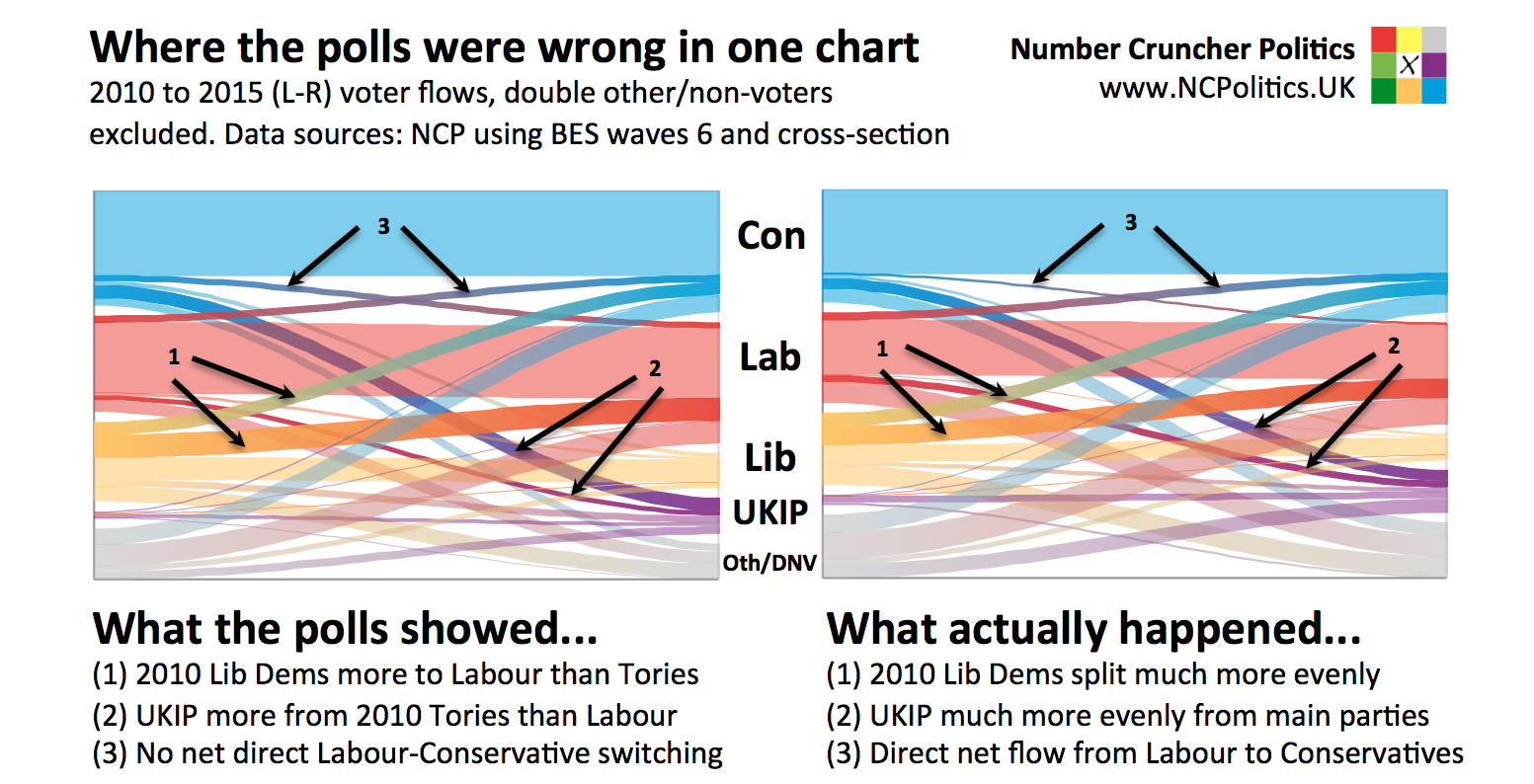
The voter flows shown in the polls were extremely clear – 2010 Lib Dems were going disproportionately to Labour and the UKIP vote was coming disproportionately from 2010 Conservatives. John Curtice described the former as a “crutch” and the latter as a “wound”. Intuitively it made complete sense – one of the Lib Dems’ parent parties was founded by ex-Labour moderates, while UKIP’s origins lie among disgruntled Eurosceptic ex-Tories. However, analysis of electoral data and the BES survey suggests a different picture.
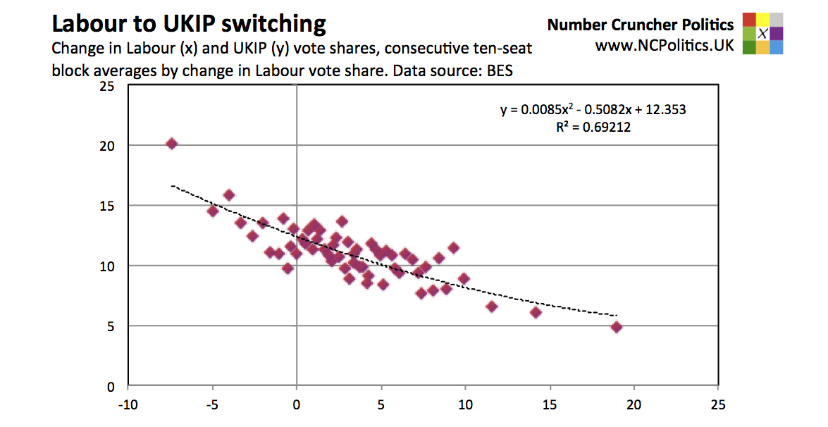
The modelling – using relative net flow analysis – involved taking all 572 seats in England and Wales excluding Buckingham (the speaker’s seat), ordering them by the change in Conservative vote share, from the largest gain for the greatest fall, then averaging them across interval blocks of 10 seats (11 in a couple of cases to avoid odd lots). For each group the changes in UKIP and Lib Dem vote shares were also averaged. Then the exercise was repeated with Labour vote share changes, grouped in order.
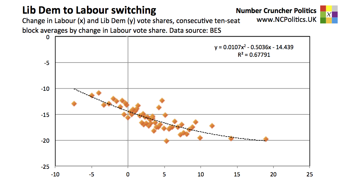
The relationship between the averaged data points (shown on the scatter plots) gives an indication of the net flows of voters between the parties. The steeper the gradient, the more voters are switching. Where the fit wasn’t linear, elementary calculus was used to derive out the gradient at each point before taking an average.
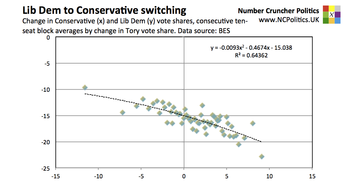
For each extra point gained by Labour, the Lib Dems lost 0.43. For extra each point gained by the Conservatives, the Lib Dems lost an extra 0.49 points. The BES data confirms this – Lib Dem to Labour switchers did outnumber Lib Dem to Tory switchers, but only narrowly.
Polls also consistently underestimated the UKIP threat to Labour. On average, pre-election surveys got the UKIP vote share right, but badly mismeasured where it came from. Almost all of them had shown the proportion of 2010 Conservative voters switching to UKIP to be two- or even three-times that of 2010 Labour voters. The relative net flow analysis suggests that every point worse the Tories did corresponded to UKIP doing 0.40 points better, while every point worse Labour did was matched by a further 0.45 point gain for UKIP, again broadly in line with the BES data.
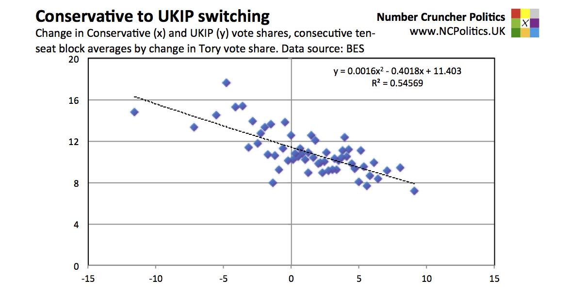
In fact given what is known about the pre-2010 voting of UKIP supporters it is likely that over the last two election cycles, UKIP has taken more voters from Labour than from the Conservatives.
Polls had also suggested that the direct flows between Labour and the Conservatives were very small and essentially cancelled each other out. There was in fact a slight net impact, that went in the Tories’ favour.
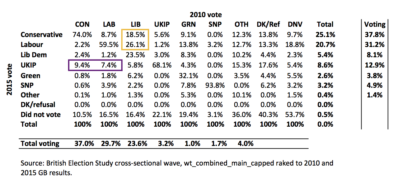
These flows also explain why polls in Scotland were so much more accurate than Great Britain-wide polls. UKIP gained less than a point, while the 2010 Lib Dem vote went predominantly to the SNP, simplifying matters. Similarly London was UKIP’s worst performance in England and Wales, while 2010 Lib Dems actually did go heavily to Labour as London polling had suggested.
The pattern of errors was reflected in questions besides topline voting intention. Those that voted Conservative in 2015 appear to have been far more socially liberal – with more progressive views on gender and racial equality – than was previously thought. They were also better qualified and more gender balanced. In fact the BES data suggests it more likely than not that the Tories had both a larger vote share and a larger lead among women than among men.
These numbers support the theory that Conservative modernisation helped – not hurt – the Tory performance in 2015. It very likely made the difference between winning a majority and falling short.
Conversely, the idea of a split on the right and a reunification on the left was wrong, a possibility originally raised by Fisher in 2014. As in many other countries, it now seems the revolt on the right hurt the centre-left the most. It is therefore worth revisting two important pieces of work: Ford and Goodwin’s Revolt on the Right (2014) and Roberts et al. (2014) Revolt on the Left given that the apparently contradictory polling evidence was flawed in precisely the area in which it differed.
Methodologically, the root of the problem is very likely to have been a sample imbalance combined with problems weighting the data, with differential turnout as a contributory factor, as was suggested by the BES team and others. As widely noted, opinion poll respondents tend to be more politically engaged than voters as a whole. This is a problem in and of itself, but additionally, the bias arises unevenly within opinion poll respondents.
Further analysis of the sample and its imbalance has identified a significantly undersampled section of the electorate – as would be expected, they were far more likely to have voted Conservative in both 2010 and 2015 than the sample as a whole. Those that had voted for one of the coalition parties in 2010 and subsequently changed their vote to Labour or UKIP were overrepresented. The risk that this “electoral flux” could cause problems for pollsters, such as blunting the effectiveness of methodological changes introduced after 1992, was highlighted by my own prediction of the polling failure and Conservative victory.
Further work is clearly required in the area of political engagement to identify groups of voters that are undersampled. Initial remedial work (Singh, forthcoming), when applied to online polling data, corrects for around 4 points of the error or around 5 points taking into account differential likelihood to vote. Opinion polls at the election understated the Conservative lead over Labour by 6.5 points, with a negligible difference between telephone and online pollsters.
__
Note: this is a summarised version of an article which originally appeared at Number Cruncher Politics and is reproduced here with kind permission of the author. The article represents the views of the author and not those of British Politics and Policy, nor the LSE. Please read our comments policy before posting.
__
About the Author
Matt Singh runs Number Cruncher Politics, a non-partisan psephology and polling blog. He tweets at @MattSingh_ and Number Cruncher Politics can be found at @NCPoliticsUK.


There are two separate points here. Firstly, polls are measurements of voting intention, not seat predictions. The first link shows Scottish polls – every one in the final month had the SNP between 46% and 54% (they got 50%) and Labour between 20% and 28% (they got 24.3%):
https://en.wikipedia.org/wiki/Opinion_polling_for_the_2015_United_Kingdom_general_election#Scotland
Secondly, the forecasts were, in fact, reasonably close. The final model-based forecasts for the SNP were all between 52 and 56 seats (they got 56). The two from betting odds were a bit lower, but the worst was 46, not “10 or 20”. The forecasts a month out were slightly lower, but that was due to the way the models were built – nothing to do with polls.
https://en.wikipedia.org/wiki/United_Kingdom_general_election,_2015#Final_predictions_before_the_vote
“These flows also explain why polls in Scotland were so much more accurate than Great Britain-wide polls.”
What utter rubbish. Nobody predicted that the SNP would take all but 3 of the seats that they stood for. Most predictions were for 10 or 20 seats not for over 50.