

 Should we conceive of Europe as a collection of individual states or as a group of distinct cities and regions which are part of a larger whole? Dimitris Ballas, Danny Dorling and Benjamin Hennig present figures from their new ‘Social Atlas of Europe’, which provides a new way of illustrating the key social and geographic features across European countries. They argue that by viewing Europe in this way it becomes apparent that most of the real social divides across the continent are within states rather than between them.
On 19 September 1946, Winston Churchill stated that: “we must re-create the European family in a regional structure, called, it may be, the United States of Europe”. This idea of a Europe of Regions and of a European People instead of a Europe of nation-states has long been at the heart of the thinking and efforts that have gradually led to the creation of the European Union. Nevertheless, the recent ascendancy of populist groups and the so-called ‘Eurosceptic earthquake’ in the recent European parliament elections have contributed to the painting of a picture of Europe where Euroscepticism is the dominant trend and where the revival of old nationalisms and divisions is inevitable.
Yet, a closer look at the evidence reveals a much more complex picture, which is convincingly argued by Ruth Wodak in her recent blog. In fact, and despite the significant rise of the votes for Eurosceptic parties, the overwhelming majority of votes and parliament seats were won by parties that are strongly committed to the European project. Perhaps the best example is the triumph of Italy’s centre-left Democratic Party whose leader, the Italian Prime Minister Matteo Renzi, in a speech delivered at the State of the Union before the European elections vowed to push for a United States of Europe during the Italian presidency.
It is also worth noting that according to the most recent Eurobarometer survey in Spring 2014 “close to two-thirds of Europeans feel that they are citizens of the EU (65 per cent of all those polled replying ‘yes’), after a 6 point rise since autumn 2013”. In addition, there is a small but rapidly growing number of formal and informal groups of Europeans (such as New Europeans, Bringing Europeans Together, One Europe and Eustory) who promote and celebrate the idea of a collective European identity and of a “European people” instead of a “nation-state” mentality.
A human cartographic approach to exploring European identity
As three European geographers whose first languages are Greek, English and German respectively, we feel that the best way for us to contribute to the debates about what it means to be European is to consider and visualise Europe and its economy, culture, history and human and physical geography in terms of a single large land mass. To that end we created The Social Atlas of Europe which represents an effort to use state of the art geographical information systems and new cartography techniques in order to offer an alternative way of visualising Europe and its people in a more fluid way, in many cases plotting aspects of the lives of Europeans without imposing artificial national boundaries on the patterns. The atlas includes all states that have demonstrated a strong commitment to a common European future by being closely associated with the EU, either as current members or as official candidate states (or official potential candidates for EU accession) and/or states which are signed up to any of the following agreements: the European Economic Area, the Schengen Zone, and the European Monetary Union.
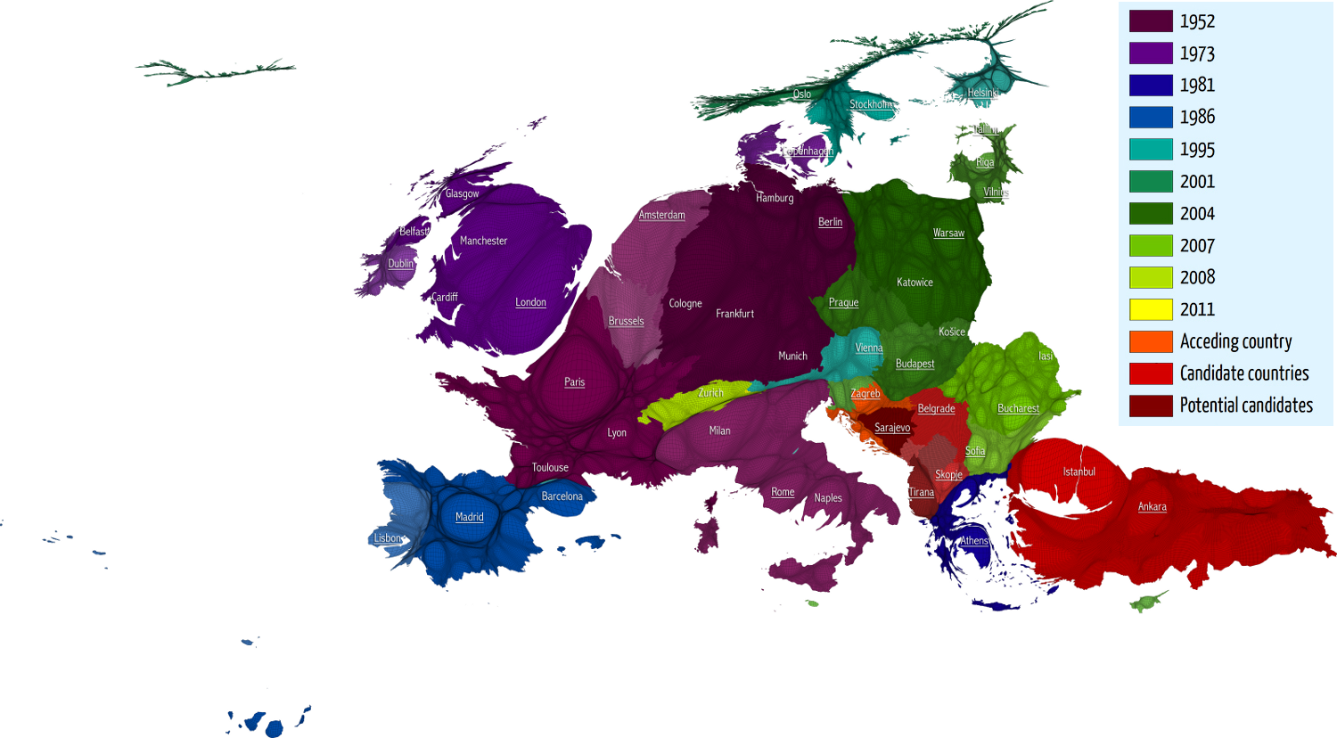
The map below shows these European countries using a rainbow colour scale to determine the colour hue for each state according to the year of association with the European Union. The more recent the formal association the near to the red end of the spectrum the hue is. The map below also uses a cartographic projection which redraws geographical area on the basis of fine-level spatial information about where people live rather land mass, showing clearly where most people are concentrated. For example, Madrid, Paris, Istanbul and London are huge, while Scandinavia is small, whereas the Rhine-Ruhr metropolitan region in Western Europe, including the areas of Cologne, Dortmund and expanding towards the Netherlands, is much more prominent compared to a conventional map. In addition countries and regions that are more densely populated are more visible in the map (e.g. most of the United Kingdom, Italy, Poland, Romania) compared to rural large areas in the north of Europe.
Figure 1: Map of Europe based on population showing association of states with the European Union (click to enlarge)
Note: Basemap: Hennig Projection Gridded Population Cartogram. Source: The Social Atlas of Europe
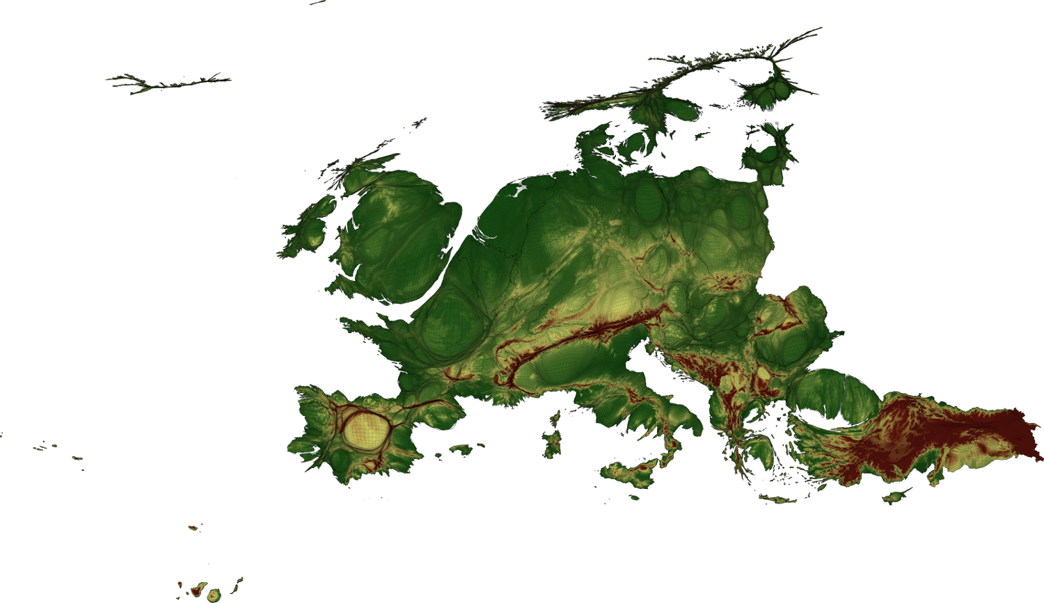
The next map is the topographic version of the previous cartogram, with the area being drawn scaled proportionally to population but coloured by altitude. In this way physical and human geographies can be mixed up on the map. Rather like a traditional physical geography map, upon which cities are drawn, this is a new human geography map, but one upon which mountains and valleys are also depicted.
Figure 2: Map of Europe based on population and representation of topography (click to enlarge)
Note: The size of each portion of the map is representative of the number of people living in each area, while the colour represents the altitude (the lighter the colour, the higher the altitude). Basemap: Hennig Projection Gridded Population Cartogram. Source: The Social Atlas of Europe
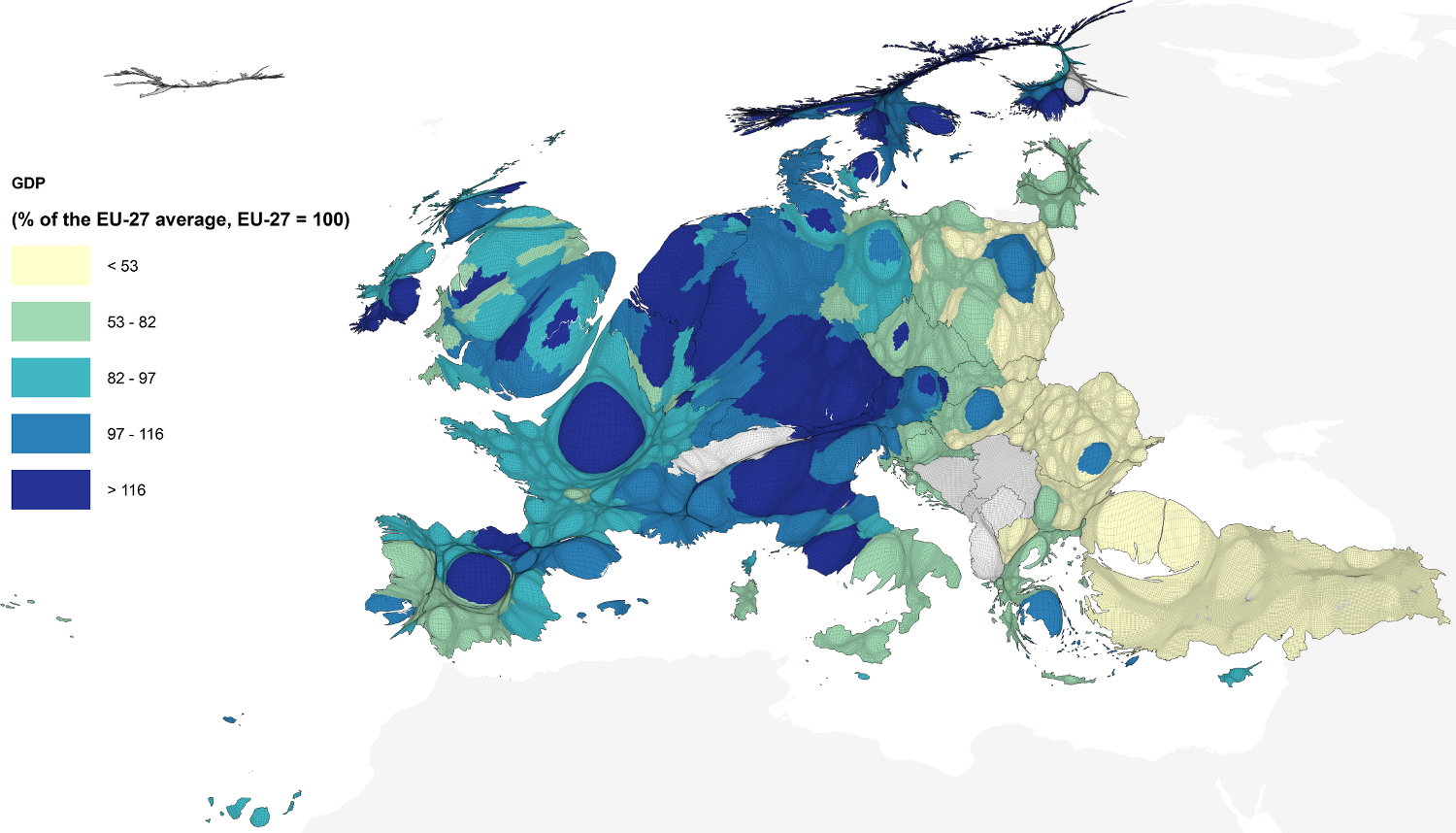
The innovative approach to transforming the human and physical space of Europe simultaneously used to create these maps makes it more likely for Europeans – who began to look at Europe using these projections – to make more sense of both their home area’s physical and human geography and to think of Europe as one place – the place they belong to or their “homeland” (instead of just thinking so much of their nation-state). In the next map below (Figure 3) we have also included areas to the east, south and north-west of Europe in grey-shades to show how the continent, reprojected in this way, fits into a larger home. The areas shaded grey within Europe in this map have no data reported by Eurostat on the indicator shown. An area without data – on a map – might as well be off the map, but by including it grey-shaded it is hopefully clear what is missing and where.
A continent of regions and cities rather than nation-states
The mapping approach illustrated above also offers a new way of thinking about Europe as a continent of regions and cities rather than nation-states and a new way of appreciating the huge number of ways in which people living in different parts of Europe have so much in common. This can be further illustrated by shading the gridded-population cartograms according to a socio-economic theme of interest. In the map below we have coloured the resized grid cells on the basis of publicly available data from Eurostat for European statistical regions on Gross Domestic Product per inhabitant in purchasing power standard (PPS).
Figure 3: Map of Europe based on population and GDP per inhabitant (click to enlarge)
Note: The size of the territories represent the number of people living in each area, while the colour represents the GDP per inhabitant (ranging from low GDP per inhabitant in light yellow, to high GDP per inhabitant in dark blue). This is defined as Gross domestic product (GDP) per inhabitant, in PPS by NUTS 2 regions (% of the EU-27 average, EU-27 = 100), 2010 based on data from the Eurostat Regional Yearbook 2013 (Turkey at national level). Basemap: Hennig Projection Gridded Population Cartogram. Source: The Social Atlas of Europe
Looking at the data which was used to reveal these overall patterns, it is noteworthy that there are two regions in the UK, Inner London & Berkshire, and Buckinghamshire & Oxfordshire which belong to the top end of the top class of geographical areas with a GDP per inhabitant in PPS in Europe which is over 116 per cent of the EU average (Inner London has the highest value in Europe, at 328 per cent of the EU average, whereas the value for Berkshire, and Buckinghamshire & Oxfordshire is 143 per cent).
In many ways these two regions have much more in common with other very affluent regions across Europe such as Luxembourg (266 per cent of the EU average), the Belgian capital city region of Brussels (223 per cent), the German city region of Hamburg (203 per cent) and the Norwegian capital city region of Oslo og Akershus (192 per cent) rather than with the rest of the UK. In contrast, regions such as Tess Valley and Durham (77 per cent) and South Yorkshire (81 per cent) are more similar when considered by this measure to other European regions such as the island of Crete (80 per cent) and the Ionian islands in Greece (76 per cent), Leipzig in Germany (91 per cent) and Galicia in Spain (90 per cent).
Often the real differences in the quality of life and the types of challenges and problems faced by Europe’s populations are not found across national borders but between regions, villages and cities or between rich and poor quarters of a town. And the rich quarters of Europe are all more similar to each other than to the poorer areas that are nearer to them.
A country called Europe?
The maps shown above give a flavour of The Social Atlas of Europe, which contains a collection and in-depth discussion of nearly two hundred maps and other graphical illustrations painting a picture of Europe, its people and its environment in relation to a wide range of themes and using data from a variety of sources. We hope that this research can be used to further enhance the perception of European identity and solidarity and that it will be of particular use for those wishing to strengthen the feeling of affiliation and belonging to something larger than the nation-state which underlies much of the modern-day European project. Our work shows just how different the separate countries, regions and great cities of this continent are, but also how often they are – in so many parts – so similar. Indeed, looking at the maps in this atlas you may begin to believe that you are looking at the cartography of a single large group of people of a country called Europe. The real social divides within Europe are more often within states rather than between them.
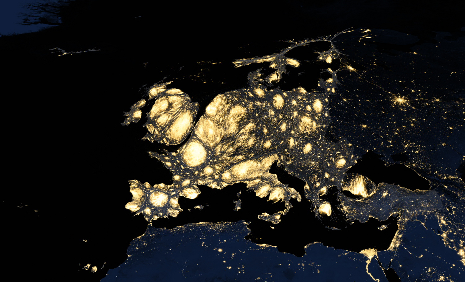
Figure 4: Map of Europe at night based on population (click to enlarge)
Source: The Social Atlas of Europe
The Social Atlas of Europe, by Dimitris Ballas, Danny Dorling and Benjamin Hennig, published by Policy Press will be launched on Wednesday 27 August 2014, 6:45pm at the Royal Geographical Society. Enquiries: Kathryn King
Note: This article was originally published on our sister site, the LSE’s EUROPP blog, and gives the views of the authors, and not the position of the British Politics and Policy blog, nor of the London School of Economics. Please read our comments policy before commenting.
 Dimitris Ballas – University of Sheffield
Dimitris Ballas is a Senior Lecturer in the Department of Geography at the University of Sheffield.
–
 Danny Dorling – University of Oxford
Danny Dorling is a Professor of Human Geography at the University of Oxford.
–
 Benjamin Hennig – University of Oxford
Benjamin Hennig is a Senior Research Fellow in the School of Geography and the Environment at the University of Oxford.






Authors have examined some alternatives model European project to answer both eurosceptics and pro European identity. One basic idea that has some feasiblity is home land in the place of nation state and bigger European as land mass with geographical area with cities and regions within this bigger geographical area.
To put other wise is subordinate nations state/ home lands to bigger concept of political United states(home lands?) of Europe perhaps with distinctive features from federal structured USA?
New word home land and home rule etc will imply some bigger political entity like federal or unitary government structure in the instant case is European union area but the question that may arise is is it and will it fit with
coherence with rising globalisation phenomena where every entity tries to compete in market or tries to control the market to maximise one own profit and previleges more at the cost of others taken global GDP and value of output at the given technology update as a constant in point of time? and unless the supreme global political power backed by necessary police/military power the global markets may become a field of political and economic anarchy.
Therfore one has also to search for global protective democratic political body be it in UN or otherwise that hormone both economic and political interests of humanity on earth.
These maps are grotesque, an academic anecdote to magnetize audiences.