


 Each month, the team from electionforecast.co.uk compare new constituency polls as they are released to their estimates of what polls would show in those constituencies. This allows for an assessment of the accuracy of their modeling approach. More information about the overall model can be found here. The results presented in this post use all constituency polls released by Lord Ashcroft in April so far.
For the past few months, we have been comparing Lord Ashcroft’s constituency polls as they are released to our estimates of what such polls would show from the previous day. These comparisons offer a test of our model’s ability to accurately predict what polls would show in constituencies where there has not yet been a poll. In April, so far, Lord Ashcroft has released three separate batches of constituency polls – the first on April 1st, the second on the 8th and a third batch yesterday (April 14th).
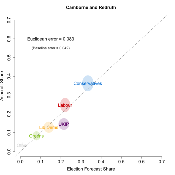
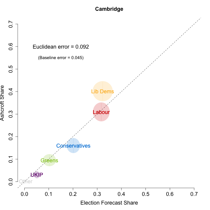
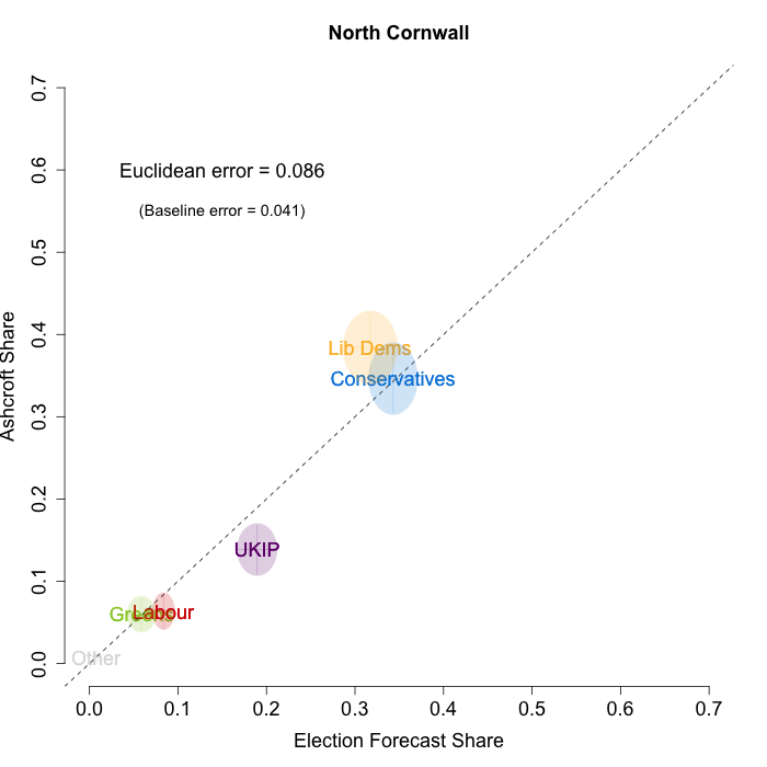
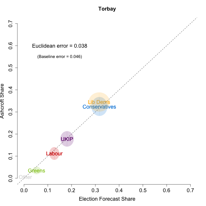
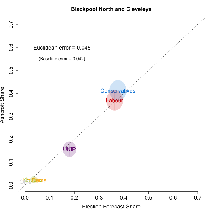
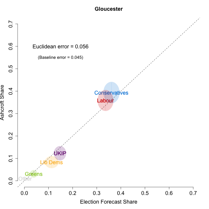
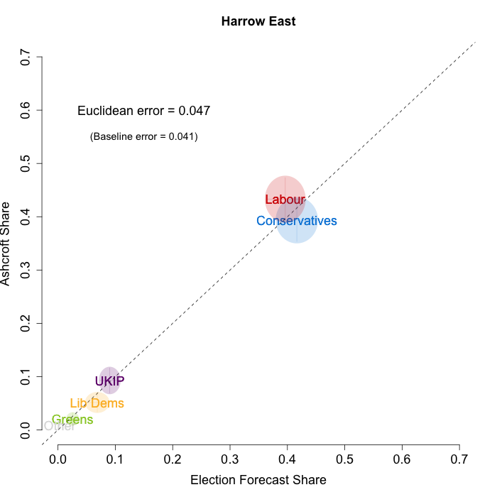
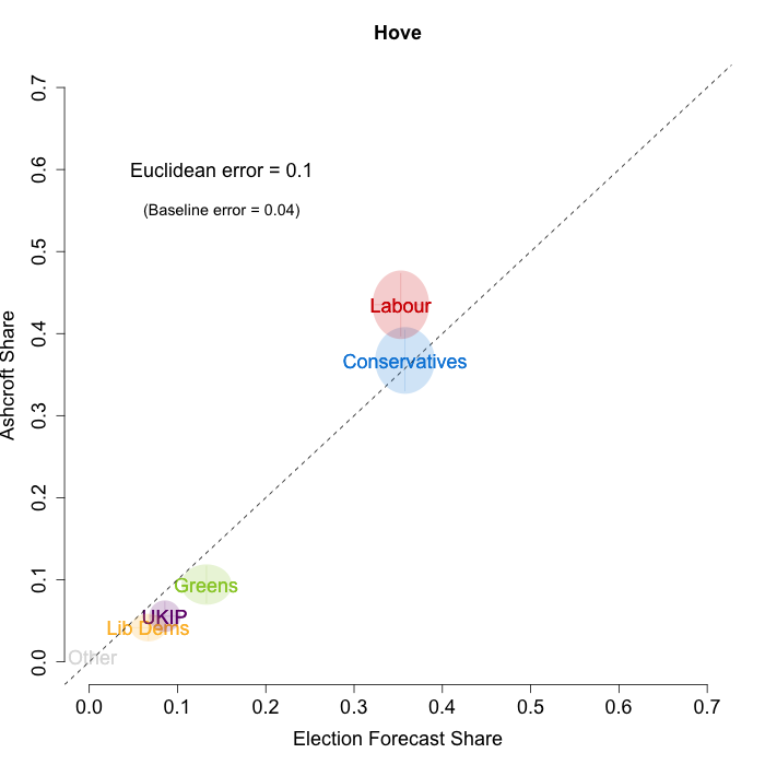
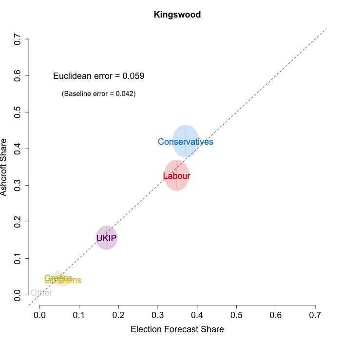
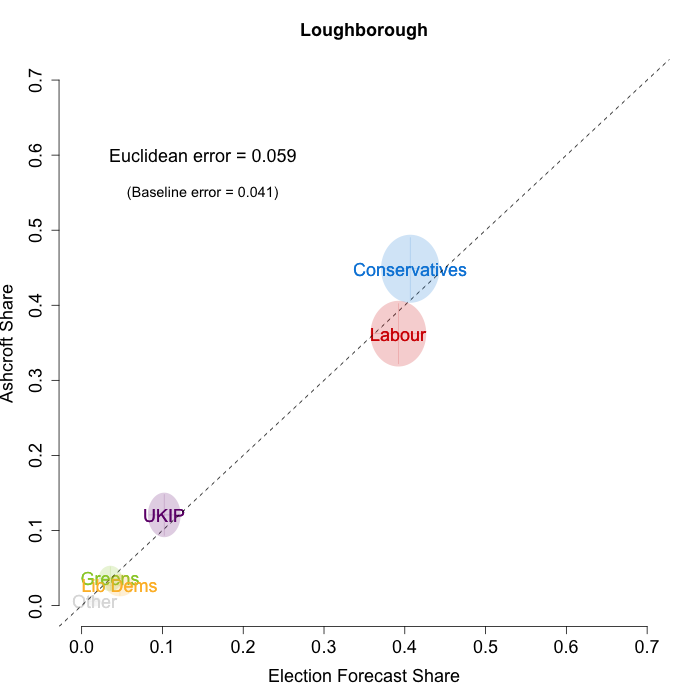
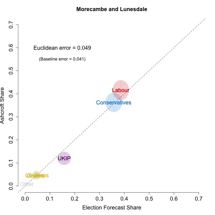
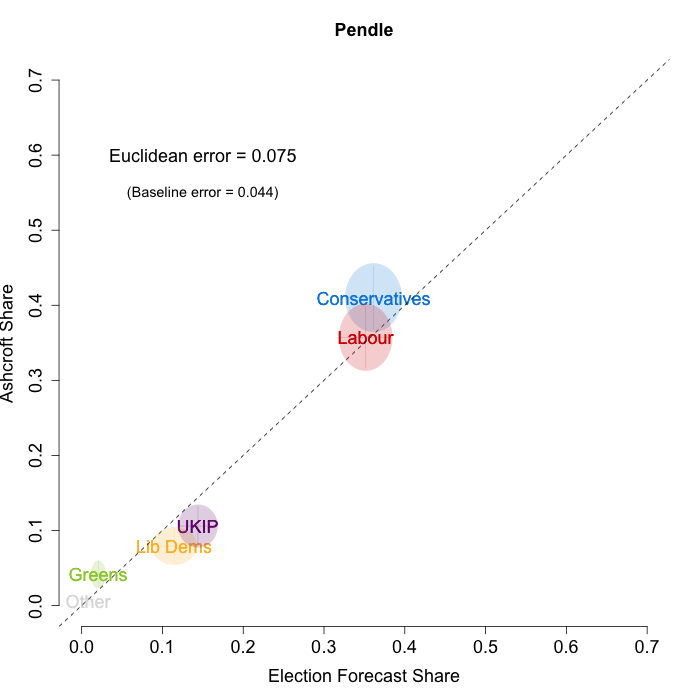
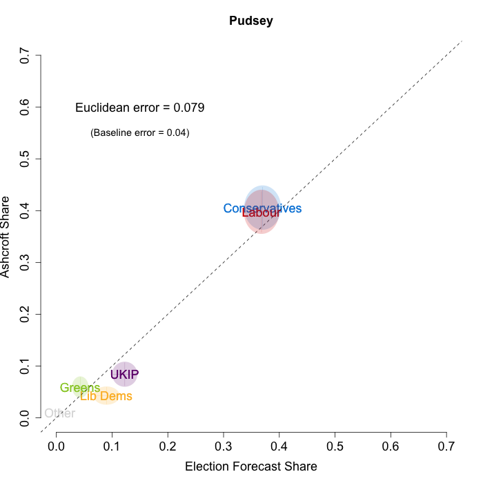
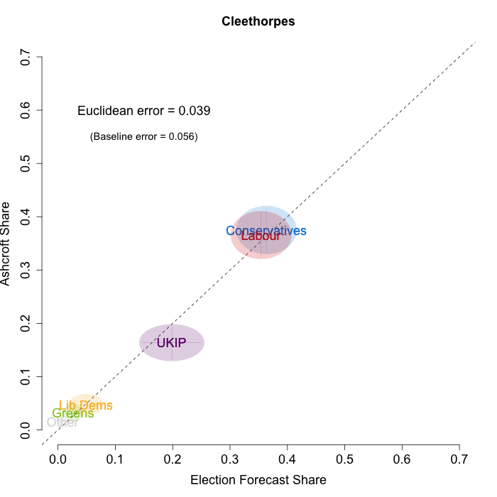
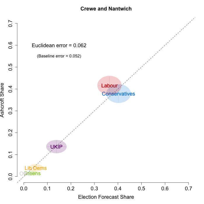
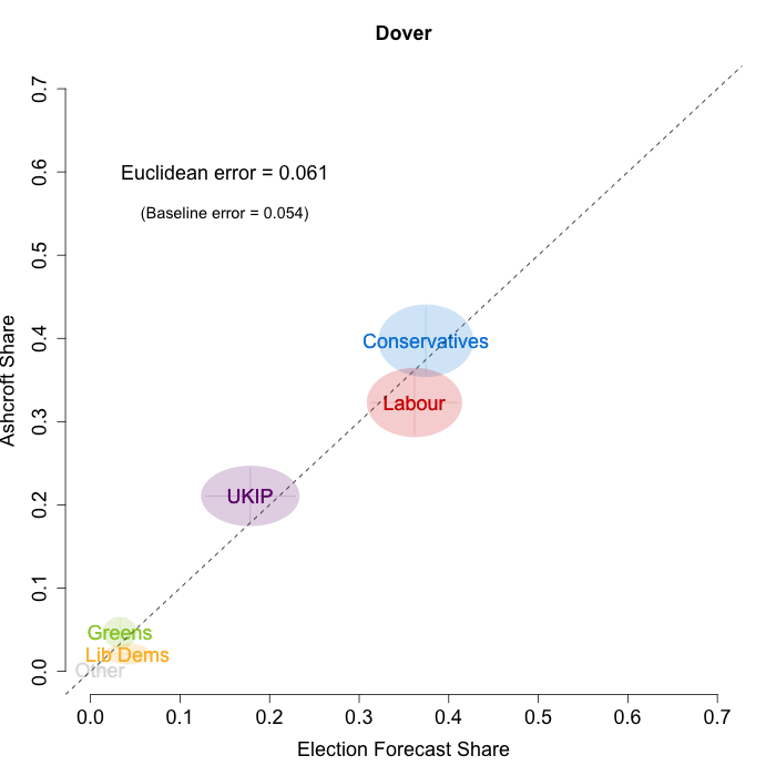
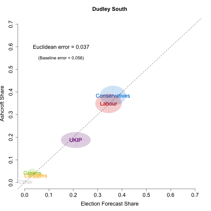
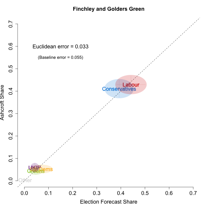
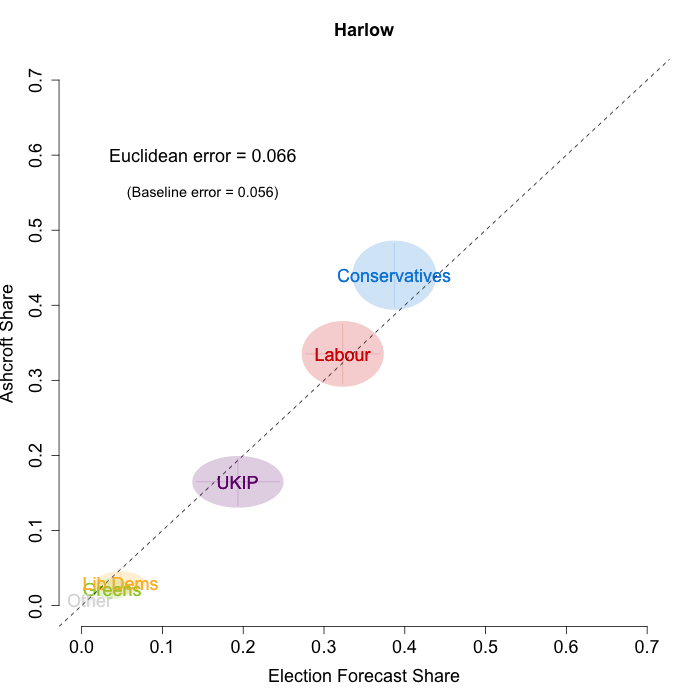
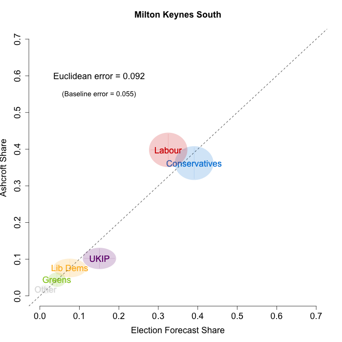
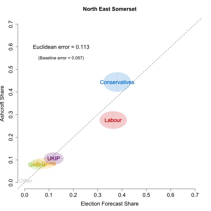
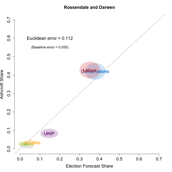
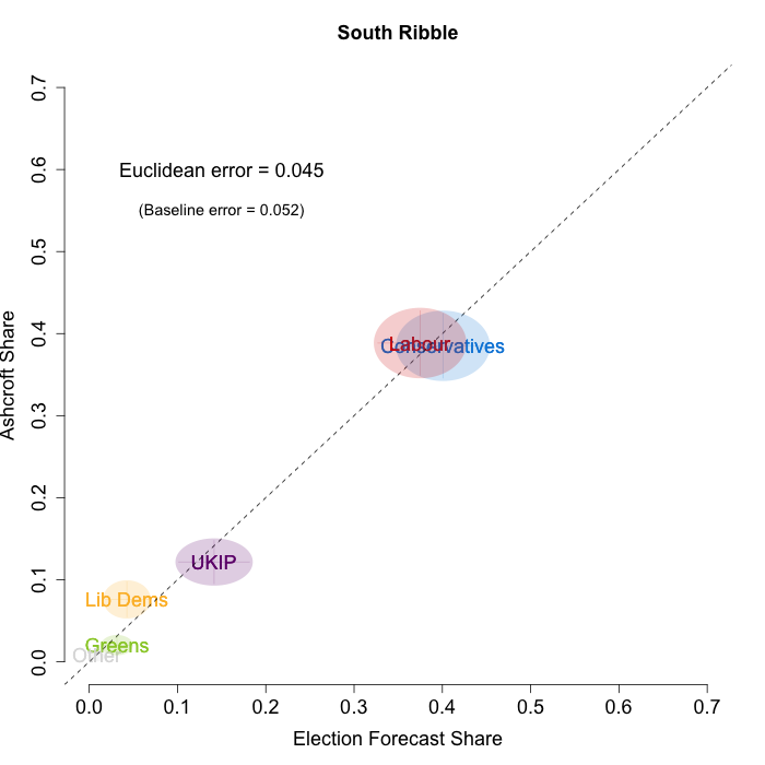
In the graphs below, we plot our estimates from the day before each release of the polls on the x-axis and the Ashcroft estimates on the y-axis. Note that, as for previous months, our model uses the data before the application of the “spiral of silence” adjustment which reallocates survey respondents failing to give a preference to the parties they voted for at the last election.
Both the polls and our estimates include uncertainty; in the figures below we break these results out by constituency and plot ellipses capturing the joint margin of error around each point. Whenever these ellipses cross the dashed 45-degree line, we can say that our predicted vote share range for a given party, in a given constituency, coincides with the range implied by Lord Ashcroft’s polls.
1st April
8th April
14th April
Navigating through the plots suggests that we continue to accurately recover the current state of play in many of the constituencies polled during April. We predict the “winning” party in 17 of 28 cases, with our erroneous predictions concentrated in the constituencies where the race is particularly close (for example, in Crewe and Nantwich we predict a Conservative victory while the Ashcroft poll suggests a narrow Labour win).
To measure the magnitude of our prediction errors systematically, we compute a Euclidean distance between our estimates and Ashcroft’s polls. Averaging across all constituencies polled in April thus far, the mean distance between our estimates and Ashcroft’s polls is 6.8 percentage points. Given the size of the polls and the uncertainty we were calculating for our estimates, we would have expected it to be 4.6 percentage points. This suggests that in these constituencies, as in others we have evaluated, we are somewhat overconfident in our estimates.
We can also compare the performance of our model to a simpler forecasting model such as uniform national swing. As we have mentioned before, there is no single correct method for calculating uniform swing, and we use three versions that give UNS a good chance to perform as well as our own model. First, we calculate the England-only swing from our poll estimates for all of England, calculate the average swing implied by those, and then apply that average swing to each constituency’s 2010 results. Second, we can be kinder to the UNS model by calculating the average swing from our poll estimates using only the constituencies that Ashcroft polled this round. Finally, we can calculate the average swing across the Ashcroft constituency polling itself, and use that to apply a uniform swing. The table below provides the average Euclidean error from each of these UNS-variants for each batch of polls in April.
Note: Table measures Euclidean error between model predictions and measured Ashcroft vote shares in percentage points. The model with the lowest error for each batch is emphasized.
As the table demonstrates, the error associated with our predictions is significantly lower than either the national or constituency-specific UNS models in all three batches. Our model also out-performs the Ashcroft-specific UNS predictions in 2 out of 3 batches. The comparison with the Ashcroft-only swing is a stern test for any forecasting model, as it requires knowing exactly the average swing of the constituencies of interest.
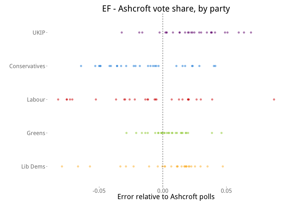
Nevertheless, we can go a step further and investigate the structure of the errors we are making. In the plot below we investigate whether our model systematically over- or under-predicts the vote shares of particular parties. The x-axis of the plot measures the difference between the electionforecast.co.uk predictions and the Ashcroft poll vote shares for each party. This number is positive when our model predicts a higher share of the vote for a party in a constituency than suggested by the Ashcroft poll. Negative numbers represent cases where our model under-predicts a party’s vote share in a constituency. The y-axis orders the parties by their absolute mean error such that parties at the top of the plot are subject to greater average error than those at the bottom.
The graph reinforces our previous evaluations: on average, our model over-estimates UKIP vote share, and slightly underestimates the vote shares of Labour and the Conservatives. While our predictions for the Liberal Democrats also have a tendency to diverge from the Ashcroft polls, there is little evidence to suggest that these errors are systematically pointing in one direction or the other.
Overall, these results largely agree with our previous analyses. We correctly predict the winning party in most constituencies but we remain a little overconfident in our estimates. Furthermore, there is some evidence to suggest that we are systematically over-predicting UKIP at the expense of Labour and the Conservatives.
As a final point, and a reminder of why this is a difficult (but fun) election to predict, the map below shows all of the constituencies that have been polled over the past year. Constituencies coloured in green have received at least one individual poll, and those in grey have not. There is a reasonable amount of green on this map, but there remains a lot of grey! With just 21 days until the election, we await further constituency polls and will continue to include new polling information as it is released.
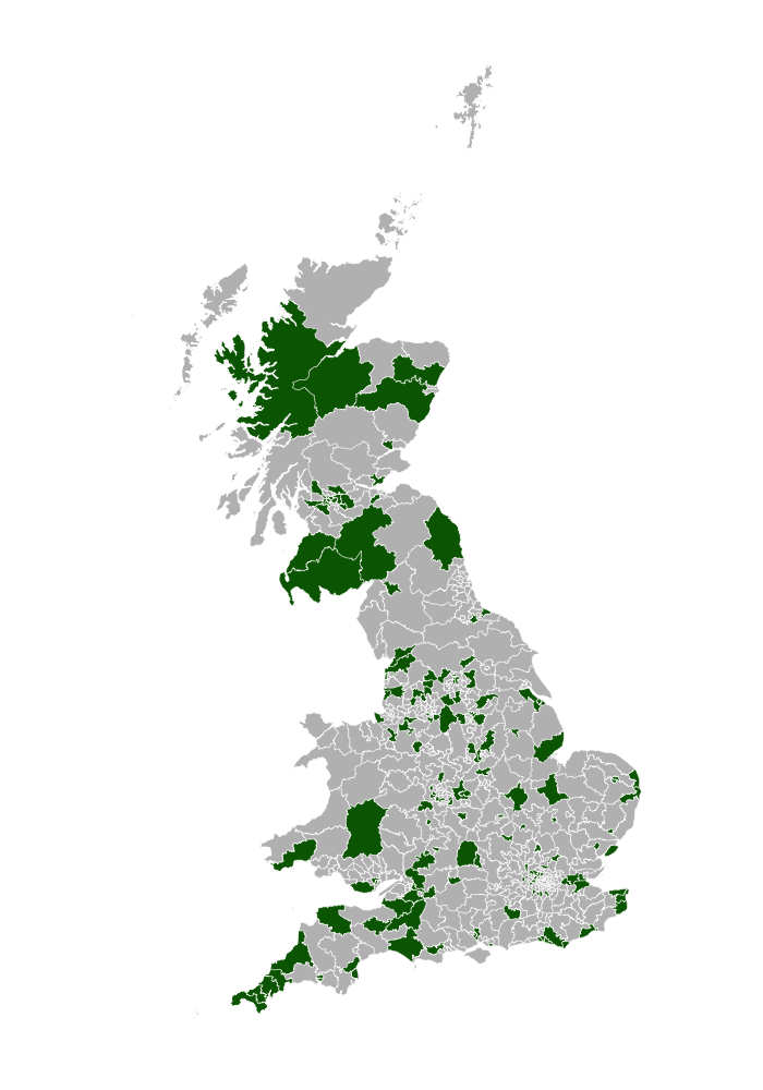 Note: Figures accurate as of April 15th.
 Jack Blumenau is a PhD candidate in Government at the London School of Economics.
 Chris Hanretty is a Reader in Politics at the University of East Anglia.
 Benjamin Lauderdale is an Associate Professor in Methodology at the London School of Economics.
 Nick Vivyan is a Lecturer in Quantitative Social Research at the Durham University.


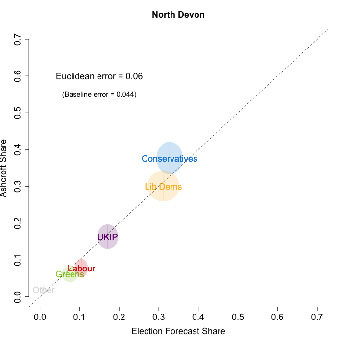
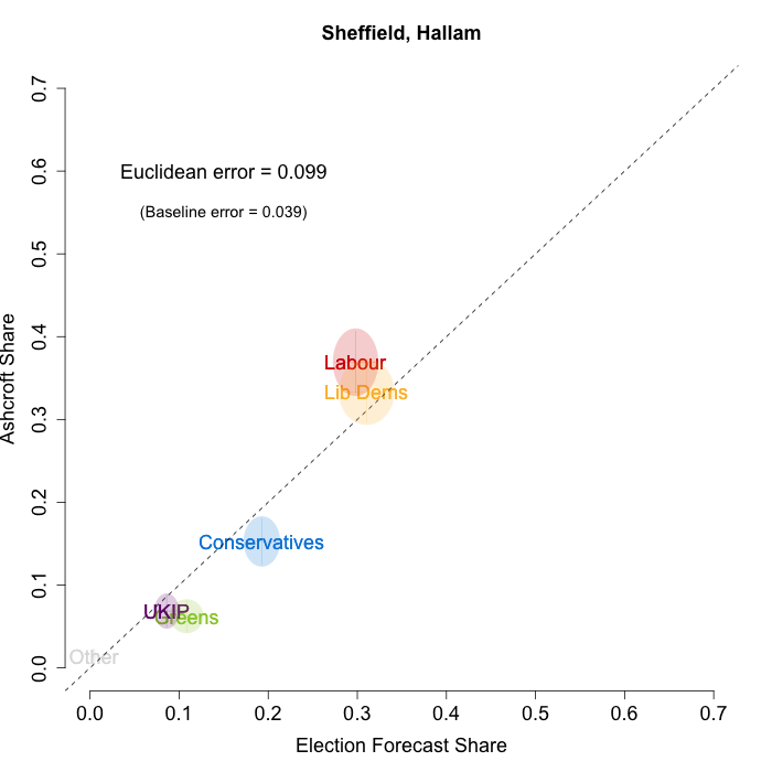
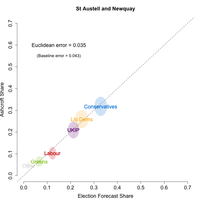
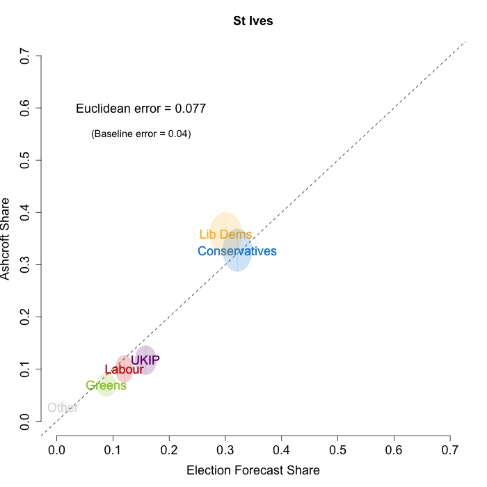





“We predict the “winning” party in 17 of 28 cases, with our erroneous predictions concentrated in the constituencies where the race is particularly close”
It may that your errors are concentrated in the close races, but your errors are clearly not random! By my analysis of the fantastic graphs above, in every single case where you got the winner wrong you wrongly predict either a Tory win (when Ashcroft found Lib or Lab) or a LibDem win where Ashcroft found a Labour win. There is not a single example of a non-Tory prediction and Ashcroft finding a Tory win. If the error was random I would expect at least some of those, as it is the analysis strongly suggests pro-Tory bias in your model…
After reading this post, I followed suit with my own model, examining how my model stacks up to all the constituency polls I have included in the model. http://mjdudak.com/comparing-prediction-to-constituency-polls-and-projection-update-2015-4-16/