 Advances in data analysis and visualization now mean that members of the public can be far more informed about the intricacies of politics and the records of those who represent them. Gokhan Ciflikli discusses his new interactive tool, adavis, which shows seven decades of data on Congressional voting records and which allows users to examine how party and politicians’ ideologies have changed in that time.
The need for political accountability has never been greater. The advances in data science and visualisation in the last decade provides opportunities for creating social awareness to an extent that was not possible for many before. To this end, I built adavis, an open-source, interactive website that visualises nearly 70 years of US Congressional voting records since World War II. The live app can be accessed here, and the underlying code is publicly available on GitHub, where a local copy can be downloaded to any computer that has the data analysis software, R, installed.
Data and Design
The underlying data for the app utilises 70 years of US voting history as recorded by the Americans for Democratic Action (ADA) foundation. Quoting their website:
The Annual Voting Records have served as the standard measure of political liberalism. Combining 20 key votes on a wide range of social and economic issues, both domestic and international, the Liberal Quotient (LQ) provides a basic overall picture of an elected official’s political position.
Users can either choose to display the liberal quotient as a nominal score (as-is), or opt for the adjusted score. The procedure for the adjustment follows that of Tim Groseclose, and takes into account the temporal changes in party alignment over time and widely used in academic studies of US domestic policy.
Users can control which specific combination of representatives are currently plotted on screen. The first three dropdown menus located on the sidebar allow the user to change the party (Democrats/Republicans), chamber (House/Senate), and LQ score type (nominal/adjusted). Underneath, a numerical slider controls which year is shown. These global sliders apply to all tabs unless otherwise indicated.
The app uses viridis colour scales for data visualisation. They span wide, making differences easy to spot; they are perceptually uniform, ensuring consistency across the range of values, and they are robust to colour-blindness (as well as grey scale printing). Users can choose from four different colour palettes, and select whether high values are assigned to light or dark shades.
State of the Union
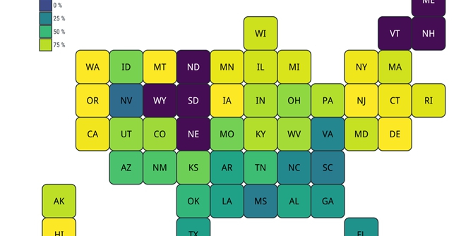
As Figure 1 shows, the opening tab visualises the US in a stylised way – instead of accurate geographic representations, it renders states as identical-sized boxes. This prevents what’s known as the ‘category size’ bias, a phenomenon characterised by overrating larger units over smaller ones, so that Montana gains more attention than, say, Rhode Island. The plot displays the liberal quotient scores based on the current slider combination. States with no representatives from the selected party are indicated with a distinct colour. By default, the app visualises the adjusted LQ scores of House Democrats in 1963:
Figure 1 – adavis representation of Liberal Quotient (LQ) of Democratic US House Representatives in 1963
Change from Previous Year
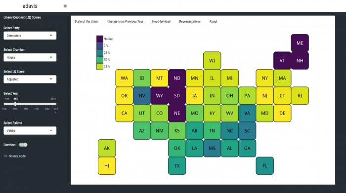
Equally important to show is the voting behaviour changes from the previous year (Figure 2). Major events, such as political ‘shocks to the system’ – the assassination of JFK, Watergate scandal, the end of Cold War, 9/11 to name a few – are often influential in causing shifts in the political paradigm. The default display shows the one-year lagged snapshot of the first tab – i.e. how House Democrats voted in 1963 in comparison to their own 1962 voting record. Hovering over data points provides precise information about the shift. For example, we see that the most extreme states in either direction are: Georgia, whose delegation voted 14.5 percent more liberally, and Iowa, which voted 12.3 percent more conservatively.
Figure 2 – adavis representation of voting behavior change by Democratic US House Representatives in 1963 compared to 1962
Head-to-Head
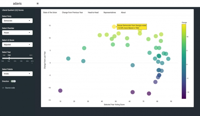
Another way of slicing the voting data is to look at and compare two states over time. In this section (Figure 3), users have access to a set of new sliders that controls the states and the timeframe. Any period between 1948 and 2015 can be selected. Note that the current selection of party, chamber, and LQ score type is still governed by the sidebar sliders. As Figure 3 shows, the tab opens with comparing California and Texas throughout the timeframe covered by the data. We observe that House Democrats from California has always voted extremely liberally; however their Texan-counterparts eventually caught up in mid-2010s. We also see the gradual progression to more liberal voting in the latter case, as Democrats from Texas had been voting quite conservatively until 1970 and then rapidly became more liberal.
Figure 3 – adavis comparison of voting records of Democratic US House Representatives from Texas and California, 1948-2015
Representative Look-Up
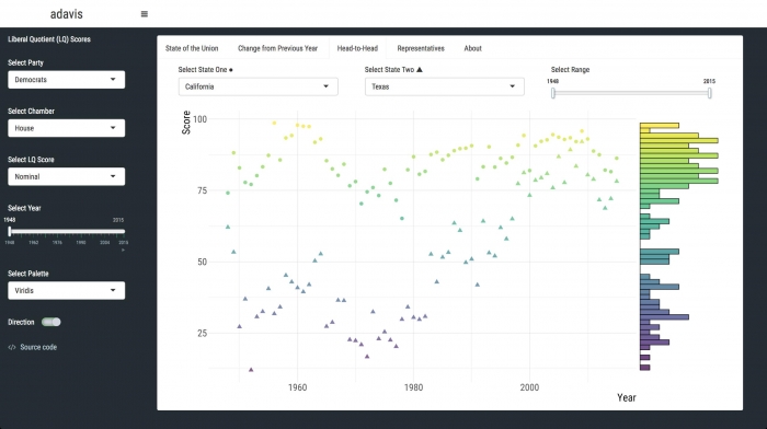
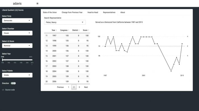
Finally, users can search for specific representatives to see their complete voting history during their political tenure (Figure 4). The search box accepts any name/surname combination and suggests auto-completion options. The data is shown in two ways: first, a data frame is shown, displaying the year, congress, district, and Liberal Quotient (LQ) score of the selected representative. Second, the LQ scores of the representative are plotted over time. The plot has some helper elements such as the average voting score (over the whole tenure), as well as one standard deviation away in both directions. This range highlights the career voting choices of any given politician. In the case of long-tenured representatives, the data can be used to compare different congresses and even decades:
Figure 4 – adavis voting record of House Democrat Nancy Pelosi 1987-2015
Please read our comments policy before commenting.
Note: This article gives the views of the author, and not the position of USAPP– American Politics and Policy, nor of the London School of Economics.
Shortened URL for this post: http://bit.ly/2ELEdF8
_________________________________
About the author
Gokhan Ciflikli – LSE International Relations
Gokhan Ciflikli is a PhD candidate in LSE’s International Relations department. His academic interests revolve around exploring violent conflict dynamics, identifying the determinants of foreign policy decision-making, and quantifying gender issues in academia.