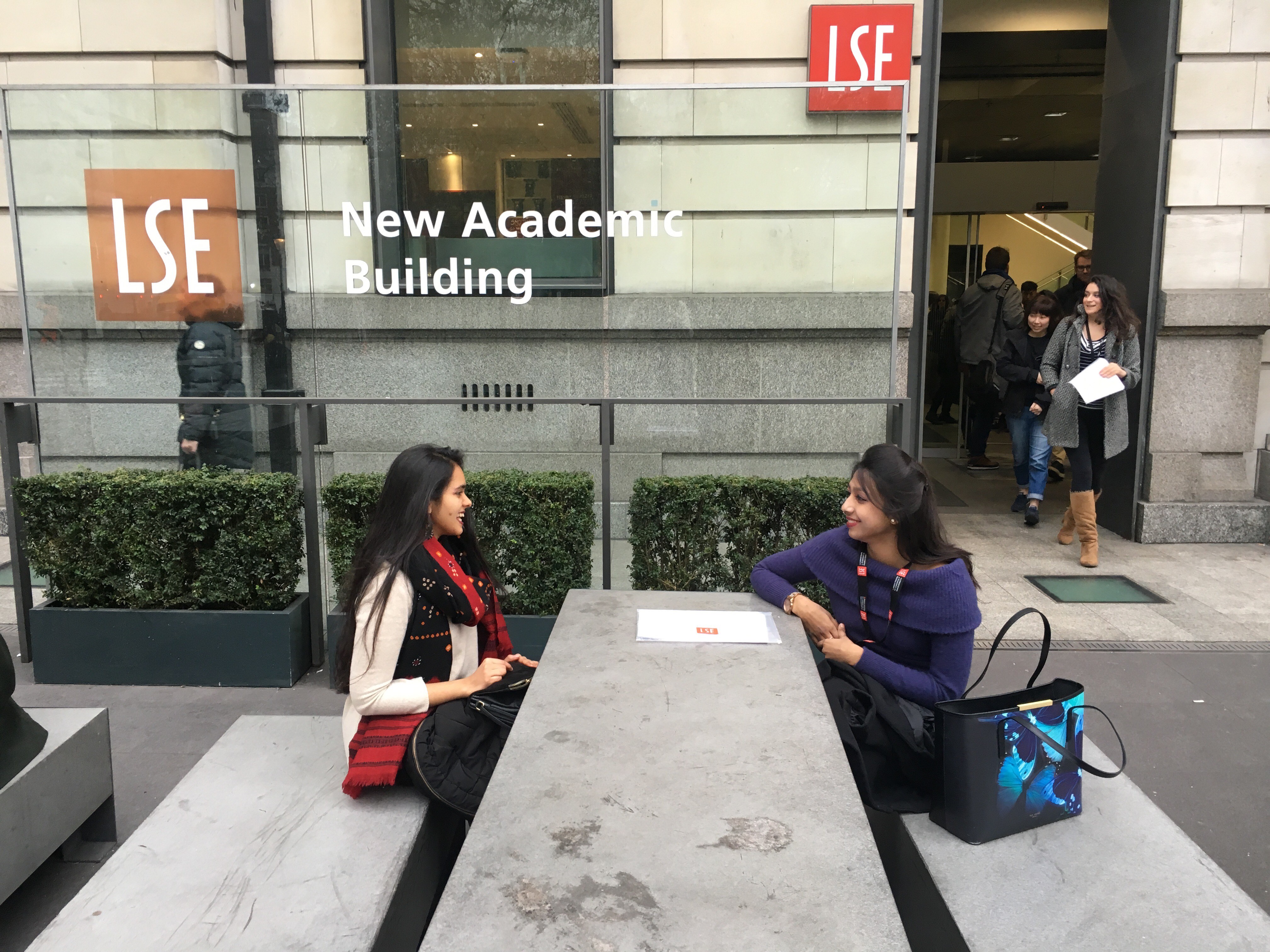
MSc Marketing student Bridget Harkness is no stranger to the power of brand guidelines to tell the story of an experience. That’s why she’s created her own palette of colours to describe her first semester here at LSE. This is the first in a series of three articles of Bridget’s personal stories of life in London and her top tips for making the most of your time here.
I’m a visual person. This is one of the reasons I chose to earn my degree in marketing at LSE. My visual inclinations are also what give me a tendency to view the world through colour. In marketing, visual standardisation is often achieved through something called ‘Brand Standards’ or ‘Brand Guidelines’. These brand standards include not only specified typefaces, spacing, specific messaging instructions and a collection of stock photos but also will include exact colour combinations designated for use in certain purposes and platforms (see photo of LSE’s recommended colour guidelines).
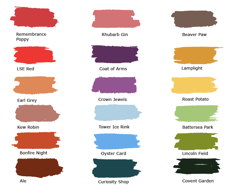
For all you fellow visual learners out there, I have compiled my own palette of colours–which I feel conveys my own story and experiences to describe my first semester here at LSE. London and England in general is famous for getting a bad rap for the grey skies and rainy weather but I found a much broader spectrum of colour here.
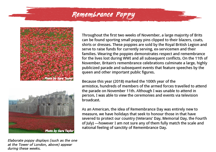
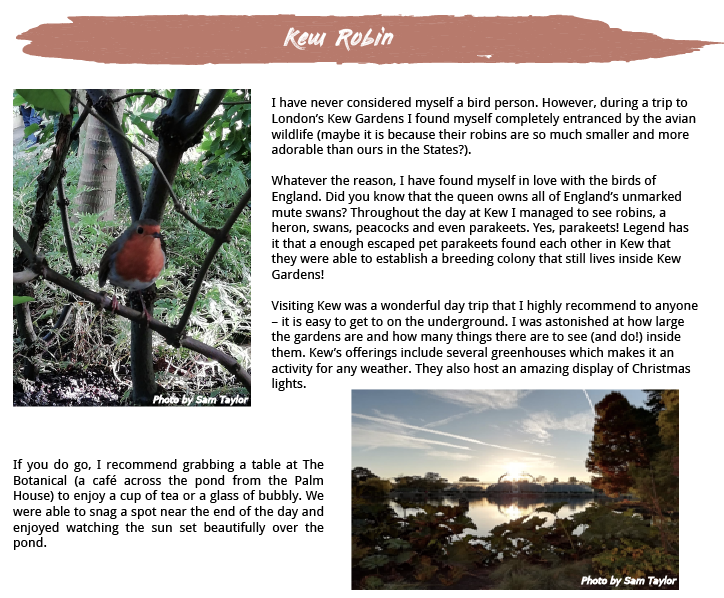
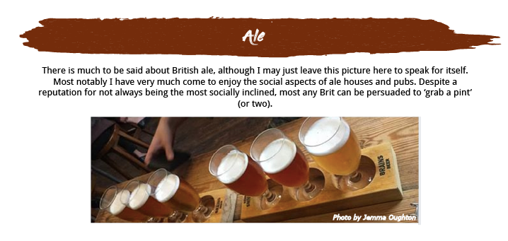
Here’s a little explanation of the first set in the palette. You can see the rest of my stories and tips in my next posts.
See the other articles in this series to see the rest of Bridget’s palette unpacked!


