 Danny Quah is a Professor of Economics and International Development at LSE, and Director of the Saw Swee Hock Southeast Asia Centre, at LSE’s Institute of Global Affairs. He is also a Senior Fellow at LSE IDEAS. Danny works on the shifting global economy and the rise of the east. His current writing on global hegemony and world leadership in global economic policy-making. His empirical research seeks to make large things visible to the naked eye.
This post relates to Danny’s December 2015 public event, hosted jointly by the LSE Department of Mathematics and the LSESU Applicable Maths Society. The lecture, entitled “Using Mathematics: Making Big Economics Visible to the Human Eye” can be viewed here, with accompanying slides available here.
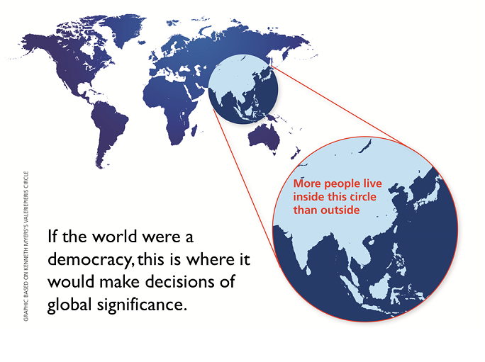
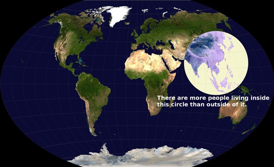
In 2013 Ken Myers guessed and verified that his Valeriepieris circle – a circular region on a 2-dimensional map, centred in the South China Sea and about 4,000 km in radius – contained more than half the world’s population. More people lived inside that one-sixth of the world’s land area than outside.
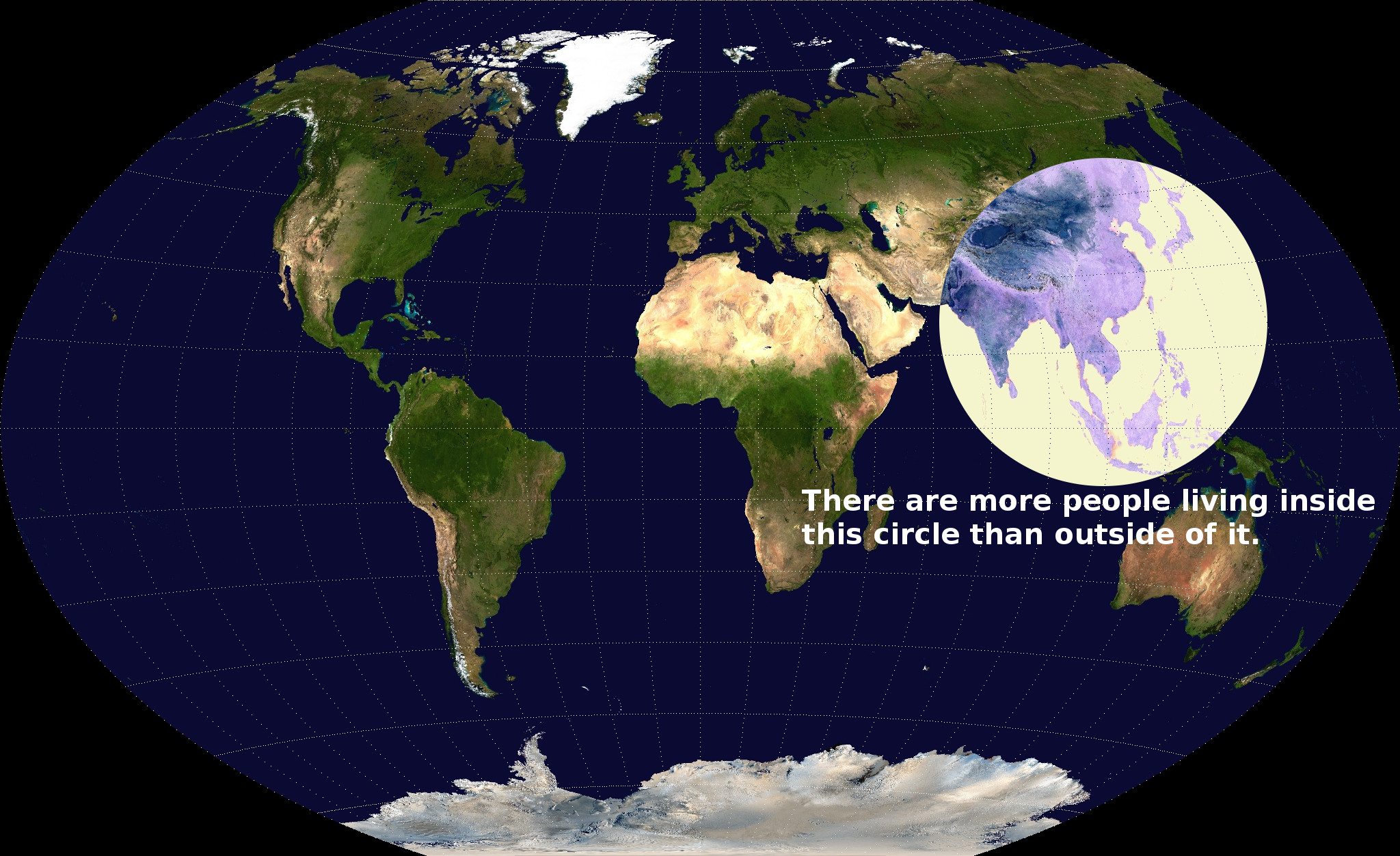 (Ken’s map appeared, uncredited, in every major aggregator site I know, and in countless news stories; it must have been viewed by scores of millions of people. Caitlin Dewey did the math explicitly; the depiction was no. 24 on the Washington Post’s 40 Maps That Explain the World, and no. 12 on Twisted Sifter’s 40 Maps That Will Help You Make Sense of the World. Robbie Gonzalez described on io9 the map’s significance.)
That representation, however, left open the following question: ‘Where is the smallest circle one can draw on our planet that contains at least half the world’s people?’
 I worked out (in my book-in-progress “Ordering the World”) an algorithm to answer that question. I addressed this question on a 3-dimensional planet, for those readers who worried about the distortion induced by the 2-dimensional projection in Ken Myers’s picture.
With the help of Ken Teoh, a remarkable SEAC summer intern (a Wharton School student at the time), in September 2015 I showed that Ken Myers’s guess turned out to be remarkably close to the 2015 optimum. Of course, populations in different parts of our planet shift over time but in 2015, using population data with 100 km resolution on Earth’s surface, the smallest circle on our planet containing a majority of the world turns out to be that circle centred near Mong Khet, in Myanmar, with great-circle distance 3,300km.
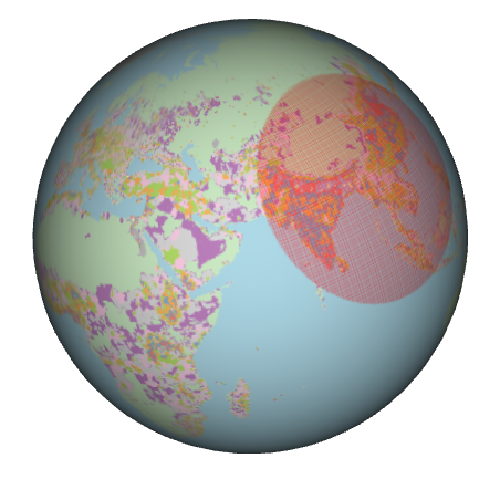 That’s the conclusion. Details and code will be made available presently. To see the result a little more clearly, here’s a 3-dimensional interactive animation of where, if the world were a democracy, it would make decisions of global significance. (I’ve been told this animation doesn’t work on all hardware/browser configurations. I’m working to fix the problem but have not yet succeeded in doing so; apologies. If it does work for you, however, what you do is follow the link to a new webpage; click your mouse on the globe image, hold and drag to rotate; use the mouse wheel/middle button to zoom.)
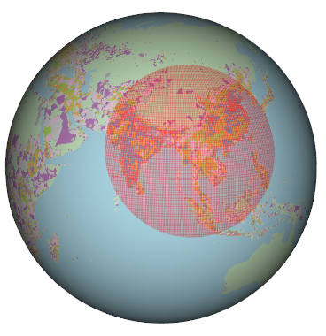 P.S. This circle I’ve drawn differs from that Ken Myers produced. There are three important conceptual differences:
1. Ken’s picture stated that included in his circle was more than half the world’s population. In my circle here, I ask instead, ‘Where is the smallest circle on Earth that includes within it fraction x of the world’s population’ (where in my picture, for illustration, x is half – what I present here can be re-done for any x between 0 and 1). In other words, I solve a variational problem, optimising over a parameter space that is the surface of our planet. Ken had the brilliant insight to just set down his circle. He eyeballed a map of the world and then added up the populations of countries.
2. Ken used entire nations – India, China, Japan, and so on – to total up his population count. I instead draw on geographical data produced by agencies that surveyed and estimated population densities down to resolutions of 100km. It is possible to go even finer in geographical space, but even at the resolution I used, the computation time on ordinary computers to find the tightest cluster took days. In my calculation, parts of countries might be excluded; in Ken’s calculation, entire countries are either in or out.
3. I cast a net of circles formed by radial distance on the surface of our 3-dimensional planet. Ken, bravely, drew a circle covering a geographical expanse depicted on a 2-dimensional map. A circle on a 2-dimensional projection is, of course, not a circle in 3 dimensions, and vice versa.
Noteworthy – not by design but as outcome – is that Japan is mostly excluded from my circle; it is entirely included in Ken’s.
While it’s nice to be clear about all these differences – that’s what academics do – the bottom line is, Ken Myers nailed the key idea, pretty much.
This post originally appeared on the author’s personal blog in September 2015 and is reposted with permission.





Interesting article. I wonder what the next circle would be? That is, the smallest circle not intersecting the existing circle which has 50% of the remaining population, or 25% of the total.