 When we think of ‘superstar cities’ such as San Francisco, concerns arise about inequality, segregation and the effect of gentrification on mixed neighborhoods. In exploratory research, Kevin Kane looks at the link between inequality and urban segregation and political polarization. He finds that inequality does not necessarily link to neighborhood segregation in superstar cities: neighborhoods with growing incomes, a mix of education levels and less new housing, tend to be less income segregated.
In the contemporary US, overall measures of inequality are steadily rising, and political polarization seems to be the rule rather than the exception. My research looks at how much – if any – of this can be traced to the way that we use urban space to segregate ourselves. I find that neighborhood sorting, which can lead to segregation, is influenced heavily by people’s occupations, education, and how cities use land for housing.
Disciplines such as urban planning, sociology, geography, and economics have long weighed in on the determinants and impacts of neighborhood mixing—or lack thereof. Land use patterns across urban areas are fabulously complex and idiosyncratic, especially when comparing urban regions against each other. This makes it challenging to evaluate the extent to which like and non-like people live near to one another in cities, and even more challenging to link to overall increases in inequality and polarization.
Richard Florida has, in numerous studies including his 2017 book The New Urban Crisis, drawn this connection in the context of the distinctive location patterns and also the economic productivity of the “creative class,” arguing, broadly, that fast-growing, “superstar” regions characterized by innovation, venture capital, and price appreciation tend to be the most unequal overall. The rationale is that, since a region’s land use patterns are by and large determined by the location decisions of the wealthy, a superstar city might have more tendency to segregate.
My research develops two new ways to conceive of some of the spatial relationships involved in both neighborhood mixing and regional inequality. First, we address the issue of what is proximity in a region? The most typical way, empirically and conceptually, is to use a standard geographic unit like a census tract or ZIP code, comparing, for example, how many rich and poor people live in the same neighborhood. However, most people don’t know what census tract they live in, and ZIP code geographies have been rightly criticized for often having odd boundaries – they exist for mail delivery, not because they’re in any way reflective of the people in them. We propose an egocentric measure of neighborhood – what’s called an egohood — which has your census block group in the center plus and all other block groups within 1.5 miles. This is intended to capture a person’s activity space where they may have meaningful proximity to others at places like nearby schools, stores, or parks.
Figure 1 – Example egohoods in Chicago, IL
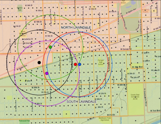
In this way, we can measure the people that surround the small geography of a census block group to see how mixed a neighborhood is – and subsequently, how mixed neighborhoods are across an entire region, the logic being that some regions have inherently more segregated neighborhoods whereas people mix more in other regions. In order to go beyond just the spatial separation of rich and poor, we also analyze mixing across educational attainment levels and occupational categories (service, working, and creative class) to capture other elements of wealth and class.
Photo by Derek Liang on Unsplash
Secondly, explanations for inequality in a region are not simple and straightforward. While it may be intuitive to connect a region’s level of inequality to, say, recent growth, new housing construction, education levels, crime rates, or voting tendencies, these characteristics are not independent of each other and affect different regions differently. To estimate models which explain neighborhood mixing, we use a new machine learning technique which allows us see not only these relationships (for example, the impact of growth on mixing) but also but how it affects the impact of other factors on mixing (for example, how is the relationship between growth and mixing changed in areas with higher crime?). We look at these “ingredients” of mixing across all 381 metropolitan areas in the US.
Regional mixes
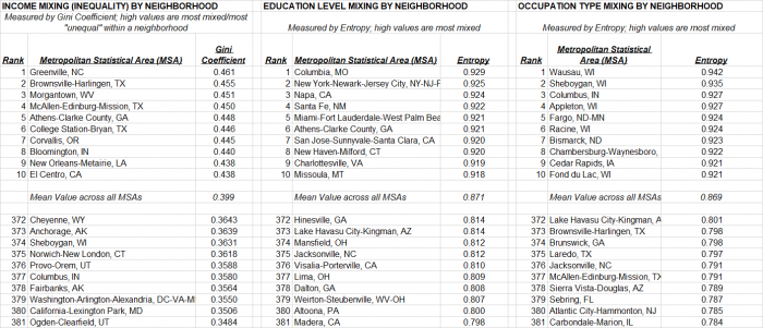
Figure 2 shows what mixing looks like at the scale of a region. While Richard Florida suggests that inequality is a trait of superstar regions, neighborhood mixing – a measure of spatial equality in a region – has a different look. The list of regions which are in fact the least spatially segregated by income are mid-sized, poorer regions in the South and Texas (such as Greenville, Brownsville, McAllen, and New Orleans) while those which are most spatially segregated by income are in Alaska, Utah, and Washington, D.C. By and large superstars are neither the most – nor the least mixed.
Figure 2 – income inequality, education and occupation across neighborhoods in 2010 (click to enlarge)
Meanwhile, regions which are the most mixed by educational attainment are some of the largest metros as well as college towns: New York City, Miami, San Jose, Charlottesville, New Haven, and Athens, Georgia while the most spatially segregated by education level are found in Appalachia, the South, and California’s central valley. Occupational mixing follows a crisper pattern nationwide – the Midwest has more occupational mixing while the South and Southwest are more spatially segregated by job type.
Since this research’s objective is to let patterns emerge from the data, we consider four broad categories of “ingredients” which have been discussed in the context of “superstar” regions: economic well-being; business and production; housing; and demographic, cultural and political factors.
Figure 3 – Ranking of key cities across 381 US metros
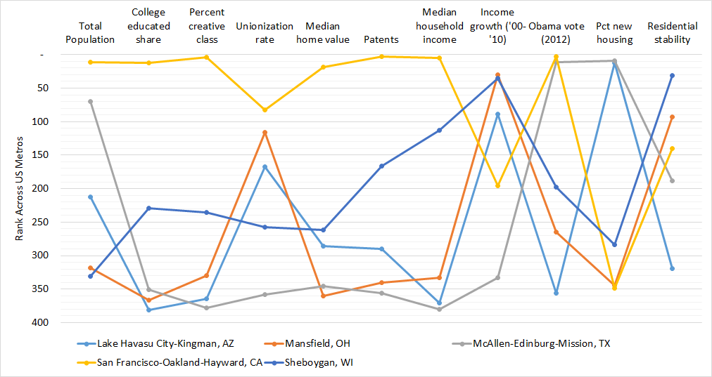
Our results show that overall, many of these measures are closely related, but they do affect different regions differently. Some examples can be instructive:
Despite being a part of the Sunbelt housing boom (#12 in new housing), as Figure 3 shows, Lake Havasu City scores quite low on several typical socioeconomic indicators including college education, creative class share, income, patenting, and home values, and had amongst the lowest Democratic voting in 2012. Lake Havasu City is middle-of-the-pack in income mixing (#188), but amongst the most segregated by education (#373) and occupation (#372). Meanwhile, Mansfield, Ohio, a small Midwestern metro, shares several of these measures with Lake Havasu City: lower education, income, creative class share, and low Democratic voting. However, it differs in having few new homes and far higher residential stability, characteristic of its Midwest, “rustbelt” location. Mansfield sorts by education (#366) and income (#374) but is more occupationally mixed (#74).
San Francisco is a unique case but prominent in innovation and urban literature. It ranks very high in invention, home price, income, education, creative class share, and liberal voting. In San Francisco’s case, this is a recipe for very high neighborhood educational mixing (#12), but low-to-mid income mixing (#227) and occupational mixing (#272). Urban economist Ed Glaeser found Sheboygan to be one of the most equal metro areas by income overall. Sheboygan is older, more stable, less expensive to live in, and moderate to below-moderate in several typical socioeconomic measures. Sheboygan’s residents tend to sort very strongly by income (#374) but tend to mix by occupational category (#2). In contrast, the residents of McAllen, Texas sort by income (#4) – but not by education (#368) or occupation (#377). McAllen votes liberal and has more new housing, but scores very low in nearly all typical socioeconomic well-being measures.
Figure 4 – Occupational Mixing in US Metropolitan Areas (2010)
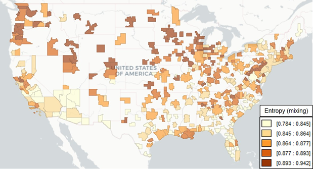
Polarized occupational mix linked with more income segregated neighborhoods
Our machine learning technique allows us to parse through some of these observations more systematically. Overall, we find that when a metro area’s occupational blend (its mix of creative class, working class, and service class jobs) is more polarized, its neighborhoods tend to be more segregated by income. Residents sort themselves in regions by myriad factors, but broad distinctions between occupational groups show strong effects.
Income growth, overall, is related to greater neighborhood income mixing. However, this effect diminishes if a region is too highly concentrated in “creative class” jobs. This is consistent with the concern over inequality in superstar regions—it may also manifest itself in residents segregating by neighborhood too. Regions whose residents spatially segregate themselves by education tend to have fewer senior citizens, people who move a lot (residential instability), and high college education rates. This too appears consistent with the notion of a highly educated, younger, mobile, tech-oriented creative class workforce—and our results hint that this could lead to greater spatial segregation by education level.
Finally, land use patterns matter. A region’s share of newly constructed housing (i.e. within the last ten years) show a few mitigating effects. Overall, more new housing means less mixing—consistent with the idea of homogenous city areas that have similarly aged and similarly priced housing stock. This makes sense—when large (usually greenfield) developments are built, they form new neighborhoods which attract residents of a similar demographic and income level, whereas regions whose land use patterns are more mixed are more socioeconomically mixed as well. Our results show that this relationship is strengthened when the region also has lower incomes, less inventive activity, fewer creative class workers, and less Democratic voting. One possible explanation may be found in the relative age of the data we needed to use in order to assemble such a wide range of characteristics (approximately 2012)—this may suggest a component of neighborhood segregation in fast-growing cities hit hard by the housing & financial crisis around that time. Paradoxically, though, areas where people tend to stay put (long housing tenure) is related to more income segregation too; however, this only existed in the presence of lower education levels or fewer creative class workers.
Superstar cities are not the sole factor in neighborhood polarization
We intentionally excluded neighborhood racial/ethnic mixing as an outcome measure in our models as many social scientists lament that race is correlated with so many different social outcomes that it requires a more thorough, independent analysis. This is especially true as a region’s history of redlining or race-based spatial separation is a key element of its historical development trajectory—this is something we did not include explicitly in our research. That notwithstanding, regions with higher Black or Hispanic population shares led to more neighborhood income mixing, but less neighborhood mixing by occupation.
Overall, myriad idiosyncratic factors have led to the way in which the privileged and less privileged have sorted themselves across urban neighborhoods, including development timing, construction trends, central city vibrancy, and the prevalence of stable, wealthy enclaves. We intuitively know many of these things, but drawing robust empirical conclusions linking them—especially outside the confines of a single region—is another matter. Our research is exploratory rather than confirmatory; however, it makes some key methodological and illustrative advancements about the relationship between inequality and neighborhood mixing—all too important in today’s polarized political environment. Implicating superstar cities alone is an insufficient explanation, and there are some strong connections between factors that make them superstars and the level of exposure that people have to others who are not like them.
- This article is based on the paper, ‘Rising inequality and neighbourhood mixing in US metro areas’ in Regional Studies.
Please read our comments policy before commenting.
Note: This article gives the views of the author, and not the position of USAPP – American Politics and Policy, nor of the London School of Economics or the Southern California Association of Governments.
Shortened URL for this post: http://bit.ly/2ORyhRo
About the author
 Kevin Kane – Southern California Association of Governments
Kevin Kane is a Senior Regional Planner and Demographer for the Southern California Association of Governments’ (SCAG) Research & Analysis Department and adjunct professor in the University of Southern California’s Sol Price School of Public Policy. Kevin leads in-house research efforts at SCAG which include applied empirical analyses of housing policy, travel demand management, telecommuting, the impact of e-commerce on cities, development finance proposals, and a range of data-intensive “Smart City” initiatives. He recently served as a postdoctoral fellow at UC-Irvine’s Metropolitan Futures Initiative where he led research efforts to combine “big data”, Geographic Information Science, and spatial statistical methods to understand long-term social, economic, and built environment changes in Southern California.


