 Digital humanities is a discipline that defines itself around the melding of traditional theories and new digital possibilities and offers a rich source of inspiration and reflection for the wider academic community. Miriam Posner recently gave a keynote on the discipline’s contested relationship with the social construction of data and its profoundly ideological nature. The digital humanities, and the wider scholarly community, face a crucial choice – we can accept the datasets inherited and constructed by powerful institutions, reproducing existing social inequalities, or we can scrutinize data, rip it apart, rebuild it, re-imagine it, and perhaps build something entirely different.
This is a lightly edited version of the keynote address given at the Keystone Digital Humanities Conference at the University of Pennsylvania on July 22, 2015.
Tonight I’d like to outline some ideas about how digital humanities might critically investigate structures of power, like race and gender. We are doing some of that now, as evidenced by some of the work at this conference, but I don’t think we’re doing it with the energy or the creativity that we might. I’ll argue that to truly engage in this kind of work would be so much more difficult and fascinating than we’re currently talking about for the future of DH; in fact, it would require dismantling and rebuilding much of the organizing logic, like the data models or databases, that underlies most our work. So I’ll start by saying a little about where I think we are with digital humanities now, and also about some new directions, with respect to these structures of power, that I’d like to see the field go.
We’re at a really interesting moment, as everyone always says during periods of contention. In some ways, it’s a frustrating time, but in other ways, it represents some meaningful opportunity. The field of digital humanities is growing and institutionalizing, as evidenced by this very conference, and beginning to find a good number of adherents. DH gets occasional mainstream press coverage, and there’s at least the perception, if not the reality, that opportunities and funds are available to digital humanities scholars in a pretty remarkable way.
We can map points and shapes — not perfectly, but we can do it. We can build graphs and charts, and we can do an OK job mining texts in search of patterns. We’re working more with images, though that’s still pretty nascent, and we’re even making some forays into moving image analysis. All of this is really fun and interesting, and personally, I get a lot of satisfaction out of doing this kind of thing, and helping other people to do it. It’s useful and absorbing, and in many cases, it really does help us do our work better.
But there’s more out there, and even bigger challenges. For all of its vaunted innovation, the digital humanities actually borrows a lot of its infrastructure, data models, and visual rhetoric from other areas, and particularly from models developed for business applications. In some ways, that’s inevitable, because the business market is just so much bigger, and so much better funded, than the market for weird, boutique humanities tools.
But let’s take Google Maps, which powers a lot of our projects. Many have observed — I’m certainly not the first — that this technology enshrines a Cartesian model of space that derives directly from a colonialist project of empire-building. This business of flattening and distorting space so that it can be graphed with latitude and longitude? That makes sense when you’re assembling an empire — which is why the Mercator projection emerged in Western Europe in the 16th century. It doesn’t help, of course, that Google Maps is owned by a corporate entity with intentions that are pretty opaque.
But not even open-source alternatives like OpenStreetMap ask us to really reimagine space in any meaningful way. What models of space — what possible futures — are we foreclosing by leaning so heavily on this one representation? What would the world look like if we viewed it on a different kind of map, like, for instance, these maps, produced by Aboriginal communities in Australia?
In a similar way, many of the qualities of computer interfaces that we’ve prized, things like transparency, seamlessness, and flow, privilege ease of use ahead of any kind of critical engagement (even, perhaps, struggle) with the material at hand.

Even time is a big problem for us, as anyone who’s tried to build a timeline knows. Many tools that store temporal data demand times and dates nailed down to the minute, or at least the day, when of course many of us are dealing with things like “ca. 1500s.”
You might be familiar with some problems with the most common types of data visualization, which are great for quickly conveying known quantities but terrible at conveying uncertainty or conflicting opinions. You can assign a number to the degree of your uncertainty for data points, but how do you show the possible universe of missing data? How do we show the ways in which heterogeneous data has been flattened into a model to make it visually legible? If we want to communicate that degree of complexity, must we give up on visualization altogether? (note – Lauren Klein is working now on a really exciting excavation of the history of data visualization, demonstrating, among other things, that our current repertoire of charts and graphs is not inevitable but one option among many we could have chosen.)
Likewise — and this is what I want to focus the most on today — most of the data and data models we’ve inherited deal with structures of power, like gender and race, with a crudeness that would never pass muster in a peer-reviewed humanities publication. This matters, actually, and I want to explain why it matters. I like to show this project as an example of a mismatch between the way we experience the world and the way the world can be made computationally tractable, as Johanna Drucker would say.
This digital project, by Martin Schoeller for National Geographic, presents us with an array of faces, each of visually ambiguous ethnicity. Clicking on a face reveals both that person’s self-identification and the Census boxes that he or she checks. It’s clear in every case that the individual’s self-conception (“Trinidadian American/colored”) is far more complicated and nuanced than the Census category (“white/black”).
 The Changing Face of America, by Martin Schoeller

But of course, these simplified categories are the ones that become reified in Census data and scores of maps and visualizations. So to some significant degree, the fact that we don’t have a really accurate model of race in this country means that we can’t really understand people’s lived experience of it. Or at least we can’t produce data-driven visualizations that do a very good job of reflecting people’s lived experiences.
To give another example, this one dealing with gender, the Getty recently released as linked open data its Union List of Artist Names, which is an incredibly important resource that places like museums use to establish what are called authorities — that is, to make sure they’re all using the same name to refer to an artist, and to associate that name with other data about the artist within and across institutions. It’s tremendously important, and without it museums couldn’t share and network information; we’d never be able to figure out who holds what. But look how it deals with gender:
 ULAN’s gender specification, one of many data specifications that deal with gender as a binary.

So why do we allow widely shared, important databases like ULAN to deal so naively with identity?The fact that it captures gender is crucial — otherwise we wouldn’t be able to say that women are underrepresented in a museum’s collection — but no self-respecting humanities scholar would ever get away with such a crude representation of gender. Or at least I hope not. (I just want to make it abundantly clear here that I’m not trying to pick on ULAN. It was just the example that was closest to hand. Many data specifications deal with gender in this way, and in fact I’m told that ULAN is working on this right now.)
There are probably a lot of reasons, many to do with practicalities and efficiencies and who’s actually aware of what data is where. But one big thing is that, technically speaking, we frankly haven’t really figured out how to deal with categories like gender that aren’t binary or one-dimensional or stable.
We might, though. We might figure it out. I’m thinking here of Topotime, which is a data specification for representing time that was developed by Elijah Meeks and Karl Grossner at Stanford. By specifying that certain characters represent things like uncertainty, contingency, or approximation, they’ve shown how we could move from depicting time as a point or a line to a much broader canvas of shapes.
 If the standard visual rendering of time is as a point or a line, Topotime makes available a broader palette of shapes.

It’s interesting to consider what it might look like if we began to think about representing structures like race and gender with as much nuance as Karl and Elijah’s system for dealing with time. What would maps and data visualizations look like if they were built to show us categories like race as they have been experienced, not as they have been captured and advanced by businesses and governments?
For example: a useful data model for race would have to be time- and place-dependent, so that as a person moved from Brazil to the United States, she might move from white to black. Or perhaps the categories themselves would be time- and place-dependent, so that certain categories would edge into whiteness over time. Or! Perhaps you could contrast the racial makeup of a place as the Census understands it with the way it’s articulated by the people who live there.
Or, with a sufficiently complicated data model, you could express the racial makeup of a place from one person’s point of view, and then change the perspective to represent someone else’s. I might see a black neighborhood, for example; someone who lived there might see it as Haitian.
Perhaps, if we take Stuart Hall seriously, it makes more sense to define race not as a data point in itself but as the product of a set of relationships of power; in that sense, it’s both imaginary and constitutive of our reality. Is there a data model, or a set of functions we might define, that could represent that?
It may sound like I’m asking us to develop data models that pin a person’s identity down in even greater detail, in the way Facebook’s expanded gender categories do. But that’s not it at all. What I’m getting at here is a comment on our ambitions for digital humanities going forward. I want us actually to be more ambitious, to hold ourselves to much higher standards when we’re claiming to develop databased work that depicts people’s lives. Work such as Deb Verhoeven’s, which develops categories in collaboration with the communities they represent, will be invaluable here. As Verhoeven demonstrates, it’s vital to do this work in partnership with the communities at stake.
I’d like us to start understanding markers like gender and race not as givens but as constructions that are actively created from time to time and place to place. In other words, I want us to stop acting as though the data models for identity are containers to be filled in order to produce meaning, and understand that these structures themselves constitute data. That’s where the work of DH should begin.
We’ve heard a lot of calls lately — and I think rightly — for increased attention to race and gender in digital humanities work. It’s not that interesting work isn’t being done in digital humanities; there’s wonderful, fascinating work by people whom I really respect. It’s just that the stuff that seems to get the most attention, not just from the scholarly community, but from mainstream news outlets, seems not to deal overmuch with women, queer people, and people of color.
When this scarcity gets pointed out, DH practitioners have tended to point to work that does feature people from these communities, generally projects that gather primary source materials or bibliographies. This is important work, built by people who are brave and forward-thinking and generally under-resourced, and we are terribly remiss in not recognizing and celebrating it.
I think, though, that part of the reason the conversation has been a bit frustrating is that those of us who are interested in seeing more robust cultural critique need to be more specific about where the intervention might most productively take place. It’s not only about shifting the focus of projects so that they feature marginalized communities more prominently; it’s about ripping apart and rebuilding the machinery of the archive and database so that it doesn’t reproduce the logic that got us here in the first place.
The great value of teaching DH to undergrads, I’ve come to believe, is not showing them how to use fun new technology, but showing them how provisional, relative, and profoundly ideological is the world being constructed all around us with data. It’s an opportunity to show them that our most apparently universal categories — man/woman, black/white — are not inevitable, but the result of very specific power arrangements. Data visualizations, maps, and spreadsheets look terrifyingly authoritative to a 19-year-old — and to us, too. One great value of rigorous inquiry is that you can help people see how this was all constructed, and to what ideological end.
But we’re not. We’re mostly not. There are some significant exceptions, which I’ll get to in a minute, but for the most part, we seem happy to flatten the world into known data structures, and visualizations that might easily be reshuffled into a corporate PowerPoint deck.
That sounds harsh, and I don’t mean it to be. I’m guilty of this myself, if guilty is the right word, and I understand the impetus quite well. We want our stuff to be legible. We want people to understand it. We want to share it with other institutions, link it up, and create interoperable archives. We want it to be useful.
But the very difficulty of imagining alternative possibilities should give us pause. When the structures that govern our identities seem as unassailable as they do now, they must have great power. And so what could be more ambitious, more interesting and challenging, than understanding the nature of that power?
As I wrote this, I started thinking about the feminist film theorist Laura Mulvey, whose 1977 experimental film, Riddles of the Sphinx, I happened to see as I composed an early version of this talk. Pre-Mulvey, feminist scholarship tended to do what I think of as counting women. How many women show up on the screen, in what roles, and how does the film treat them?
Mulvey’s intervention was to show us that the whole damn thing was broken. It wasn’t just that we didn’t see enough women in powerful roles. It was that the entire organizing logic of narrative cinema was built around the subjugation of women. You can buy Mulvey or not, but in film studies, the discipline in which I was trained, she showed us that structural inequalities can be written in to the very language of a medium. (I really thought I was the first to make this DH/Mulvey comparison, until I saw that Tara McPherson had gotten there first in this great interview with Henry Jenkins. As in so many things, Tara is about 10 steps ahead of me.)
Perhaps you can see how I think this applies to digital humanities projects, too. We can do what we know how to do: visualize datasets that we inherit from governments and cultural heritage institutions, using tools that we’ve borrowed from corporations. Or we can scrutinize data, rip it apart, rebuild it, reimagine it, and perhaps build something entirely different and weirder and more ambitious.
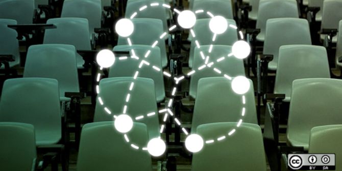
Digital Humanities projects re-imagining categories
I say we could, but in fact some people have, although I don’t think their work has necessarily been recognized with the acclaim it should have. So I wanted to tell you about a few projects that I admire, and which seem to me to embody a commitment to reimagining the categories that have structured people’s lives.
Jacqueline Goldsby, Mapping the Stacks, 2005-2010, Chicago
We know that the question of what gets included and excluded within archives and repositories themselves is deeply political. At the University of Chicago, the English professor Jacqueline Goldsby led a team of graduate students to describe and arrange collections related to African American history in Chicago. This meant spending time in smaller Chicago institutions, like the South Side Community Arts Center, and crawling into people’s attics and storage rooms to dig out their old papers. As Goldsby and her students knew, if an object isn’t figured as part of our object of study, it can’t be extracted and represented as data.
Michelle Caswell and Anne Gilliland, “False Promise and New Hope: Dead Perpetrators, Imagined Documents and Emergent Archival Evidence,” The International Journal of Human Rights, 19:5 (July 2015), 615-627.
When it comes to thinking rigorously about data models, some of the people who are considering these issues in the most sophisticated ways are, as you might expect, people in information studies.
In an article that they just published last week, my colleagues at UCLA, Michelle Caswell and Anne Gilliland, take on the problem of what happens when the perpetrator of human-rights abuses dies before admitting culpability. On the one hand, you have a massive archive, rife with evidence documenting the abuses; on the other hand, you have a looming absence, because the perpetrator can never be cross-examined. Gilliland and Caswell suggest that rather than take a perpetrator at his word, thus relegating victims’ testimony to a perpetually provisional status, we instead stipulate the perpetrator as an “imaginary document” within the archive itself. As an archival document, the perpetrator can be subjected to evidentiary testing and cross-examination, just the way any archival data would be.
It may not immediately sound like it, but it strikes me that what Gilliland and Caswell are proposing is a data model for interrogating the perpetrators’ actions. If the perpetrator cannot be represented as part of the archive, then he escapes researchers’ scrutiny. If he can be re-mediated into our data, then his actions can be represented and attributed properly.
David Kim, “‘Data-izing’ the Images: Process and Prototype,” part of Performing Archive: Curtis + the Vanishing Race, by Jacqueline Wernimont, Beatrice Schuster, Amy Borsuk, David J. Kim, Heather Blackmore, and Ulia Gusart (Popova).
Moving on to what we do with the data we have, one project I want to highlight is a data visualization built by David Kim (who was working as part of a team led by Jacqueline Wernimont) on the photographer Edward J. Curtis, whose photographs of Native Americans are collected in a set of books called The North American Indian.
 This data visualization takes as its object not Native American communities, but Curtis’s construction of these communities.

In building a spreadsheet about the Curtis photographs, the obvious choice for David would have been to record and then visualize the categories Curtis used to describe the people depicted. Instead, David chose to build a data visualization that highlights not Curtis’s categories for Native American people, but how he constructed those categories.This data visualization takes as its object not Native American communities, but Curtis’s construction of these communities.
The easiest thing for David to do would have been to create visualizations that reified Curtis’s own categories; that is, to take Curtis’s word for what appears in these photos. But David knew that Curtis’s photos don’t provide us immediate access to these people; instead, the view they offer is highly mediated and carefully constructed, more indicative of Curtis’s own understanding of Native Americanness than of life as these people encountered it. So he’s turned the data visualizations back around, focusing their scrutiny on Curtis himself, and the Western imperial ideology that he represented.
This is a pretty simple example, but actually pretty sophisticated, too, revealing the researcher’s fluency with both cultural studies and archival theory.
Evan Bissell and Erik Loyer, The Knotted Line
 The Knotted Line
And then, moving on to the level of the interface, perhaps we can look at a project devised by Evan Bissell and Erik Loyer. It’s called The Knotted Line, and it always drives my students kind of nuts. It’s about the history of confinement in the United States, and it tells the story through a series of 50 paintings and data points that you really have to hunt for. It’s infuriating and weird, but it’s also obviously built with skill and, I would say, with a great deal of anger. It asks us to question the point of an interface, and it links our conviction that we’re entitled to straightforward, transparent interfaces with our inability to look deeply at the structures of injustice and inequality in the United States.
Who is our work for?
My undergrads, as I mentioned, all groan when I show them The Knotted Line, because it doesn’t do what they want it to do — what they think it should do — and it doesn’t seem useful. And in fact, there are so many projects out there that actually do seem useful: that provide actionable, clear information that we can easily assimilate. Which does make you wonder: If you build a Knotted Line, will anyone come?
I don’t know, I think they might. Some might. It’s clear to me that our vocabulary for interpreting and evaluating this kind of work isn’t very well-developed yet, but maybe we just need more practice. Here, I thought again of Laura Mulvey, and of this quote from her famous essay “Visual Pleasure and Narrative Cinema”:
It is said that analysing pleasure, or beauty, destroys it. That is the intention of this article. The satisfaction and reinforcement of the ego that represent the high point of film history hitherto must be attacked. Not in favour of a reconstructed new pleasure, which cannot exist in the abstract, nor of intellectualised unpleasure, but to make way for a total negation of the ease and plenitude of the narrative fiction film. The alternative is the thrill that comes from leaving the past behind without rejecting it, transcending outworn or oppressive forms, or daring to break with normal pleasurable expectations in order to conceive a new language of desire.
Mulvey’s asking us to reconsider the ease and plenitude we get from what she calls “the reinforcement of the ego,” and in doing so, she’s asking, whose ego? Who is our work for? If film — like data — builds worlds by extracting and reassembling bits of what we know, then whose world are we building? How far have we thought that through?
I mentioned that I saw Mulvey at a screening of Riddles of the Sphinx, her experimental film with Peter Wollen about motherhood and feminism. She almost apologized before the screening for its difficulty and strangeness; and it is a strange and difficult and taxing film.
But for all Mulvey’s warnings about estrangement and the destruction of pleasure, I found myself actually moved almost to tears by the movie. I became a mother myself a couple years ago, as many of you probably know, and I felt, watching the film, that: yes, this is how it is to be a mother — so infuriating and claustrophobic and sublime all at once. And there was pleasure there, or a thrill, in Mulvey’s term: a thrill in seeing one’s experience captured in its complexity and contradiction, and at not being lied to or patronized. (It must be said that this isn’t a perfect film; it deals with race in particular in a somewhat odd, exoticizing way, as Mulvey acknowledged at the screening.)
Mulvey told us that, at the British Film Institute’s behest, she traveled the British countryside with the film, screening it for very confused audiences, most of whom walked out. But she told us, too, that some of them stayed, and that these tended to be the mothers, who were so grateful to see themselves, finally, on the screen. So maybe this is the thrill we can work toward — the thrill in capturing people’s lived experience in radical ways, ways that are productive and generative and probably angry, too.
Of course, we can’t capture these experiences without the contributions of the people whose lives we’re claiming to represent. So it’s incumbent upon all of us (but particularly those of us who have platforms) to push for the inclusion of underrepresented communities in digital humanities work, because it will make all of our work stronger and sounder. We can’t allow digital humanities to recapitulate the inequities and underrepresentations that plague Silicon Valley; or the systematic injustice, in our country and abroad, that silences voices and lives.
This talk’s title proposes that DH might work toward a different possible future, and this is what I meant. Sometimes people frame calls for DH to engage more with race and gender as a kind of philanthropic activity; won’t you please consider the poor women and people of color?
But that’s wrong. DH needs scholarly expertise in critical race theory, feminist and queer theory, and other interrogations of structures of power in order to develop models of the world that have any relevance to people’s lived experience. Truly, it’s the most complicated, challenging computing problem I can imagine, and DH hasn’t even begun yet to take it on.
This content is published under the Attribution-Noncommercial-Share Alike 3.0 Unported license.
My sincere thanks, too, to Lauren Klein and Roderic Crooks for their advice and feedback on this talk. I’d also like to acknowledge the huge intellectual debt I owe to David Kim and Johanna Drucker, with whom I’ve argued, negotiated, and formulated a lot of these ideas, mostly in the context of teaching together. David’s important dissertation, Archives, Models, and Methods for Critical Approaches to Identities: Representing Race and Ethnicity in the Digital Humanities (UCLA, 2015), takes on many of these issues at much greater length.
This piece originally appeared on the author’s personal blog and is reposted with permission.
Note: This article gives the views of the author, and not the position of the Impact of Social Science blog, nor of the London School of Economics. Please review our Comments Policy if you have any concerns on posting a comment below.
Dr Miriam Posner is the Digital Humanities program coordinator and a member of the core DH faculty at the University of California, Los Angeles. Her book, Depth Perception, on medical filmmaking, is under contract with the University of North Carolina Press. She is also a member of the executive council of the Association for Computers and the Humanities.


5 Comments