 Is there evidence that UKIP support is channelled by local concerns about the influx of immigrants? Juta Kawalerowicz shows that the UKIP vote is not actually driven by experience of change in local areas. Instead, the UKIP vote is correlated with the perception of levels of immigration.
The renewed interested in the connection between immigration and electoral politics can be traced to the spectacular rise of UKIP. Even though the party secured just one seat in 2015 general election, its anti-immigration rhetoric resonated strongly among certain sections of Britain’s electorate – UKIP polled 13 per cent of the vote and came second in 120 out of 624 contested seats. Although the party originally focused around Conservative euroscepticism rather than immigration, relative to supporters of other parties UKIP sympathisers are much more likely to see immigration as the single most important issue facing the country (see figure 1). Aside from party rhetoric, exemplified by Nigel Farage asserting that parts of Britain were becoming like a ‘foreign land’, is there evidence that UKIP support is channelled by local concerns about the influx of immigrants?
Figure 1: The most important issue by party support

Source: British Election Study 2014, wave 1 (February-March 2014)
To answer this question, I focus on people’s reaction to increases in the share of immigrants between 2001 and 2011, which can be extracted from Census small area statistics and constituency boundary files.[1] As it is not clear which groups the respondents mean when answering questions about immigration (see this report for a discussion of public perception of immigrants), I divide this category into three non-overlapping ‘immigrant’ group: white foreign-born, non-white UK born and non-white foreign-born.
This distinction allows me to examine whether UKIP supporters are really mobilised by the arrival of EU8 migrants from Eastern Europe or whether UKIP support is higher in constituencies with increasing proportion of second and third generation British-born ethnic minorities. (Analysis of British Attitude Survey 2013 shows that while being born in the UK is ranked as the most important factor when considering whether someone should be considered as ‘truly British’, the percentage of people saying that ancestry is very important reaches nearly 60 per cent among those aged 65 and above.) The increase in the share of each of these groups between 2001 and 2011 is shown in figure 2.
Figure 2: Changes in proportion of each immigrant group in Westminster constituencies in England, Scotland and Wales
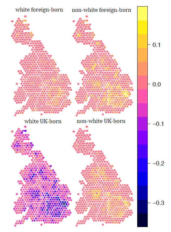
Source: Census 2001 and 2011. Hexagon boundaries were kindly supplied by Benjamin Hennig
Firstly, we see a relative decrease of white UK born group, especially in inner London, which generated a lot of interest in connection to alleged ‘white flight’. At the same time, during this period London attracted all ‘immigrant’ groups, with greatest increases among non-white foreign-born. Another pattern deserving attention is the difference in the extent to which these changes in share of these three ‘immigrant’ groups cluster, with white increases in share of foreign-born most evenly distributed.[2]
How well do levels of immigration among these groups correspond with UKIP support? Figure 3 shows the share of electorate voting UKIP in May 2015 general election. As we can see, the hypothesis that UKIP vote is driven by experience of change in the local area can be rejected – in fact Pearson correlations between UKIP vote and increases in the share of each immigrant group are negative.
| Correlation | % UKIP vote | Perception of immigration levels |
| Increase in share of: | ||
| White foreign-born | -0.22 | -0.14 |
| Non-white UK born | -0.07 | -0.08 |
| Non-white foreign-born | -0.19 | -0.19 |
Interestingly, what seems to be correlated with UKIP vote is the perception of levels of immigration (Spearman correlation 0.54). In three waves of British Election Study available for 2014, respondents were asked whether they think that immigration levels are getting higher or lower (with answers recorded on a five point ordered scale where 1 stood for “getting much lower” and 5 “getting much higher”). It is known that people tend to overestimate the share of immigrants (for instance Ipsos 2014 report shows that British respondents think that 31 per cent of population consists of foreign-born respondents, where the figure is closer to 13 per cent according to 2011 Census); here we also show that people’s estimations of levels of immigration do not correspond to actual change in their local areas, it is the perception that seems to be linked with anti-immigration vote.
Figure 3: Share of UKIP vote by constituency in 2015 general election
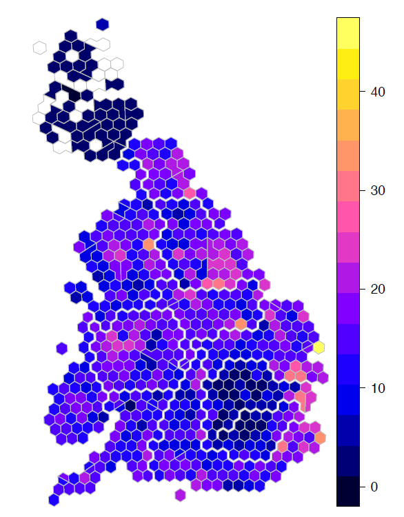
Source: British Election Study 2014, waves 1(February-March), 2 (May-June) and 3 (September-October)
Lastly, let’s discuss how perception of change unravelling over longer periods of time, such as increases in the share of immigrants, can shift quickly due to increasing national salience of immigration in the period leading to elections. Figure 4 maps perceived levels of immigration over three waves of British Electoral Study in 2014. While it is a fact that immigration has been on the rise between 2001 and 2011, we have shown in figure 2 that there was some variation in changes in local areas; if people’s perception of immigration levels is based on real change in their areas we’d expect estimates to vary accordingly.
Figure 4: Perceived levels immigration. Scale from 1 to 5 where 1 stands for ‘Getting a lot lower’ and 5 for ‘Getting a lot higher’
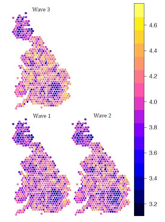
Source: British Election Study 2014, waves 1(February-March), 2 (May-June) and 3 (September-October).
What emerges is that with each wave respondents thought that levels of immigration are getting higher, a situation unlikely to arise in relative short period of 3 month between each wave. In addition, even though respondents perception is devolved from real ethnic change, it seems that people start paying more attention to immigration in their local area in the months leading to elections – for all three groups the Spearman correlation is higher for wave 3 carried out in September-October 2014 than in wave 1 in February-March the same year.
This offers some support to Hopkins’ politicised places hypothesis, which says that in communities which are undergoing demographic changes at the time when salient national rhetoric politicizes immigration, immigrants can quickly become the targets of local political hostility.
Note: This article gives the views of the author, and not the position of the British Politics and Policy blog, nor of the London School of Economics. Please read our comments policy before posting.
Juta Kawalerowicz is a doctoral candidate in sociology at Nuffield College, Oxford University. She is interested in political sociology, with an emphasis on determinants of prejudice and far-right politics. She is also interested in research methods, particularly mapping and spatial techniques in quantitative social research.
[1] The question of change rather than absolute levels of immigration has rarely been addressed at a small geographic scales; this is because of changing electoral boundaries, making direct comparison difficult. Here, I used GIS (rgeos and sp packages in R) to calculate 2001 statistics within 2011 electoral boundaries.
[2] The statistical measure for assessing spatial clustering is Moral I and takes values between -1 and 1, where values closer to 1 indicate more clustering. The values for increase in share of white foreign-born, non-white UK born and non-white foreign born are 0.34, 0.68 and 0.54 respectively.


Juta
An excellent piece and I love the GIS maps. But we need to know the unit size and which controls you are using. There is also a risk that the immigration opinion and immigrant increase questions are confounded and tap something similar. If you use ward as the context, try running both ethnic levels and changes together. I think you’ll find that local ethnic change really does predict a higher UKIP vote once 2001 levels are controlled for.
Given that immigration is the top concern of people across Europeat 38%, UKIP’s stance is well grounded in political reality. Remember that poll was conducted in May before the worst of thimmigrants crossing the MED>e Calais crisis and much of the
https://0d2d5d19eb0c0d8cc8c6-a655c0f6dcd98e765a68760c407565ae.ssl.cf3.rackcdn.com/00849a0ac7b2e4117de5f2305e844687e5e48ad2.pdf
There is a great deal of evidence for the argument against immigration, a small subset of which is here:
Conclusion HofL study on immigration:
This submission examines these claims. It concludes that the economic consequences of large-scale immigration are mostly minor, negative or transient, that the interests of more vulnerable sections of the domestic population may well be damaged, and that any economic benefits are unlikely to bear comparison with its substantial impact on population growth. Such findings are in line with those from other developed countries. Although it does not benefit the UK population as a whole, large-scale immigration does benefit migrants, their families and sometimes their countries of origin.
http://www.publications.parliament.uk/pa/ld200708/ldselect/ldeconaf/82/82ii.pdf
“Mass immigration could see water shortages, failing hospitals and we won’t feel richer”
http://www.telegraph.co.uk/news/uknews/immigration/11003975/Mass-immigration-could-see-water-shortages-failing-hospitals-and-we-wont-feel-richer-says-Civitas.html
Migrants do take our job – Home Office report:
https://www.gov.uk/government/uploads/system/uploads/attachment_data/file/257235/analysis-of-the-impacts.pdf
In short, building a new city the size of Hull or Nottingham every year to house the influx of immigrants is not sustainable.
A very biased piece of work not up to the standard of a university essay, it has just repeated the ignorant rantings of the media, which as we know is highly biased. There is no evidence that immigration was the main aspect of UKIP’s stance in fact the idea of stopping all immigration is a media concept not one of UKIP which has clearly stated that control of our borders along the similar controls employed by other nations involving the whole of immigration instead of the current bigoted ideas that people from 27 nations have free entry etc, whilst people from other countries are prohibited from the same rights. To pretend that UKIP and BNP have the same policy is highly dubious, and one can only grade this piece as a fail. You will need a resit.