In one way or another I have been observing teaching for over 20 years. Throughout, I have drawn maps of the teaching environment. My first observations were as a trainee secondary school teacher – observing senior colleagues so as to learn the secrets of their craft. Later, as a (relatively), fully-functioning school teacher, I observed the next generation of trainees teachers as they took their first steps into teaching. Various job moves continued the trend and now, working at the Teaching and Learning Centre at LSE, I find myself observing some really thought-provoking practice as I support colleagues and departments to enhance the quality of the teaching and learning experience. Drawing maps started as a means of charting which student was sat in which chair, but now I use it as a tool for recording information, interaction and activity.
As an observer I draw these maps during the observation process but I also draw them after my own teaching sessions as I reflect on the relative success/failure of my own practice. For me, mapping works best at the whole-class level – where the teacher is leading a discussion or running a question and answer session. This form of teaching can be mentally draining and physically exhausting as the teacher tries to lead the group through a series of deliberations and towards a critical understanding of the subject matter. Therefore, mapping the learning environment allows me to ‘measure’ levels of engagement at the whole-class level.
Some of my maps have become rather elaborate as I have developed codes, symbols and cyphers as a way of representing many of the types of activity that take place in a typical teaching session but here I present maps that focus on information flow.
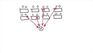
This first map is a map I have drawn too often. It shows information flowing back and forth from teacher to an individual student. A common instance of this involves the teacher asking a question, getting an answer then asking another question. Some students will volunteer an answer; some will be nominated by the teacher, and some students will stay quiet. The teacher controls the pace and direction of the session but there is no information flowing student to student.

In my second map the layout of the desks has changed but the flow of information is still teacher-student. One of the features of horseshoe layouts is the increased likelihood of discussion through face-to-face interaction. But this is only true if the teacher adopts a particular pedagogy. When the information flow is teacher-student, teaching can start to become teacher-led and the challenge for the student is to supply the answers that are in the teacher’s head.
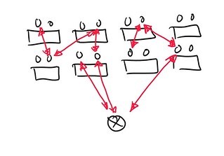
This is one of my favourite maps. The information flows from student to student. Ideas are developed and critically debated. The teacher’s role here is to keep the discussion going by asking open questions that encourage debate. Once the first student has offered an answer the teacher should seek supporting or opposing positions (perhaps encouraging students to argue from theoretical or philosophical perspectives). After a while the students no longer need the teacher’s prompts, they become accustomed to being part of the critical discussion and expect to be involved.
This map shows the very least amount of student activity that I expect in a teaching/learning session. In this instance, students work as pairs to discuss, analyse or examine a topic, question or artefact. Information flows student-student and the teacher’s role is to facilitate feedback and organise the responses that pairs give into a more general answer. Pairs don’t even need to feed back to the whole class: they can be partnered with other pairs and share their thoughts in small groups.
Mapping the way that information flows in the teaching environment gives an overview of who is really doing all the work and allows me to see if a class is more teacher-centred or student-centred. This is quite a blunt tool and it needs to be used in conjunction with more thoughtful reflective practice but I find it a really useful way of getting an overview of how active/passive the student group has been. My more nuanced maps also show the level of participation of each individual student; the student who asked the first question (and the time that this occurred); the position of the teacher at various phases of the class, and whether the teacher was mainly looking at the class of looking at the board. There are likely to be lots of variations on this and my general model could be personalised to individual tastes but I recommend this to others as a way of examining aspects of their practice. Drawing these maps doesn’t take much time or talent but the results can be a purposeful catalyst for development.
Image: Dr Margaret Bray teaching a class in the Department of Economics
Disclaimer: This post is opinion-based and does not reflect the views of the London School of Economics and Political Science or any of its constituent departments and divisions.
Note: This post first appeared in the LSE Education Blog which has been discontinued. Posts from that blog will occasionally feature here in the From the Archive section.