Understanding data visualisations is an essential skill in today’s data-driven society. But beyond technical considerations like accuracy and consistency, what makes a good visualisation and what should researchers consider when looking to communicate complex findings? Helen Kennedy presents an overview of her research investigating the many factors affecting our engagement with visualisations.
Data are increasingly ubiquitous. They are assumed (by some) to have the power to explain our social world. They are used to inform decision-making that affects all of our lives, for example by governments and businesses, and increasingly influence media and cultural practices like journalism. But it is difficult to comprehend large datasets, what they mean and what they do, especially for people who are not expert in data visualisations but who encounter them with growing frequency. As long as that remains true, the ability to engage in data-driven conversations and decision-making will remain off limits to certain groups, existing uneven power relations will be reproduced and new, data-based ones will emerge.
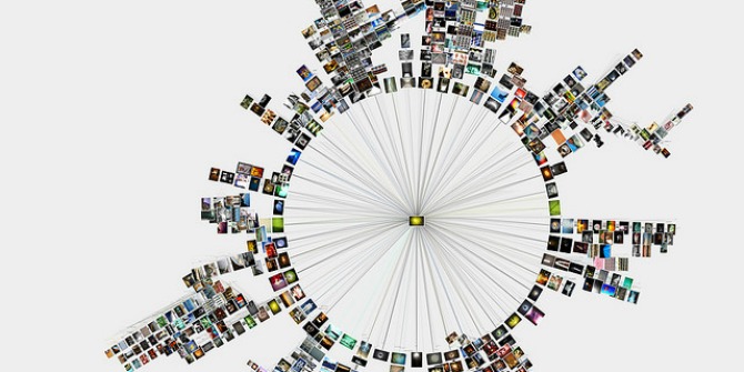
 Image credit: United States Department of Energy (WIkimedia, Public Domain)
The visualisation of data (that is, the visual representation of data in charts and graphs) is seen as one way of addressing and overcoming these dangers, and of promoting data transparency and awareness. This is because the main way that people get access to data is through visualisations, which, like the data on which they are based, are also increasingly widely circulated. For a long time, experts have argued that visualisations are important tools for making data transparent and for communicating in ways that data themselves cannot. This idea can be traced back to the mid 19th century and the work of Otto and Marie Neurath, developers of Isotype, a graphical system for representing quantitative information through icons. The Neuraths put their ideas into action in their Museum of Society and Economy in order to promote ‘intellectual democracy’. The Roslings’ GapMinder, ‘a modern “museum” on the Internet’ is similar: it also aims to promote social awareness (this time about global sustainable development) by visualising statistics.
Data visualisation expert Andy Kirk of Visualising Data estimates that there are around 75 common chart types, and that’s just the ones that have names. The proliferation of chart types can make understanding visualisations difficult, yet it is also an essential skill for those of us who wish to understand the data within them and so to participate in informed ways in data-driven conversations and society. Until recently, not much was known about how we engage with data visualisations. This gap in knowledge led me and a team of researchers to explore this topic on a research project called Seeing Data. Through focus group research, interviews, diary-keeping and other methods, we identified a range of factors which affect our engagements with data visualisations. These include:
- Subject matter: when the subject matter speaks to our interests, we’re more likely to engage with data visualisations.
- Source/location: when visualisations are encountered in already-trusted media that we view or read regularly, we are more likely to trust them; otherwise, we don’t.
- Beliefs and opinions: we like visualisations which communicate data in a way that fits with our world views, but some of us also like our beliefs to be challenged by data and visualisations.
- Time: engaging with visualisations can be seen as hard work by people for whom doing so does not come easily, so having time available is important in determining whether we want to do this ‘work’.
- Visual elements: the conventions that visualisation designers draw upon play a role in determining whether we’re willing to spend time looking at a visualisation. These may appeal to us, or they seem too unfamiliar and therefore offputting.
- Emotions: visualisations provoke emotional reactions – if we feel immediate confusion about a visualisation, we are less likely to invest time and effort in making sense of it. Subject matter, visual style and other factors all provoke emotional reactions.
- Confidence: we need to feel confident in their ability to make sense of a visualisation, in order to be willing to give it a go. This usually means feeling like we have some of these skills:
- Language skills, to be able to read the text within visualisations (not always easy for people for whom English is not their first language).
- A combination of mathematical or statistical skills (knowing how to read particular chart types or what the scales mean) and visual literacy skills (understanding meanings attached to the visual elements of datavis) – sometimes called ‘graphicacy’ skills,.
- Computer skills, to know how to interact with a visualisation on screen, where to input text, and so on.
- Critical thinking skills, to be able to ask ourselves what has been left out of a visualisation, or what point of view is being prioritised.
This might seem like common sense, but these factors haven’t figured prominently in research into engagements with visualisations. The field has instead focused on how to maximize the effectiveness of visualisations, with effectiveness understood in mostly technical terms as accuracy, consistency, confidence and speed of comprehension, as if these other factors did not play a part. So our findings represent an important contribution to understanding how people engage with visualisations and the factors that affect this process. The challenge for people making data visualisations is to develop ways of evaluating user engagement which are efficient (most visualisers have little time and money for user testing), but which take into account the factors identified in our study.
Our study also suggests that, given the factors we have identified, visualisers should have modest expectations about who (and how many) will engage with the visualisations they make. People may learn from a visualisation they don’t like, but we are attracted to visuals, so what a visualisation looks like might stimulate us to look further, deeper and for longer. Visualisations are not always self-explanatory – they require interpretive work and visualisers can help their users do this work by including things like a title, a key, a data source and other descriptive text. These are other findings from our study that are relevant to data visualisers.
For non-experts looking at data visualisations, some skills are needed to make sense of them, or are at least helpful. On Seeing Data we developed a resource targeted at non-experts to start them on this process, called ‘Understanding Data Visualisations’. But acquiring new skills is difficult, for all sorts of socio-cultural, political and economic reasons – it was far beyond the scope of our research to address these. But our research does raise broad questions about how people learn to relate to data, through formal mathematical education and more informal cultural practices. We found people relate to statistics emotionally as well as cognitively and rationally. So, might we need to re-think existing, scientific approaches to statistical education and consider what softer, arts-based approaches might contribute to developing skills for feeling confident with data? This is an important question, because as long as people don’t feel they have the right skills, participating in our increasingly data-driven world will not be commonplace, and that has troubling implications for democratic citizenship.
Note: This article gives the views of the author, and not the position of the Impact of Social Science blog, nor of the London School of Economics. Please review our Comments Policy if you have any concerns on posting a comment below.


Great article, thank you!
but you forgot about ProofQuick, IMHO.
http://proofquick.com/
Dear Helen,
This is truly fascinating research.WE are working on building Analytics using Agriculture data in india,
we would be very keen to speak to you and understand more on the data nuances.
deeply appreciate your response.
Ravi