During the first wave of the pandemic in 2020, the public heard government ministers ask for the ‘next slide please’ on a near-daily basis. Charts and infographics featured on national television like never before. But as William Allen, Justyna Bandola-Gill, and Sotiria Grek report in new research, the use of these images reflected and conveyed particular policy interests and priorities.
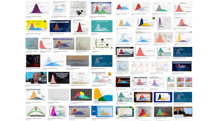
As the COVID-19 pandemic swept across the globe in 2020, advice to limit contacts and socially distance ourselves from other people reflected the often-repeated goal to ‘flatten the curve’. This phrase related to the now-famous line chart of cases: reducing the speed and scale of infections was an important step in protecting frontline health services from being overwhelmed.
Yet this chart is just one of several ‘generic visuals’ about the crisis that were circulating on media and in the news. These were most visibly on display when ministers held near-daily press conferences during the first wave. Stood in front of podiums next to a large screen, politicians and various public officials presented slides containing the latest statistics and information—punctuated with requests to show the “next slide please.”
 Chief Scientific Adviser Patrick Vallance talks about a slide showing R levels in the UK at a COVID-19 briefing in October 2020. Photo: Pippa Fowles/ No 10 Downing St via a (CC-BY-NC-ND 2.0)
But these images did more than just convey data dispassionately: they helped the government establish and communicate its authority during a crisis that—at the time—did not have a clear endpoint. In our paper, we present an analysis of all 79 sets of slides that the government used during its daily press conferences from 30 March to 24 June 2020, we tracked both the number and types of graphics.
The average number of unique graphical items per briefing shifted during this period, as indicated by the horizontal lines. The vertical dashed lines indicate when key policy moments occurred.
 Fig.1: The average number of unique graphical items per briefing shifted during this period, as indicated by the horizontal lines. The vertical dashed lines indicate when key policy moments occurred.
There were two main phases of (visual) communication during these initial stages of the pandemic. The first, from 30 March to 9 May 2020, covered the first national lockdown which began on 26 March and its extension on 16 April. It featured relatively few graphs that focused on transport use, cases, hospitalization, and deaths. Although some new charts appeared as available data expanded, the messaging mainly stuck to communicating scientific evidence—as well as signalling the limitations of that evidence.
One of the most widely-publicised charts compared the cumulative number of deaths in the UK to those in other high-income countries. Consistently appearing on the last slide in the press conferences, it showed how the UK was performing relatively well compared to its peers, with fewer mortalities than the United States even through early May.
 Fig.2: Charts comparing UK mortalities to other countries as used on 8 April (upper image) and 3 May (lower image)
This chart was politically useful in two ways. First, it potentially cast the government in positive light by highlighting its better performance compared to others (a ‘benchmarking’ effect’). But as mortalities rose, and the numbers no longer supported this claim, the government suddenly—and permanently—removed this image from its presentations on 10 May. The reason for this wasn’t lost on the opposition: three days later at Prime Minister’s Questions, Labour Party leader Sir Keir Starmer argued ‘when we did not have the highest numbers in Europe, the slides were used for comparison purposes, and as soon as we hit that unenviable place they have been dropped’.
Second, along with the other core themes that regularly appeared in the first phase, it set the terms of what policymakers needed to address to solve the crisis. Bringing mortalities under control would become a crucial plank of the government’s eventual plans.
The second period covered 11 May—the day after the government formally announced its plans to exit lockdown—to the final briefing on 23 June 2020 as restrictions started to lift. Our analysis revealed an apparent shift in policy objectives: from reacting appropriately to emerging data and scientific knowledge about the virus, to proactively communicating an exit strategy.
For instance, infographics conveying behavioural advice rather than statistical trends became more prevalent. What is more, the slides themselves became more graphically consistent, professionally designed, and sophisticated in layout. Instead of merely describing available data, these slides were interpreting what the public should do based on this information: as the government’s new slogan demanded, people needed to ‘stay alert, control the virus, save lives’.
 Fig.3: Selection of charts used during the briefing on 12 May—one of the first after the government announced its plan for exiting lockdown—illustrates a greater degree of consistency and sophistication compared to the first phase.
Tracking the appearance and use of visuals in these highly unusual press conferences provides a window onto the ways that ministers built and expressed their authority during an acute crisis. To be sure, policymakers have always used numbers to communicate their priorities on a range of issues: for instance, in their new open-access book, Sotiria and Justyna have studied this practice in the context of the Sustainable Development Goals. And, as was the case for the increasingly dire mortality figures, media and opposition figures can seize the opportunity to highlight politically inconvenient numbers for the government in power, as Will has shown in the case of increasingly high immigration levels to the UK.
But as policy-making increasingly uses quantitative data to both understand problems and communicate solutions—both in ordinary and extraordinary times—visualization is likely to remain an essential tool in policymakers’ toolboxes. As a result, researchers should prioritise having a better understanding of these uses and their effects.
This blog draws on the authors’ paper, ‘Next Slide Please: The Politics of Visualization during COVID-19 Press Briefings’. published open access in the Journal of European Public Policy. Governing the Sustainable Development Goals: Quantification in Global Public Policy is also available to read open-access here. For more publications of the METRO project, please check here.
The content generated on this blog is for information purposes only. This Article gives the views and opinions of the authors and does not reflect the views and opinions of the Impact of Social Science blog (the blog), nor of the London School of Economics and Political Science. Please review our comments policy if you have any concerns on posting a comment below.
Image Credit: Featured image: Chief Medical Officer Chris Whitty talks about a slide showing R levels in the UK at a COVID-19 briefing in October 2020. Photo: Pippa Fowles/ No 10 Downing St via a (CC-BY-NC-ND 2.0), Briefing slides and graphics reproduced under the Open Government Licence v3.0.


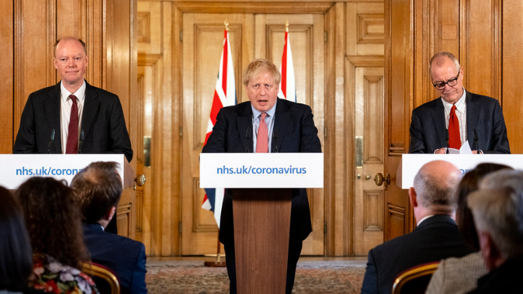

Interesting article, thanks but picture credits wrong. The photo isn’t Chris Whitty, it’s Chief Scientific Adviser, Sir Patrick Vallance.
Good spot! Thanks for pointing this out and now amended.