In this feature essay, Mona Sloane reflects on the importance of material ‘stuff’ when it comes to understanding the practices of design professionals that form the basis of her own research and considers how this ‘material learning’ is integral to understanding how designers concurrently treat and interact with the social.
This essay is part of a series examining the material cultures of academic research, reading and writing. If you would like to contribute to the series, please contact the Managing Editor of LSE Review of Books, Dr Rosemary Deller, at lsereviewofbooks@lse.ac.uk.
Dealing with ‘Stuff’ in Design: Thoughts on Materiality in Design Research
 Image Credit: Mona Sloane
Designers deal with ‘stuff’, people and futures. Doing design, usually, does not only mean to envision and create some sort of object, but also to think about how it could or should be used as well as how this sits within certain narratives of our social, political and economic futures. But how do designers do that? And what are the ways in which they not only speculate about stuff, but also treat it within their own professional practices?
These are some of the questions that are at the heart of my research, which focuses on different kinds of design practices. The design professionals I work with are spatial designers, such as architects and interior designers, as well as lighting designers. Even though the things that they design differ hugely, there is one aspect their practices have in common: the way in which they entail materiality. And that – this is the interesting part – even though they do not directly ‘make’ or ‘craft’ anything (Sennett 2009), their work is ‘conceptual or mental’ and looks to solve a problem (Parsons 2016).
You do not have to look far in most design studios to find different kinds of ‘stuff’ laying around. And this tends to find its way into the design process, implicitly or explicitly. The spatial designers I work with rely on extensive material knowledge to go about their conceptual work. What plays an important role here are material samples in all shapes and sizes, from brick, concrete and steel samples for walls, walkways and outdoor cladding to samples of leather, wood, marble, carpet, wallpaper, curtains and so on for interior spaces. These tend to pile up on designers’ desks, but are also stored in work rooms in the studio, carefully categorised, filed and always meticulously updated.
Quite early in the design process, designers make use of this extensive collection of material samples as part of doing design: in line with what they call a ‘design narrative’ – which could be, to use a fictional example, about ‘nature’ – the designer would compile a range of samples to support it, especially for interior spaces. To stick with our fictional example, this compilation would entail samples for the flooring (which could be wood for a more ‘natural’ feel), but also for furniture (probably in ‘earthy’ colours such as olive or sand) and curtains (perhaps very light and in white-ish to let in natural light) as well as some selected, more colourful highlights: for example, fabric samples with prints for cushions or textured wallpaper for a ‘feature wall’.
 Image Credit: (Benjamin Linh VU CC BY SA 2.0)
These samples are, of course, part of ‘pitching’ design ideas to clients. But they are not just for show, as it were. They form an integral part of the ontology of design in a number of ways: they help designers materialise a space prior to construction and communicate its envisioned qualities to clients to facilitate discussion. But they are also important as a link to the wider ‘stuff system’ of design (Molotch 2003). For example, materials have certain properties and these can be highly regulated, especially in the context of commercial or public spaces but also those with a particular function such as hospitals or educational institutions.
To return to our fictional example: if this design and its narrative about ‘nature’ was for a commercial space – say, a hotel – then the materials would have to be particularly robust but still look pristine after daily cleaning. They would also have to be available in large quantities at a good price, and be easily replaceable. In this case, the flooring sample would probably be switched from parquet to laminate, a material that is easy to clean and can be purchased in large quantities at a relatively low price. This, however, would probably not happen if the design was for a ‘boutique’ hotel. In this case, the parquet would most likely stay as its affective and symbolic properties express ‘quality’ and luxury.
Things would be different again if the design was for a care home, where there are very strict standards for interior materials in place, including that all surfaces be sterilisable. This means that, probably, the wooden surface sample would be switched from laminate to linoleum. The point here is that these are calculations that happen in the heads of designers and through their interactions with these material samples, but also in the context of wider social and regulatory environments. Designers put stuff and people together and have to think very carefully about how best to do that. Here, they tap into discussions about our future living. Designing a care home might mean engaging with the most current research and designing spaces that feel more ‘homely’ and less like a hospital.
Things can be very similar for lighting designers. I have worked with lighting designers that create lighting schemes for urban spaces. Unlike most spatial designers, they cannot work with a virtual white canvas: they have to design for and within existing cityscapes. This means that they need to put together light within the existing socio-spatial fabric. Here, they take the materiality of light very seriously, of course, despite its immaterial connotations: in other words, light is the ‘stuff’ they work with, a very versatile material. Its quality, similar to our wooden flooring sample example, is comprised by a range of things. One aspect that is special from the outset is that light always works in relation to a physical context, something more tangible, a surface or an object – light has to be reflected.
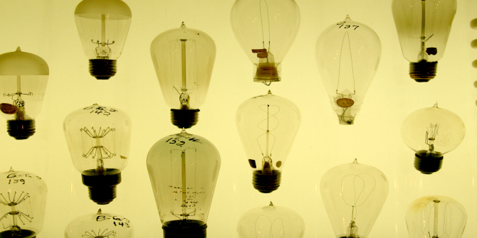 Image Credit: (Matthew Robinson CC BY 2.0)
One of the basic things lighting designers have to consider in this context is luminance and illuminance. Luminance describes the quantity of visible light (or luminous intensity) that is emitted from one light source, for example a light bulb, and then reflected by a surface before it hits the human eye. It is measured in lumen, whereby one lumen designates the luminous intensity of one candle (given that this luminous intensity is emitted uniformly across the angle of a square radian – just think about the beam of a candle light). Illuminance is the spread of light (or luminous flux) emitted by a source without reflection on a surface, but in relation to an area. It is measured in lux, whereby one lux equals one lumen per square metre. Lumen is a photometric unit, which means that it is directly related to the make-up of the eye’s physiology as opposed to its physical power. In other words, luminance is always based on the wavelengths the human eye can perceive. Illuminance, on the other hand, can be measured without taking into account human perception because lux measure the spread of light within a given area, not how it is perceived.
Though this sounds very abstract, it has highly pragmatic consequences for how light can be treated as a material within design processes. For example, lighting designers can ‘wash’ surfaces with lighting. Here, they use evenly distributed light, mounted at the top and the bottom of a wall for instance, to eliminate shadows to make the existing surface look smooth and uniform. What plays an important role here is colour. If this surface is white or black, the illuminance, which is the light emitted by a source, can be the same, but the luminance, which is the light that is reflected by a surface, may vary. A white surface reflects more light than a black surface: a white wall that is illuminated with one bulb will make the light that is emitted from this blub seem much stronger than a black wall which absorbs a lot of light. This has consequences for what kind of light source is chosen: for example, how strong the bulb is (in other words, how many lumens it emits).
But what matters equally, apart from those quantitative measures, is the capacity of a light source to display the natural colours of an object or surface in comparison to natural light. This aspect of light is called colour rendering and is determined by the light sources’ colour spectrum, which itself is invisible to the human eye but determines how well we can see colours under a certain light. If you think about traditional street lighting, which is comprised of low-pressure sodium lamps, then this effect becomes clear: having a very low colour rendering index, this light submerges everything in an orange tone: it is very hard to see colour contrast in it, it almost feels like being in snow. In comparison to that, a lamp with a light colour rendering index, which means that it has a much wider colour spectrum, will bring out colour contrast very clearly: fluorescent lamps (think hospital lighting) are a good example. Colour rendering, however, is different from the colour temperature, which merely designates the appearance of a light source. In other words, a light source may appear blue because it has a blue gel filter, but its colour rendering could be so that it brings out other colours of the objects and surfaces it illuminates.
The point here is that the materiality of light is a very complex thing: it is both relational – it only works in relation to darkness and to objects – and technical. However, when lighting designers treat light as stuff, this intricate knowledge is put to work in social, creative and pragmatic ways. Landmarks can be illuminated for wayfinding or giving identity to a place; mobility can be enhanced by marking out pathways through lighting. Moreover, the quality of the material light can be hugely consequential for how we perceive and navigate nightscapes as social spaces. How lighting designers consider luminance and illuminance, colour rendering and colour temperature can mark a space as public (think white-ish and uniformly distributed lighting, such as street lighting) or private (think yellow-ish and patchily distributed lighting, spilling onto the street from houses).
The bottom line for me as a design researcher is that materiality is prominently featured in my research and writing, because it is prominently featured in the practices I observe. This materiality, however, is sometimes hard to grasp: designers are not always explicit about their material knowledges. It took me a substantial amount of time to get under the skin of it, to be able to detect and describe ‘materiality’ as above. However, what makes it sociologically interesting for me is that this ‘material learning’ is also a way of understanding how designers treat ‘the social’. In both cases, the materiality that is featured in the design process links into the socio-technical considerations of our time. It is a window into the zeitgeist and collective speculations about our future.
Mona Sloane is a PhD candidate at the LSE Sociology Department where she holds an LSE scholarship and works and publishes on the sociology of design and urban planning, material culture and aesthetics and economic sociology as well as lighting design and public space. She holds an MSc in Sociology from the LSE and a BA in Communication and Cultural Management from Zeppelin University Friedrichshafen. She also is co-founder and former member of the LSE-based research programme Configuring Light/Staging the Social which explores the role of light and lighting in everyday life and urban design. Some of the research discussed in this piece was developed through collaborative Configuring Light research. Mona tweets @mona_sloane. Read more by Mona Sloane.
Note: This article gives the views of the author, and not the position of the LSE Review of Books blog, or of the London School of Economics.


