 In his March 2015 Budget speech, Chancellor George Osborne emphasised that austerity measures over the 2010-15 Parliament had been fairly shared: inequality had fallen and the British people were ‘all in this together’. In this article, Gabriel Zucman examines how the UK stands in terms of the levels and changes in inequality of pre-tax and benefit income and net incomes. It also explores the role of the coalition government’s policies in influencing these outcomes.
Trends in the distribution of pre-tax and benefit income
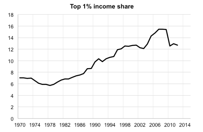
The UK has a high level of pre-tax income inequality. The share of taxable income earned by adults in the top 1% of the distribution has been in the range of 12.5% to 15.5% (see Figure 1). This is much higher than in most continental European countries – in France and Spain, for example, the income share of the top 1% is about 8% – but it is lower than in the United States, where the share is about 20%.
Figure 1: Rising pre-tax and transfer income inequality in the UK, 1970 to 2011
Notes: Data from the World Top Income Database. The series has a break in 1990 (change in tax units from family to individual basis). The top income shares estimates for 2009-10 were affected by a significant bringing forward in that year in advance of the introduction of the 50% top tax rate; the shares for the following years were correspondingly reduced.
The share of the top 1% was about 6% in the 1970s, but it has been rising ever since. There was a particularly strong rise in the decade leading up to the financial crisis of 2008-09. Two thirds of the growth in the share of the top 1% appears to be due to bonuses in the financial sector.
The measured share of the top 1% fell in 2009-10, but this was heavily influenced by bringing forward income in advance of the introduction of the tax on bankers’ bonuses and the new 50% additional tax rate. The shares for the following years were correspondingly reduced (see CEP’s Election Analysis on top taxes by Alan Manning). It is too soon to tell whether the financial crisis marks the end of increasing shares of the top 1% or if inequality will resume its rising trend once aggregate wages start growing again.
Tax data are likely to underestimate the extent of inequality among residents of the UK. Nondomiciled (‘non-dom’) residents who choose to be taxed on a ‘remittance basis‘ only pay taxes on the (possibly very low) fraction of their income brought into the UK. In other words, the dividends, interest, and capital gains earned on their foreign stocks and bonds are tax exempt if not transferred to a UK bank account. There is no other large economy with a comparable tax provision.
The number of non-doms has risen from 83,000 in 1997 to 114,800 in 2012-13. 1 The 46,700 non-doms who use the remittance basis must pay an annual flat tax (£30,000 if resident for seven years, £60,000 after 12 years and £90,000 after 17 years). This status is obviously only advantageous to wealthy individuals. With the data currently available, it is not possible to estimate the worldwide income of non-doms, but it might be large enough to affect the top 1% income share reported in Figure 1 significantly.
Labour have promised to abolish non-dom status except for short-term residents. This could potentially raise revenue of £1 billion and end an anachronistic system. But some non-doms might respond by leaving the country, although there is no compelling evidence that such migration responses would be large. This would reduce wealth inequality, but it would also reduce tax revenues.
Trends in net income inequality (post-tax and transfer)
Taxes and benefits lead to income being shared more equally between households. Before taxes and benefits, the richest fifth of households have incomes almost 15 times greater than the poorest fifth, but after all taxes and benefits are taken into account, this ratio is reduced to four-to-one.
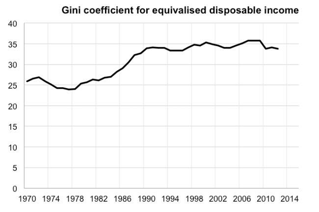
As with pre-tax income, inequality of disposable income has risen since the 1970s. It increased a lot in the 1980s, and then was stable, growing only slightly. As Figure 2 shows, the Gini coefficient4 is now around 10 percentage points higher than in 1980.
Figure 2: Rising inequality of disposable (after tax and benefit) income
Notes: Gini coefficient of equalised (modified OECD scale) disposable household income for all persons in the UK (Great Britain up to 2001-02) from Family Expenditure Survey from 1961 up to financial year 1993/4 (calendar years up to 1992), thereafter from the Family Resources Survey.
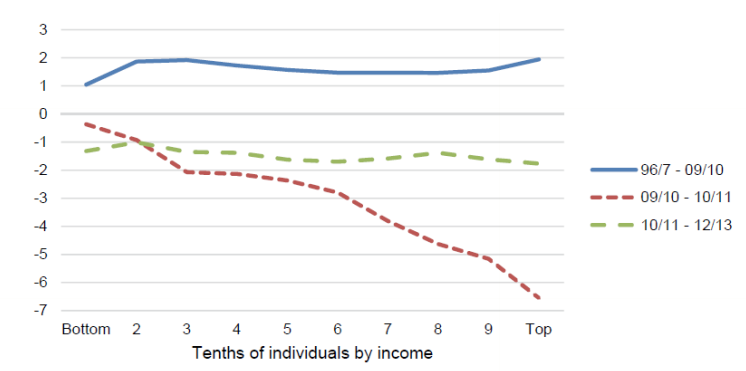
Breaking this down in more detail, Figure 3 shows that between 1996-97 and 2009-10, there was a moderate increase in inequality. Although income rose across the distribution, it was slowest in the bottom decile (1% per year) and fastest in the top decile (2% per year). In contrast, inequality fell in the depths of the Great Recession, with the bottom decile staying the same and the top decile taking a 7% cut in net income. Between 2010-11 and 2012-13, incomes fell by 1-2% yearly almost equally across the entire distribution.
Figure 3: Changes in net income across the distribution in Great Britain
Source: Hills (2015), Table 5
Notes: Lines at mid-point of each decile group. Incomes are equalised for each group.
The effects of policies on net income distribution
Although there has been little change in inequality since the coalition government came to power, this outcome is due to a combination of changes in the economy, policies inherited from Labour and new policies introduced. The latter are hard to assess fully since detailed distribution data is only available through to 2012-13.
There have been several important policy changes (see work by John Hills for more details):
• First, the personal allowance has been steadily increased (to £10,500 in 2015-16).
• Second, the uprating of working age benefits was tied to the consumer prices index (CPI) rather than the retail prices index (RPI) since 2010. Since the CPI increases more slowly than the RPI, this will reduce the value of benefits. But since real wages have fallen by 8-10% since 2008, uprating benefits with prices protected these groups more than workers.
• Third, the state pension is under a ‘triple lock’, increasing by whatever is greater among the CPI, average wages or 2.5%. This has led to a generous deal for pensioners.
• Fourth, working age benefits were cut in real terms from 2012.
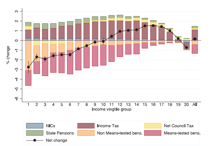
John Hills reports a simulation model of the effects of tax and benefit policy changes from May 2010 onwards (see Figure 4). The measures have been mainly regressive. On average, those below median income have suffered losses due to policy changes, especially the bottom 10%. The main gains are those above the median to around the 90th percentile. The top 5% are about the same and the next 5% have slightly lost out.
Figure 4: Percentage change in household disposable income by income vingtile (5%) group due to policy change, May 2010 to 2014-15
Source: Hills (2015) Figure 9(b)
Notes: Modelled effects of coalition policies (direct taxes, tax credits and benefits) relative to 1996-97. £billion in 2009-10 prices) starting from May 2010. Observations are grouped in vingtiles (from poorest 5% to richest 5%) using household disposable income in 2010 equalised using the modified OECD scales. 95% confidence intervals (bootstrap method) around the net change shown. EUROMOD G1.5 used.
Looking ahead, there are several changes that are likely to make net income inequality worse. For example, there will be a cap on the overall level of welfare and a £26,000 limit on how much benefits can be claimed per household. The effects of tying benefits to the CPI will depress the real value of the benefits as wages start recovering.
Conclusion
Inequality in pre- and post-tax income has risen remarkably in the UK since the late 1970s. Inequality growth was strongest in the 1980s, but has continued steadily for those in the top half of the income distribution (especially the top 1%). Inequality of net income fell in the crisis as the welfare system ‘did its job’. But there are signs that it is rising once again and the tax and benefit changes since 2010 have been largely regressive. Perhaps the main cleavage is between pensioners who have done relatively well compared with those of working age, especially the young and households with children.
This article is part of the CEP’s series of briefings on the policy issues in the May 2015 General Election. See the longer version here.
Note: This article gives the views of the author, and not the position of the General Election blog, nor of the London School of Economics. Please read our comments policy before posting.
 Gabriel Zucman is Assistant Professor of Economics at the London School of Economics.







Your data shows the Top 1% receive 13% of all income. Is it not also true that 28% of all income taxes come from that Top 1%? Is it fair that there people who receive 13% of income pay 28% of all income taxes?
The fact that inequality rose over the 1980s is fairly well-established. But is the real conclusion of this not that the UK has seen no increased in inequality over the last quarter-century?
Would be genuinely interested if you are aware of ANY metric that shows UK inequality significantly worse than it was 25 years ago (i.e., 1991)
in a word the answer to your question is no.