 A key part of the electionforecast.co.uk model is how it uses information from previous election campaigns to estimate the weight that should be placed on the standing of parties in current polls relative to the performance of those parties in the previous election. In this post, Chris Hanretty focuses on this part of the model and indicates how one should interpret the changes that the polls currently imply.
Here it is: the animated GIF that explains how you should interpret GE2015 polls. It shows all the poll movements for the top three parties for the 180 days preceding each general election from 1979.
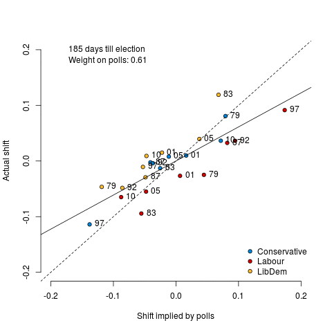
On the horizontal axis, you can see the shift implied by the polls. So, if “the polls” say that Labour is on 33%, and Labour got 29% in the previous election, then the polls imply a shift of 0.04.
On the vertical axis, you can see the shift that actually happened. So, if Labour gets 29% (as it did in GE2010) and got 35.2% in the previous election (as it did in GE2005) the shift is -0.062.
If the polls were completely accurate, all of the dots would fall on the dotted line. But they don’t: they’re a bit off. You can see how far off they are by looking at the solid line. That’s the best fitting line through those points.
I’ve put the slope of that line in the top left hand corner. If that number shows 0.5, then our “best guess” for how a party will do in the next election is to take how they did in the last election, and add 0.5 times the shift implied by the polls. That guess would be surrounded by considerable uncertainty.
The closer we get to the election, the bigger that number. That means that we put more weight on the polls. (Additionally, the uncertainty surrounding our best guess gets smaller).
But even the day before the election, that number never reaches 1. It peaks at just below 0.8.
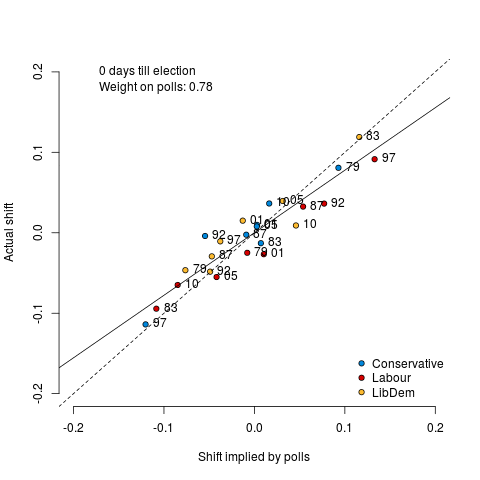
So the polls get increasingly accurate — but they always tend to over-estimate change, and you should discount accordingly.
It’s something like this analysis which powers electionforecast.co.uk‘s estimate for parties’ national vote shares on May 7th. We smooth the weights a little, so that we don’t get sudden shifts in our forecast which are just due to the noise from the historical analysis. Here’s what that smoothed weight looks like.

All these images do show one thing – that at just under one hundred days to go, we’ve got a long distance still to cover.
Chris Hanretty is a Reader in Politics at the University of East Anglia.


That is a very interesting, but highly muddled, chart. Could you repost showing just the Conservatives, just Labour, just the Liberal Democrats / Allliance?