


 When a poll deviates from the figures of other recent polls, political commentators tend to get excited. In this post, the team from electionforecast.co.uk provide some context for those wishing to interpret the results of individual opinion polls in the run up to the general election in May.
Last week saw the release of an ICM poll that found the Conservatives on 36% of the vote and Labour on 32%. The next day, TNS released a poll showing Labour on 35% and the Conservatives on 28%. The fieldwork for both polls was carried out over the same period – from the 12 – 16th February. Such differences are not rare: in January, a Populus poll showed Labour five points ahead of the Conservatives, while a poll by Lord Ashcroft showed them six points behind. Following this, Rob Ford, Will Jennings, Mark Pickup, and Chris Wleizen argued that much of the subsequent “brouhaha” was attributable to “statistical illiteracy.”
Even for those of us who spend much of our time thinking about polling data, it can be difficult to form reasonable expectations for how much variation from poll to poll we ought to expect. In this post, and in a new “Interpreting New Polls” section on our website, we try to provide some context for those wishing to interpret individual opinion polls as they are released. In essence, this requires understanding why two polls, fielded in the same period, might give different results. Essentially, it comes down to two classic statistical concepts: bias and variance. We will consider variance first.
A poll is a sample from a broader population. What we want to know is how many people prefer each party in the voting population as a whole. What we observe in the polls is how many people are willing to express a preference for each party, from a sample of the population we are actually interested in. Our sample will never perfectly represent the voting intentions of that population. The consequence of this is that random sampling variation can lead to changes in estimates of party support, even if the levels of support are stable in the population. The good news is that we can quantify how much sampling variability there is likely to be.
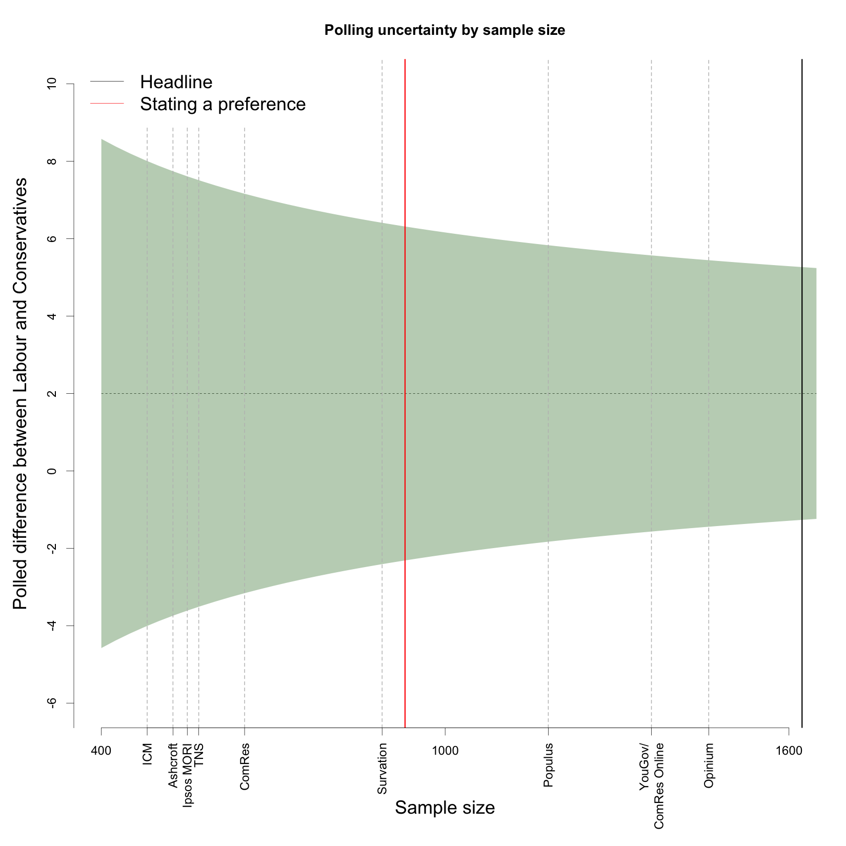
Recently, on average across all pollsters, Labour has been roughly two percentage points ahead of the Conservatives, at about 33% and 31% respectively. Let us just assume that is the true state of the electorate for the purposes of thinking about sampling variation. The figure below shows the polled difference between Labour and the Conservatives on the y-axis, with the “true” difference depicted by the dashed horizontal line. The x-axis is the sample size of a poll. If we collected a simple random sample (more on this below), the expected sampling variability would indicate that 90% of polls would find a Labour-Conservative margin in the shaded band.
What is striking is just how wide the band is. A poll with a sample size of 500 has an interval that ranges from -3.9 to 7.9, while the interval for a sample size of 1500 still ranges from -1.4 to 5.4. The difference between a 5 point Labour lead and a 1 point Conservative lead is politically substantial, but even with 1500 respondents that is the level of variation we can expect to see from poll to poll.
The plot also shows the average poll size for all the major pollsters. While the pollsters ComRes, Opinium, Populus and YouGov record preferences from a relatively large number of respondents in their online surveys, this is not the case for polls done over the telephone. Notably, ICM and TNS have some of the lowest sample sizes of respondents stating a preference, the two pollsters which showed such divergent results last week. The implication of this is that polls from these companies are likely to display higher levels of volatility than those with larger effective sample sizes. When it comes to sampling variation, the online pollsters have a clear advantage.
The figure also shows that the number of people who are likely to vote and willing to express a preference is considerably smaller than the headline sample size of most pollsters. In the polls we have collected since May 2014, the number of people actually giving an answer to the standard vote intention question is just 930 in an average poll (red line), whereas the headline figure is closer to 1600 (black line). This means that there is greater uncertainty in these estimates than the headline sample size indicates.
The calculations in the figure above are based on an assumption of a simple random sample, which is a convenient theoretical benchmark, but in practice neither telephone nor online polls are really constructed this way. One potential benefit of this is that by using demographic information about who has actually been polled, pollsters may be able to reduce sampling variability below what is implied by simple random sampling. The degree to which they can do this is difficult to quantify, and so our inclination is to stick to simple random sampling as a benchmark for how much variability to expect.
However, there is a downside to this (necessary) weighting and adjustment: the potential to introduce systematic bias into the results. This bias is usually referred to as a pollster’s “house effect”. There is an excellent post from YouGov’s Anthony Wells that explains house effects in some detail. The important thing for us is that these effects exist, and that we estimate and adjust for them in our polling model. We cannot know the absolute bias of the pollsters (relative to the ultimate election outcome) but we can very clearly see the relative biases of the pollsters: which ones consistently show particular parties at higher or lower levels of support.
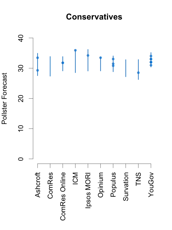
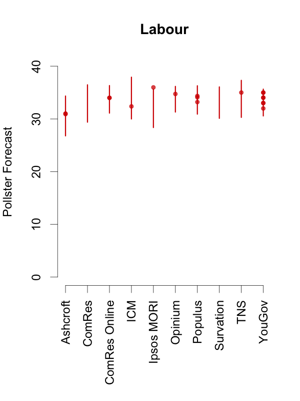
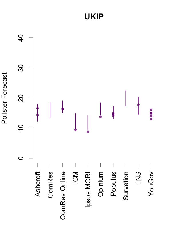
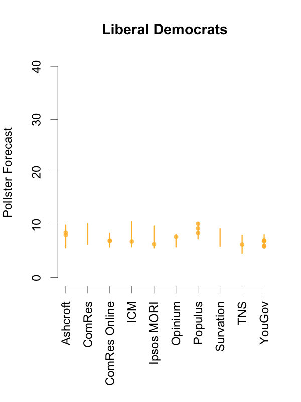
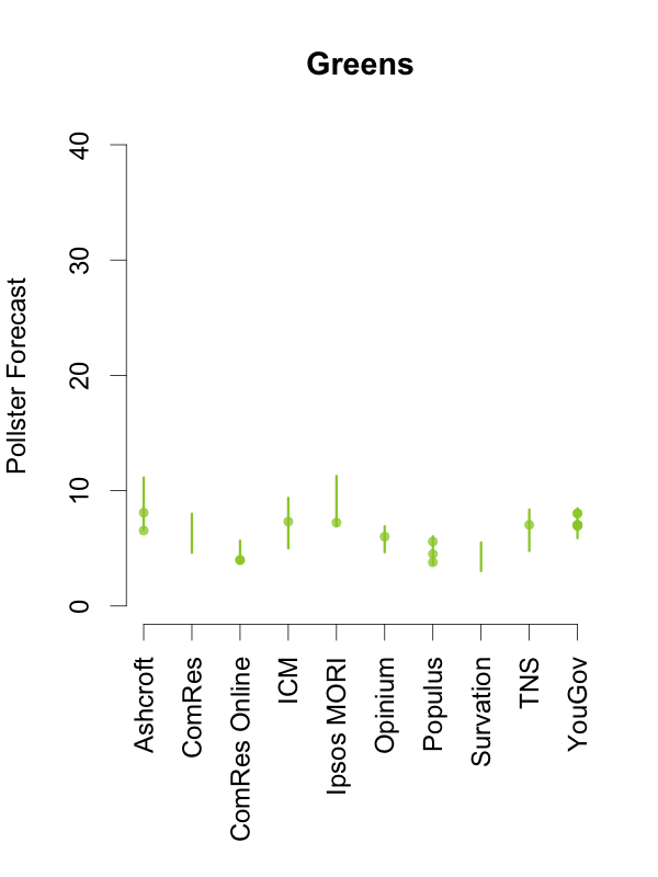
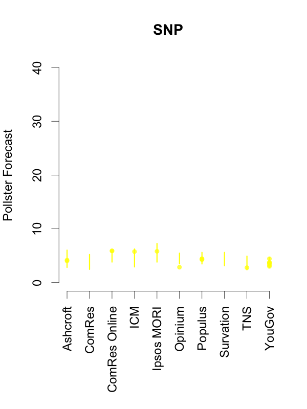
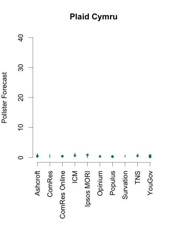
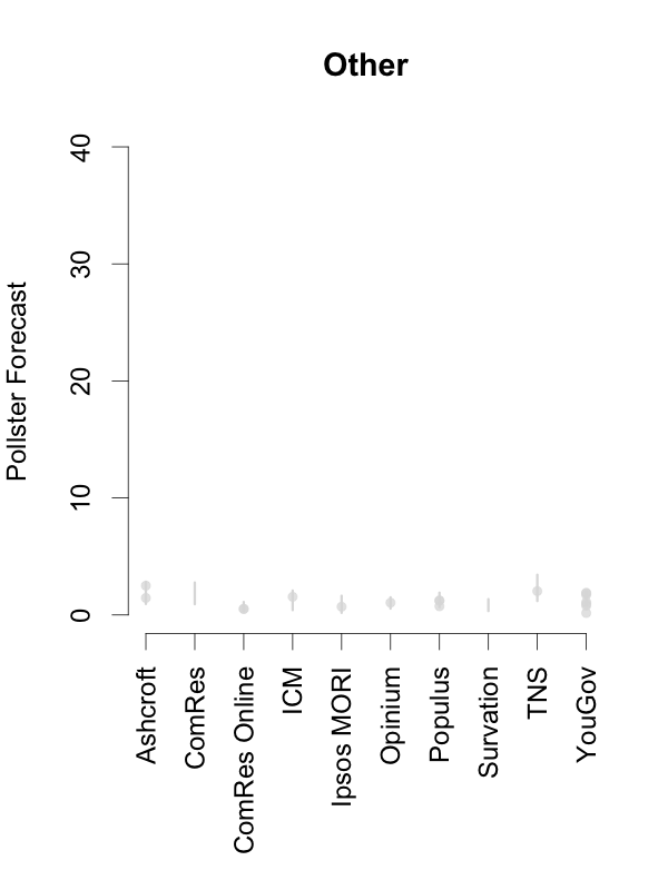
Given this, and in order to help interpret new polls as they are released, the plots below depict the 90% predictive intervals for each party, for each pollster, given their typical sample size (of voters that express a preference), their house effects, and our current national pooled poll estimates. These are estimates of what polls from these pollsters might show if they ran a survey over the last few days. The vertical lines in the graph are the prediction intervals, and the points are actual poll results from the past 10 days.
Two things stand out from these plots. First, we can see the variances for each pollster. As we saw in the plot of the Labour-Conservative margin, the prediction intervals are wide, particularly for the larger parties. This reflects the fact that there is a good deal of uncertainty in individual polls. Second, we can see the relative biases of each pollster. Almost all recent polls fall within the prediction intervals for the pollster that conducted them. This suggests that even polls that seem to show relatively large changes have been within the expected range of estimates for that pollster.
How should these prediction intervals inform our interpretation of new polls? First, if a new poll comes out, and it is inside the range we show for that pollster for all parties, this is an indication that the poll is not surprising given that pollster’s house effects and where the polls are more generally. To reiterate: this can occur even if the pollster shows a substantial swing from their previous poll, as there is substantial uncertainty in every poll.
Second, if a new poll comes out, and it is outside the range we show for that pollster for one or more parties, there are two possible interpretations. Either this is one of the 1 in 10 polls that will inevitably fall outside a 90% prediction interval, or there is some recent movement in the support for the parties that our model has not yet incorporated. While the latter is the more exciting interpretation, the former will usually be the correct one.
So, if a new poll is inside our prediction interval for that pollster, it probably indicates nothing has changed, and if it is outside our prediction interval for that pollster, it still probably indicates nothing has changed. This reflects the fact that, in general, no single poll is going to give a very strong indication that public opinion has actually changed. As these plots show, individual polls are too uncertain, relative to the magnitude of real swings in voting intention. The only way we can be confident that change has occurred is if we see evidence from many polls, each taken in the context of what the corresponding pollsters had found in their previous polls.
 Jack Blumenau is a PhD candidate in Government at the London School of Economics.
 Chris Hanretty is a Reader in Politics at the University of East Anglia.
 Benjamin Lauderdale is an Associate Professor in Methodology at the London School of Economics.
 Nick Vivyan is a Lecturer in Quantitative Social Research at the Durham University.






3 Comments