 The much strengthened policy focus on rehabilitation in the Ministry of Justice (MoJ) in recent years has meant that there is now time-series data available on individual prison performance in reducing reoffending. At a time where as much analysis as possible is needed on how to calibrate and measure rehabilitation, Simon Bastow presents latest MoJ figures, and shows even marginal improvements take time.
In November 2010, I wrote a piece for this blog on the launch of the ‘rehabilitation revolution’ in the UK offender management system. Behind the grand narrative and optimism bias, there were at least signs that pragmatic steps were being taken to shift the objectives of the prison system explicitly towards rehabilitative outcomes, something that had been systemically lacking for decades previously.
One small sign was a new commitment by the Ministry of Justice (MoJ) to publish reoffending rates for individual prisons. While other core public sector institutions such as schools and hospitals had been subjected to waves of league-tabling throughout the 1990s and 2000s, prisons had systematically managed to avoid this kind of institution-level accountability.
Since then the MoJ has published reoffending rates for further annual cohorts (2007 to 2011) (see Tables 22a and 22b at the link), buried away though they are on the MoJ website. Admittedly, most of these cohorts predate the beginnings of the ‘rehabilitation revolution’, but they give us an idea of the types of rehabilitative outcomes that NOMS and individual prisons have been achieving year-on-year, and the kinds of improvements that we should realistically expect.
Figure 1 shows the distribution of average ‘proven’ reoffending rates for five different types of prison (see Figure 1 Note for definition). I have used ‘box and whisker’ plots here to show the distribution of all prisons in each category, with the ‘box’ showing the interquartile range (25% to 75%), and the ‘whiskers’ showing upper and lower quartiles respectively. The line across the box denotes the median reoffending rate across all prisons in that category.
Figure 1: Rates of proven reoffending amongst prisoners sentenced to less than six months, by different types of prison, 2007 to 2011
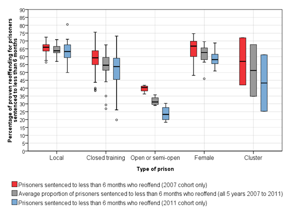
NOTE Ministry of Justice definition for ‘proven’ reoffending: any offence committed in a one year follow-up period and receiving a court conviction, caution, reprimand or warning in the one year follow-up or a further six month waiting period.
For each type of prison, there is a cluster of three boxplots. The red shows the distribution of reoffending rates for the cohort of prisoners released from prison in 2007. The blue shows the same rate for the 2011 cohort. The grey shows the average reoffending rate across all five annual cohorts.
Looking first at local prisons, generally holding shorter sentence prisoners, we can see quite narrow clustering around 66 per cent for the 2007 cohort. We can interpret this in various ways. Either most local prisons have normalized a sense of fatalism about this ‘two thirds’ rule, and have long since deprioritized efforts to boost rehabilitation. Or the structural factors are so overwhelming, that whatever individual prisons do to reduce the rate, the outcomes are still somewhere around two thirds. The reality is probably somewhere between the two.
To what extent have local prisons been able to cut into this structural trend? How has five years of ‘proactive’ offender management policies reduced chronically stable reoffending rates? The 2011 boxplot suggests a mixed picture. We see a downward stretching of the distribution, implying that some local prisons have managed to reduce their reoffending rates more significantly than others. Yet, at the same time, the reduction of the overall average is no more than 3 or 4 per cent.
In other types of prisons, there are more accentuated signs of improvement. For closed training prisons, generally holding longer sentence prisoners, we see a reduction in reoffending of around 5 per cent between 2007 and 2011, with comparatively higher downward stretching.
Open prisons tend to hold longer sentence prisons at the end of their custody, and as a result have much lower average levels of reoffending from the outset. Nevertheless it is clear that these prisons have shown more considerable improvement downwards (up to 15 per cent), and a much more decisive shift of the whole box rather than the ‘mixed picture’ stretching we see in the previous two.
Figure 2: A closer look at proven reoffending rates in individual local prisons, 2007 to 2011
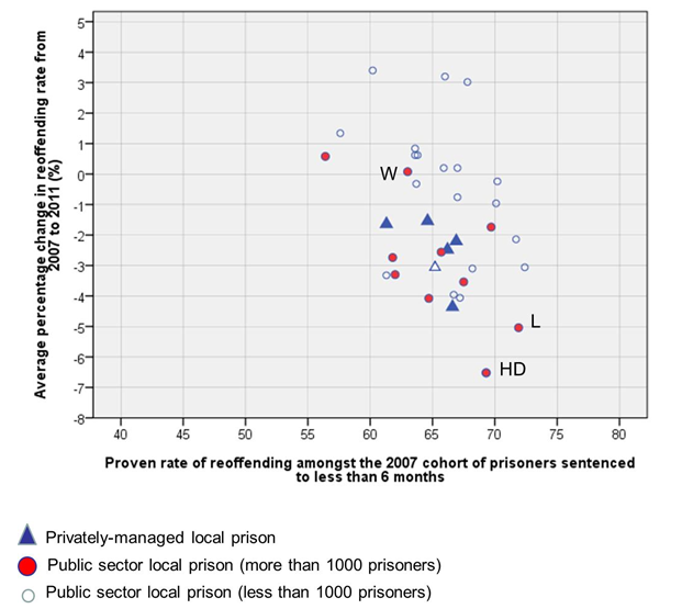
There are variations in the rehabilitative performance of different types of local prisons during this five-year period. In Figure 2 above, I plot the same data on two axes, the horizontal showing the proven rate of reoffending amongst the 2007 cohort (i.e. the red boxplot above), and the vertical showing the average change in reoffending over five years (i.e. the grey boxplot). I differentiate between public and privately-managed prisons, as well as large and small public prisons.
All five privately-managed local prisons (Doncaster, Forest Bank, Altcourse, Parc, and Peterborough) have managed to reduce their reoffending rates between 2007 and 2011 by at least 1.5 per cent. Parc prison (run by G4S since 1997) has reduced its average reoffending rate by more than 4 per cent. Birmingham prison (shown by the hollow triangle) was transferred to G4S in 2011. From 2007 to 2010 it had managed to reduce its reoffending rate by nearly 6%, only to see the rate rise once more in 2011. Perhaps a consequence of the disruption to services caused by the transfer.
The mix of rehabilitative performance amongst the public prisons is striking, and in many ways, makes the privately managed prisons look like fairly consistent performers. For some large local prisons, such as Wandsworth (W), reoffending rates have remained broadly the same throughout this period, reflecting its frenetic churn as well as leadership uncertainty and resistant staff cultures over the years. At the other end of the spectrum, we find large public sector prisons outperforming all others, such as High Down (HD) (Surrey) and Leeds (L). It is perhaps no surprise that both of these prisons had stable leadership teams and imaginative governors in place for most of this five-year period.
Note: This article gives the views of the author, and not the position of the British Politics and Policy blog, nor of the London School of Economics. Please read our comments policy before posting.
Simon Bastow has been a Senior Research Fellow at the LSE Public Policy Group since 2005. He was previously at the School of Public Policy, UCL (now the Department of Political Science). He completed his PhD in political science in April 2012, looking at chronic capacity stress and crowding in the England and Wales prison system.