In April 2016 in two contributions to this blog Ron Johnston, Kelvyn Jones and David Manley predicted the likely geography of support for Brexit in the EU referendum. In this concluding piece they compare their predictions to the result. The general pattern of their predictions turned out to be very accurate, but regional differences were more pronounced than anticipated, with variations in both late electoral registrations and turnout introducing unexpected impacts on the geography of the outcome.
In an earlier contribution to this blog we challenged the claim that the pattern of voting in the EU Referendum was unpredictable because there was no evidence that members of particular socio-economic and/or -demographic groups were more likely to vote one way or another. Using a large body of polling data collected by YouGov (over the whole of 2015 and first three months of 2016) we found clear evidence suggesting that young people and those with higher-level educational qualifications were much more likely to support Remain, whereas older voters and those with few or no qualifications were much more likely to support Leave.
Across 380 local authorities we used used this information to estimate the percentage of voters who would support Brexit (Northern Ireland and Gibraltar were excluded because we lacked enough data). Our map showed the geography of support for a Brexit and caught the interest of a number of newspapers.
In a later blog, we adjusted our predictions to take turnout into account, based on the observed patterns at the 2015 general election. A revised map showed a slightly larger number of local authorities where majority support for Leave was likely to occur.
How accurate were the predictions?
Nothing in later polling data suggested any change to the underlying patterns: older people were more likely than their younger counterparts to vote Leave; well-qualified people were more likely than those with no or few qualifications to vote Remain; and young voters, especially those with few qualifications, were least likely to turn out and vote – assuming that they were on the electoral roll at all. The only difference was that whereas the poll data we used showed a clear majority of support for Remain, by polling day the gap between the two sides was very small. But unless those who switched from Remain to Leave were overwhelmingly concentrated in particular age and qualification groups this should not have affected the overall pattern. The local authorities where we predicted greatest support for Brexit should have been those which reported most votes for it on 23 June.
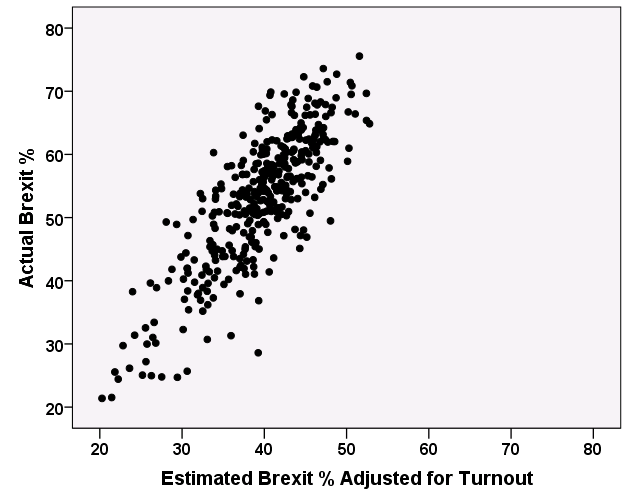
And that was the case. The graph shows our predicted percentage vote for Brexit on the horizontal axis, adjusted for likely turnout, and the actual vote on the vertical axis. The relationship is close – although in virtually all cases the Brexit vote is, unsurprisingly, larger than we predicted (in statistical terms, the correlation between the two sets of values of 0.82 indicates that 67 per cent of the variation in the actual pattern can be accounted for by the variation in the predicted pattern).
The Geography of Brexit
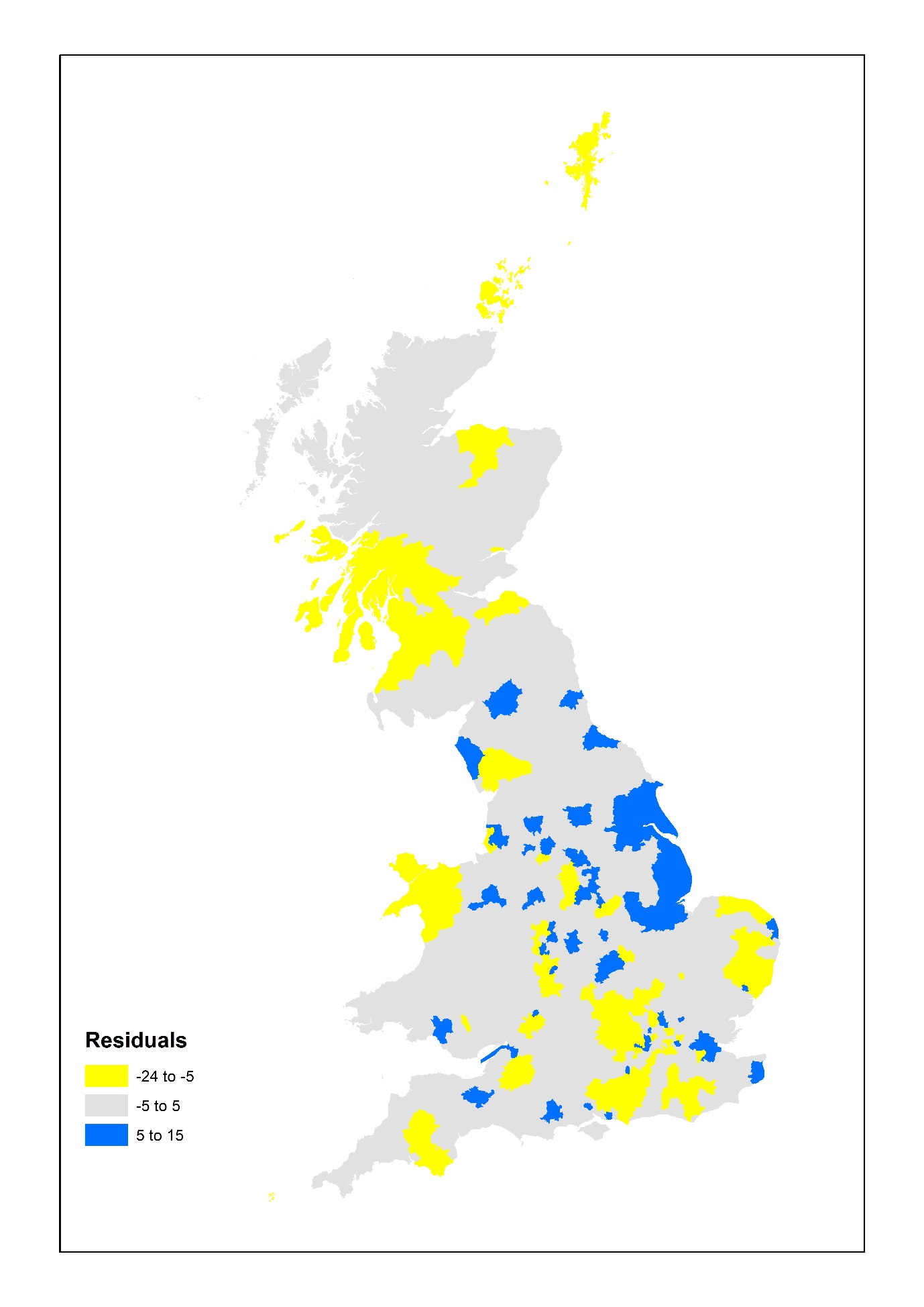
Although we got the general pattern right, there were some places where – in relative terms – we substantially under-estimated support for Brexit, and others where we over-estimated it. Where were those places, and why did they deviate from the general pattern? To answer that question we adjusted our estimates so that the overall outcome matched that of the referendum on 23 June and then explored the outliers; these were the places where the actual percentage voting Brexit was either larger or smaller than we had predicted it would be on the basis of the age structure and educational qualifications of the adult population in each local authority. The map shows those places where we under- or over-estimated the outcome by five or more percentage points.
Areas in blue are places where we under-estimated Brexit support. There were fifteen where the share for Leave was ten or more points higher than we predicted; the largest of those differences was nearly 15 percentage points, for Amber Valley District Council in Derbyshire. With two exceptions on the south coast (Portsmouth and Southampton) and two more on the Thames estuary (Medway and Thurrock) these fifteen places have one common characteristic – all are in the East or West Midlands, Yorkshire and the Humber, or the Northeast. There are none in the Northwest or Southwest of England – nor in London, Scotland or Wales. Indeed, of the 64 local authorities where support for Brexit was five percentage points or more greater than we estimated there were only two in London (Hillingdon and Newham) and two in Wales (Neath Port Talbot and Wrexham) and none in Scotland. By comparison, twelve of the 64 were in the East Midlands (30 per cent of all local authorities in that region).
Areas in yellow are places were we over-estimated Brexit. There were 76 of these – in one case (East Dunbartonshire) by as much as 24.4 points. Indeed, eighteen of those local authorities were in Scotland; all 32 of Scotland’s local authorities returned a majority for Remain, and in over half of them support for Leave was substantially less than we anticipated. London was also a region where support for Brexit was less than predicted (only five boroughs returned a majority for Leave); thirteen of the Boroughs had an actual vote for Brexit five or more percentage points lower than we predicted, as did nineteen of the 67 local authorities in the Southeast region.
These patterns suggest substantial regional variations within the UK in support for Brexit. But there were substantial within-region variations as well – not everywhere in Scotland and London was as supportive of remaining in the EU, for example. Nevertheless, across London’s 32 Boroughs on average support for Leave was 7.6 percentage points less than we predicted and in Scotland average support across the 32 local authorities was 12.3 points less; against that, in the East Midlands support for Brexit was on average 2.8 points greater than predicted across the region’s 40 local authorities.
Higher turnout, Higher Remain vote
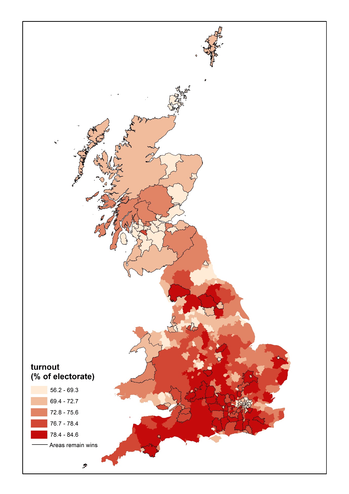
As well as these regional variations, there were two other significant general patterns. On average, the higher the turnout the less the support for Leave (with the regional differences held constant); turnout percentages are shown in the next the map. With each percentage point increase in turnout support for Leave fell by 0.27 points. Across the 380 local authorities turnout varied from 56.3 per cent in Glasgow City to 83.6 per cent in Chiltern – which translates into a difference of almost 7.5 percentage points in support for the Leave campaign between the places with the highest and lowest turnout.
Finally, there were also substantial differences between local authorities in the number of people who registered as electors there after the last annual canvass in late 2015. Lewisham’s registered electorate increased by 18.6 per cent between December 2015 and June 2016, for example, and there was an increase of more than 10 per cent in eight other local authorities; four of them were London boroughs and the others were Cambridge, Lincoln, Oxford and Slough. The average local authority’s electorate increased by 4.7 per cent. There was a significant negative relationship between expansion of the registered electorate and support for the Leave campaign (again, holding the regional differences constant); for every increase of one percentage point in the registered electorate the Brexit vote fell on average by 0.48 percentage points.
These regional differences, plus those linked to turnout variations and growth in the registered electorate, pose important questions to be addressed as the referendum’s results go on to be analysed in more detail. Could higher turnout in those where it was relatively low, plus greater efforts to ensure that more of those entitled to register to vote did so, have delivered victory for the Remain campaign? (It is guesstimated that as many as 6-7 million voters were not on the electoral roll and initial polls suggest that perhaps as many as two-thirds of the youngest age cohort – 18-24 – did not cast a vote.)
Modelling the Brexit Vote
A general pattern emerged on 23 June very much in line with our earlier modelling. There are substantial parts of the country where large numbers of people have lost out from the deindustrialisation and globalisation of the last few decades of neo-liberal economic policies, and where the educational system has not helped large proportions of the young to equip themselves for the new labour market. Increasing numbers in these disadvantaged groups were won over during the last few decades by the campaigns in parts of the print media, taken up by UKIP since the 1990s, linking their situations to the impact of immigration – uncontrollable because of the EU freedom of movement of labour principle. The wider Leave campaign built on that foundation in 2016, producing the geography displayed here.
In 1967 Peter Pulzer wrote that ‘Class is the basis of British party politics: all else is embellishment and detail’. The result on 23 June clearly suggests that is still the case – class, as expressed through educational achievements, delivered Brexit. The embellishment and detail – why so many young people did not either register to vote or, of those who did, then express their opinion, for example – remain to be explored, as do their implications for the future of British party politics.
About the Authors
 Ron Johnston is Professor in the School of Geographical Sciences at the University of Bristol

Kelvyn Jones is Professor in the School of Geographical Sciences at the University of Bristol
 David Manley is a senior lecturer in the School of Geographical Sciences at the University of Bristol.





Have any of you looked at whether the pattern of younger people voting remain, and those with higher education voting remain are just covariates of the same trend? Presumably younger people are more likely to have higher educational levels these days.
I am interested in the story of the 18 – 24 age range voters. The dominant meme is that they did not bother to vote. Percentages supposedly range from 25% to 40%. Yet this is so far from my personal experience of young people that I question the finding. I discover that there is no record of voting age at the polling station, so all these figures are conjecture based on selective polling and modelling – and prior assumptions. You too introduce the ‘young people didn’t vote’ meme with a tentative ‘initial polls suggest that perhaps…”
So what *is* the story? What do we really know about the number of 18-24 votes in the referendum, and to what extent that number was impacted by either changes to voter registration or turnout?