 LSE’s Alison Powell is director of the Ada Lovelace Institute’s JUST AI network, building on research in AI ethics to look at practical issues of social justice, distribution, governance and design. Here, she looks at how data, bodies and experience entwine – and how we might make a world where instead of predicting our individual risk we understand the complexities of living together, in situations of inequality and injustice. This post is the first in a series of four to be published by the Ada Lovelace Institute, examining data, mediation and inequality, on the theme of What is Measured is Managed.
We have found ourselves in what’s called the first ‘data-driven pandemic’. What is equally true however is that we have found ourselves in a data-driven panic.
In a newly global and intense way, data – whether visualised through graphs or underpinning decision systems that determine where medics work or who gets to travel – has become a powerful mediating force. From billboards to social media, day-to-day culture includes looking at and interpreting data visualisations drawn from aggregated statistics.
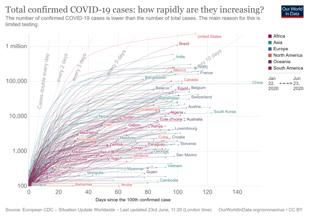
In the case of COVID-19, responses to these visualisations suggests the emergence of a ‘mediated folk epistemology’, that draws on information visualisations and commonly understood ideas of correlation to create a bottom-up, non-official interpretation of what’s going on. This response began to emerge as COVID-19 cases started to rise, and now that media narratives have turned towards economic reopening, grapples with the consequences of lockdown and the risks of a second wave.
It’s not surprising that this mediated folk epistemology began by using widely circulated images of infection curves, which include records of actual cases, as well as interventionist images encouraging action to ‘flatten the curve’. In the absence of another way to visualise or understand what’s happening, the curve has been standing in for the disease itself, shaping public discussion, encouraging personal identification with the curve and drawing attention away from the other features of a data-mediated pandemic.
While consuming this data and its messages, we have been distracted from how management, control and prediction through data consolidate power in ways that exacerbate inequality. Together, the mediating influence of curves and the power of data combine to obscure how existential risks are unevenly distributed – and how continuing data disparities exacerbate this. These data disparities include the differential impact of COVID-19 on Black and Minority Ethnic people, the relationship of health and risk to systemic injustice, and the inability of these representations to capture the costs and consequences of the pandemic.

For up-to-date visualisation visit Visual Capitalist.
The expansion of data visualisations of infection and death, along with circulation of the epidemiological models that they supposedly follow, may edge towards becoming unique forms of disinformation because they focus attention on what is measured (or indeed, measurable) at the expense of nuanced considerations of differential risk and harm from disease as well as its control to women, people of colour and elders.
As the extent of systemic racism and its consequences is revealed in relation to COVID-19 (and as pressure builds on the Government to explicate these), the gaps in what is measured become more evident. For example, the Welsh Government reports that systemic racism is one of the reasons that more people from BAME backgrounds have died from COVID-19, while the UK Government has come under pressure for not fully publishing the results of its inquiry into the differential impact on Black people in the UK. These data-driven revelations and gaps come against the backdrop of efforts to substantively engage with the culture of racism directed against Black people globally and in the UK, which further shows the gaps in what is measured.
Responses to data visualisations have become part of a social and cultural context that also includes appeals to the authority of ‘dashboard models’ as ‘technosystemic frames’ that narrow the possibility to perceive injustice. Dashboard models promise to streamline decision-making by aggregating together different streams of information, but in doing so they manipulate and restructure how information is interpreted, collapsing time by focusing on most recent information, and preventing effective transparency of information sources.
Dashboards gained popularity through the twentieth century as management tools providing ‘360-degree views’ – and with the expansion of streams of digital data dashboards have changed the way that cities are managed, and politics performed. Now dashboards are shaping the way that people are able to understand and respond to situations in real time, placing individuals in the roles of strategic managers, even though they lack information about where dashboard data streams may come from.
Both dashboards and infection curves provide examples of how control of the mediations of data can conceal the inequalities embedded in how data are collected and presented, and the models on which predictions are based. For example, the dashboards showing the numbers of tests undertaken in the UK from late April showed a blank value for the number of people tested – with no explanation provided for why this data was missing for several weeks. A focus on infection rates and curves, or dashboards that select some information as relevant and then track this over time, can both preclude or pre-empt political and ethical conversations about how different people experience different levels of risk. They can also occlude the broader risks of depending even more on (monopolised) information systems as passage points for liberty.
Disaster-driven data monopolies
Fuelled by a fascination with curves and the apparent transparency of dashboards, current promises of a return to ‘normal life’ enable ‘disaster-driven data monopolies’ to emerge, in a culture of reduced scrutiny of the arrangements for data processing and decision-making that occur behind the scenes and that consolidate power among a small number of technology companies who may be able to profit from unprecedented access to public data.
With legal protections around transparency and competition for government services suspended, decisions about the movement of life-saving equipment – or even our movements within cities and across borders – will be made based on undisclosed data sources and controlled without robust public scrutiny. Given that these systems are the passage points that permit mobility within cities or between regions, international travel and access to work, these monopolies have significant power.
We must begin to acknowledge that contagion is cultural, to speculate on what realities our curves reinforce – or disappear. The infection and recovery curve has been presented thus far as a peak and a decline, but as second and third waves of infection occur these mental models may need to be adjusted. Even so, the ‘ups and downs’ of numbers of infections and deaths conceal as much as they reveal: leaving out the differential contexts of being unable to ‘lock down’ if one works as a bus driver, cleaner or carer, and the differential impacts of being a single parent or living in a multi-generational household.
Because they are not designed to present these complexities and conflicts, the wide dissemination of such curve images distract us from the realities of living with risk and having to attend to vulnerabilities. Buoyed up by enthusiasm for ‘opening up’, we lack the information and reflection required to address complex and differential risks, instead being informed that our data has been delivered to commercial companies like Palantir, who are tasked with providing insight – without oversight.
What might we do to address these systemic risks of giving over data to actors whose predictions can’t easily be scrutinised and whose models may undermine experience? We might begin to think about data and AI ethics as a field where questions of vulnerability discussed within bioethics meet questions of justice. As these power imbalances become more clear, efforts in law, regulation and management of digital and social systems will need to be sustained.
Finally, the tendency to narrow communication and action to curves and individual positions on them prevents serious work on creating systemic change. The inability to understand that the ‘existential threat’ of COVID-19 has differential impacts among people comes with the inability to understand that its viral spread is connected with ecological disruptions and exacerbated by ongoing inequalities and a failure to enact work that moves towards justice.
Addressing the deep cultural roots of this crisis can’t occur on the narrow terms set by the technosystemic frames adopted from epidemiology or dashboard design; not when these misrecognise the ongoing complexities of risk and resilience at work in the world. We need to spend more time working on how data, bodies and experience entwine; how we might make a world where instead of predicting our individual risk people are collectively able to act to address and redress the systemic injustices that put some more at risk than others.
This post is the first in a series of four examining data, mediation and inequality, on the theme of What is Measured is Managed, originally published by the Ada Lovelace Institute and reposted here with thanks.
The second in this series of four posts will investigate further how data may act as disinformation, and digs into how epidemiological models work as forms of media. The third examines the roots of the dashboard effect and details about how it shifts power. The fourth looks at the ethical impacts of the ‘infection curve’ model and the difficulties of transitioning to a more just and equitable mode of life.
This article represents the views of the author, and not the position of the Media@LSE blog, nor of the London School of Economics and Political Science.
Featured image: Photo by Martin Sanchez on Unsplash


